Kathleen Major has been volunteering in the Manuscripts Department at AAS for several years. She worked at AAS from 1976 to 1984 and was Keeper of Manuscripts for a portion of that time. After leaving the Society to care for her children, Kathy worked at the Gale Free Library in Holden, most recently as head of technical services, until her retirement in 2014.
A large number of unidentified diaries have been purchased by or donated to AAS in the last several years, and it’s been a fun challenge for those of us cataloging manuscripts to attempt to identify the diarists by searching for any clues that might spoil the anonymity of the writers. We can then move the diaries to the identified category, thus making them more accessible to researchers.
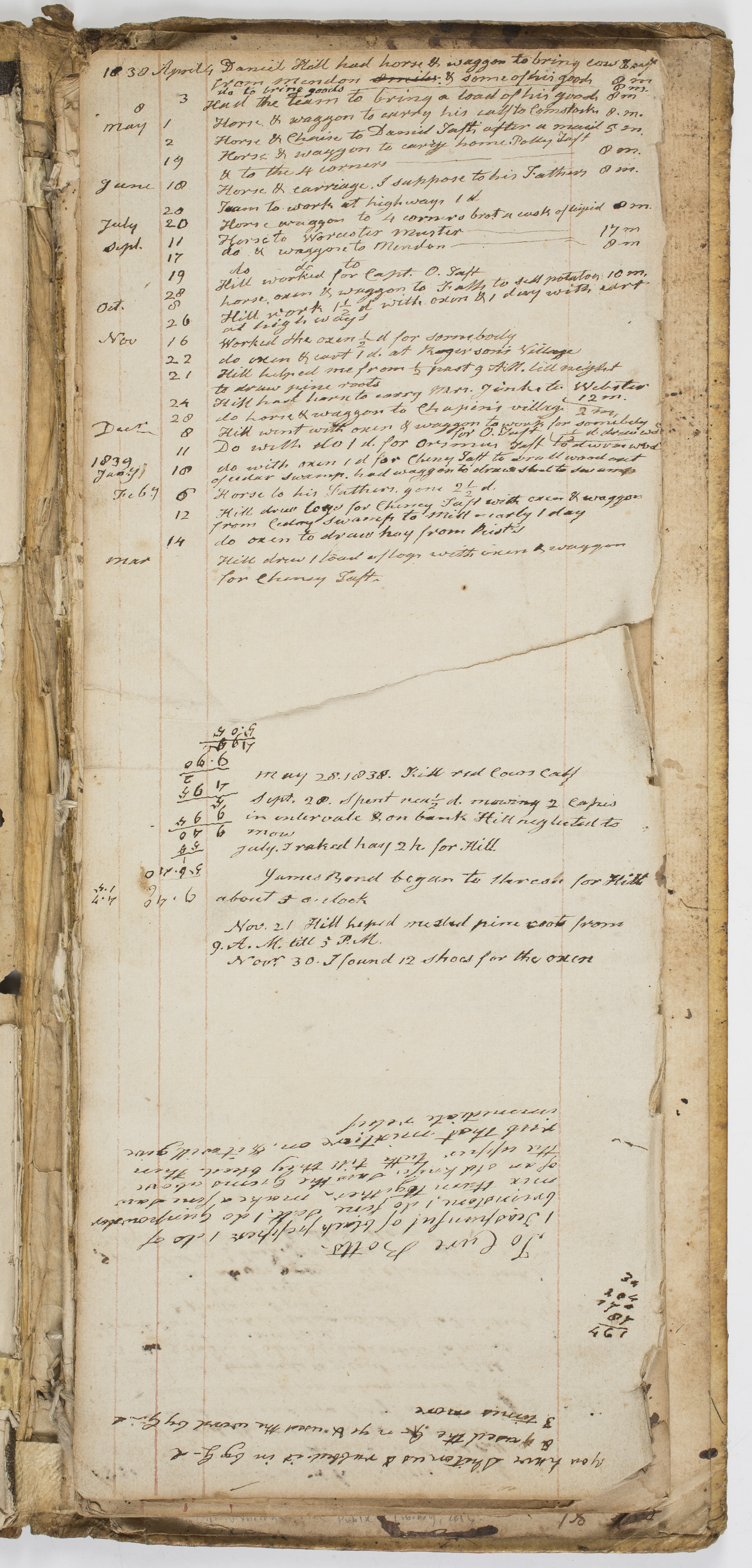
Two such diarists were recently exposed through evidence offered to us in the journals via references to the given names of siblings and cousins, possible locations, and occupations. These clues were then fed into ancestry.com and other websites. A gift of the Uxbridge Free Public Library has now been identified as the diary of Frederick Taft (1759-1846), covering the period 1837 to 1843. A Revolutionary War veteran, Taft was a prominent member of the Uxbridge community and was a prosperous farmer and cranberry grower. He was a distant ancestor of President William Howard Taft.
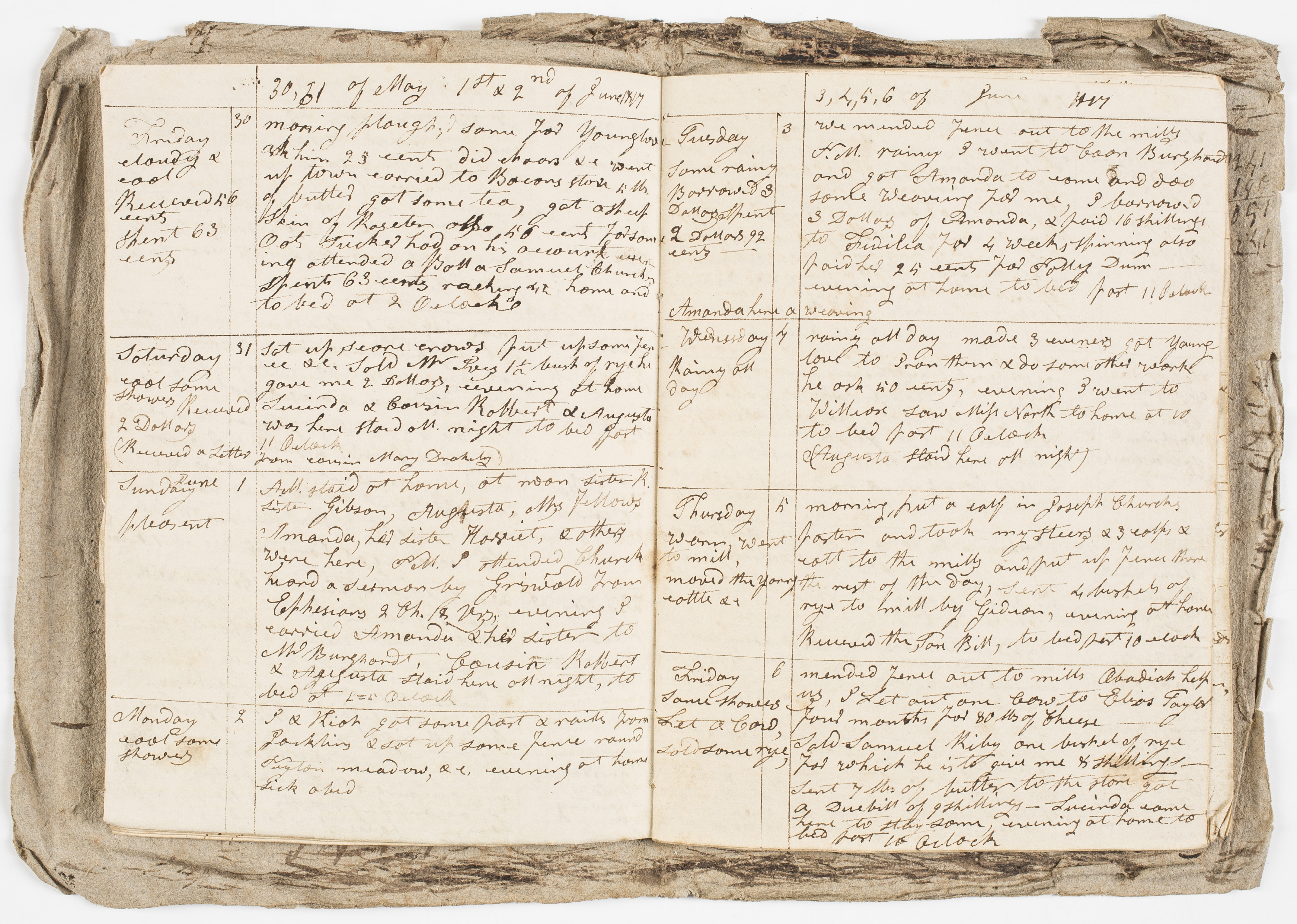
A greater challenge was an unidentified diary from 1817, given to AAS by member Ross W. Beales Jr. (elected 1982). After quite a bit of digging and using the process of elimination concerning references to nearby towns, siblings’ first names, and, finally, a reference to “cousin Wheeler,” I determined that the diarist was Claudius Wheeler (1790-1863). Wheeler was the son of a prosperous merchant and farmer who had also served in the Revolutionary Army. What is especially interesting about the diary is Wheeler’s reference to Conradt Burghardt, who owned the mill that processed Wheeler’s wood in Great Barrington, Massachusetts. Knowing that the sociologist, historian, and civil rights activist W.E.B. DuBois (1868-1963) was from Great Barrington and that the “B” in his name stands for Burghardt, we were able to determine, following additional research, that Conradt Burghardt’s Dutch colonial ancestors, also named Conradt, had been the owners of a slave named Thomas, who assumed the Burghardt surname and settled in Great Barrington as a freeman after serving in the Continental Army. He was the great-great grandfather of W.E.B. DuBois, although the diary does not appear to have any references to the “black Burghardts” of Great Barrington (DuBois’s grandfather, Othello Burghardt, was living in the town in 1817).
It is always very rewarding to find the key that will unlock the anonymity of these diarists, especially when the result becomes a piece in the puzzle of another story.
Progress on the new addition to Antiquarian Hall has been moving steadily over the past few months. Collections have been moved for protection, windows abutting the new addition have been boarded for safety, and these days you may even see staff and readers with ear plugs in the reading room, still hard at work despite the intermittent interruptions. And just last week, the steel beams have finally arrived and passersby can now see the frame starting to take shape.
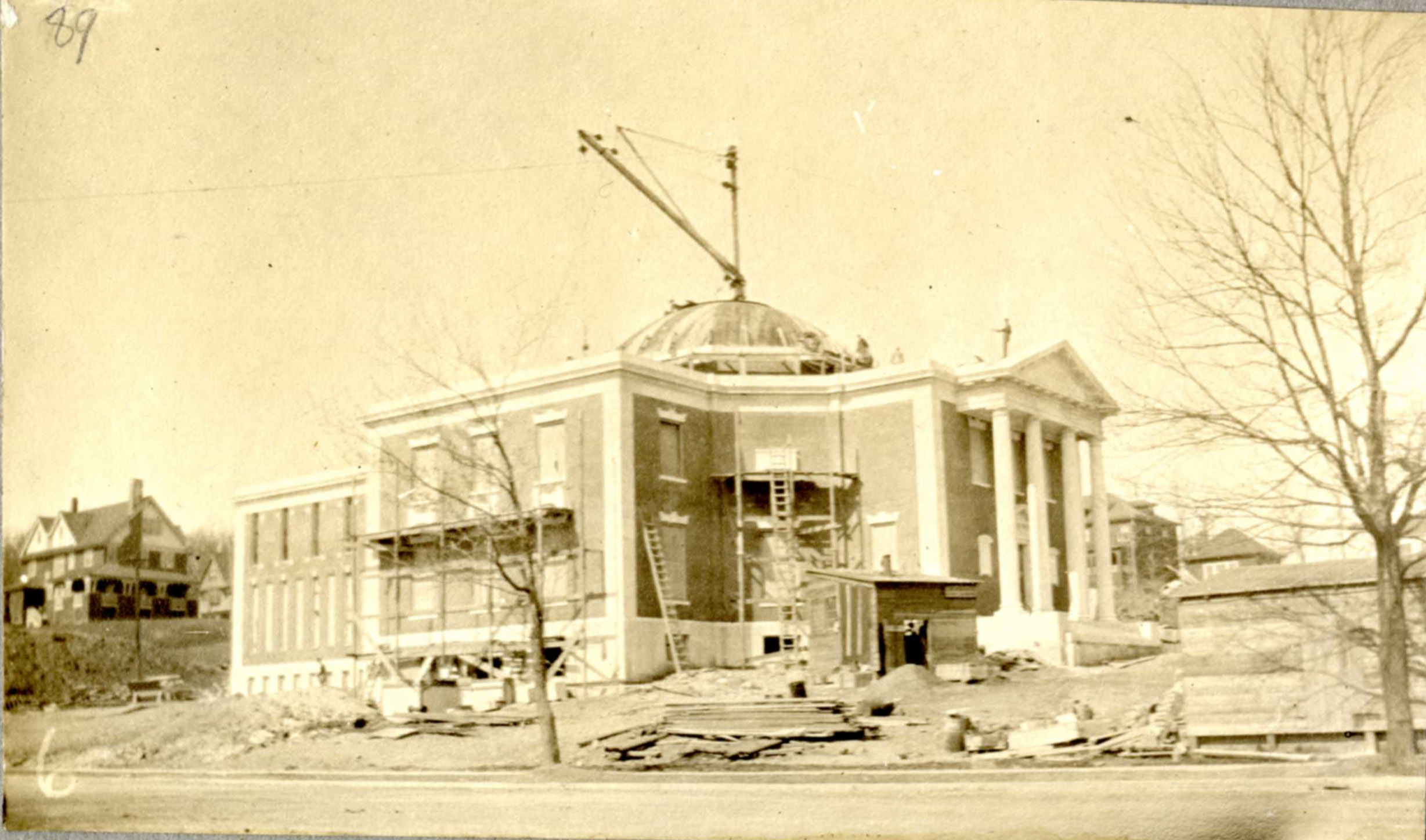
One of our favorite unexpected developments during the construction process, however, was the discovery of these Old Crow Sour Mash bottles, which were dug up during excavation for the foundation of the project. Founded in 1835, the Frankfort, Kentucky, distillery produced hundreds of barrels of bourbon whiskey each year, which was said to be favored by Ulysses S. Grant and Mark Twain. Based on the label design and construction features, these bottles have been dated to the early 1900s and so were likely deposited there during the construction of Society’s library building from 1909 to 1912.
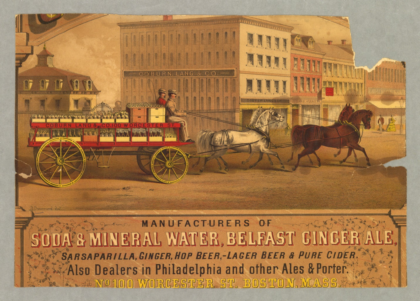
The bottles are also marked with the name and address of George F. Hewett Co., a liquor and water bottler located in Worcester from 1860 to at least 1915. Like many New England towns, Worcester was home to many bottling companies over the years. These firms sold and refilled glass containers for everything from milk to soda water. Standing orders for beverages, including liquor, soda, and seltzers, were delivered to customers by horse cart and empties were hauled away.
Detail of a chromolithograph, “Coburn, Lang & Co. Manufacturers of Soda & Mineral Water… No. 100 Worcester St. Boston,” published in Boston, 1870s.A view of the construction of Antiquarian Hall in 1910.
Finding the bottles intact was thrilling for the work crew and staff at the library. The bottles have now been cataloged and are housed safely inside the stacks. They are a reminder of the crews of workmen who built the Society’s library building before the days of modern backhoes and jack hammers and, after a hard day’s labor, may have sat at the job site and passed a bottle of Kentucky bourbon around.
Emily Isakson is a junior at Mount Holyoke College and was a Readers’ Services page this past summer. As an ancient studies major, with a focus in art history and archaeology, Emily has always been interested in what has shaped the society we know today. Her time at AAS only furthered her curiosity of the world.
Would you believe that an ancient studies major would end up at the American Antiquarian Society? Coming here, I knew that the experience would help me to have a more complete picture of the way archives function and to better understand the different ways people explore history. A few weeks in, I still found myself learning new things every day!
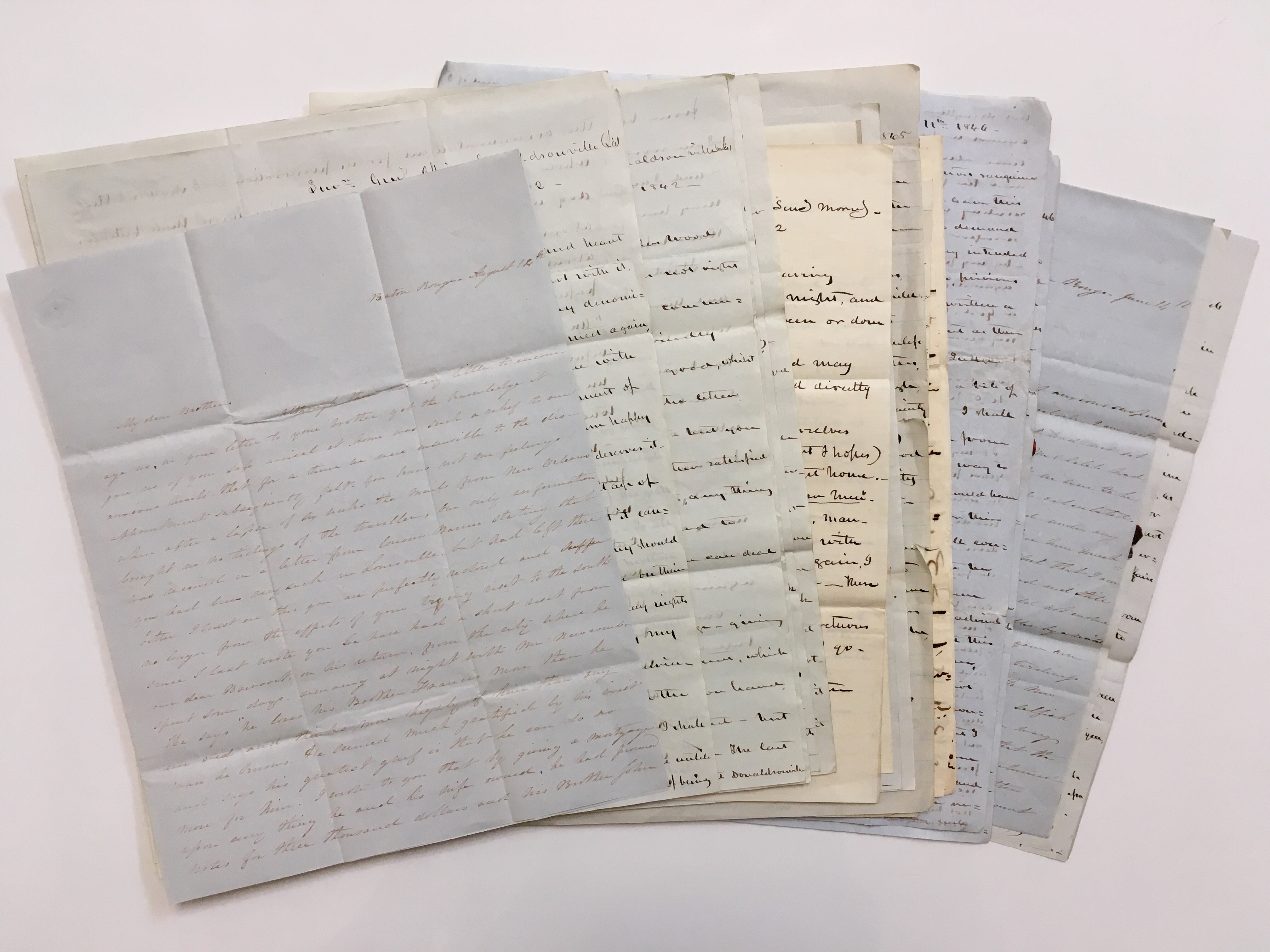
Letters from the Newcomb Papers.
My interest in forgery stems from a college course that touched upon forgeries in early Christian texts. AAS has only furthered my interest in frauds as I began to look for forged items in the AAS collection. I quickly discovered that fraudulence is not an unheard of phenomenon throughout history. First in my search, and with the help of Assistant Curator of Manuscripts Ashley Cataldo, I was directed to look into the curious, and unbelievable, case of Mark Hofmann (1954–). His story is one that could fit into the plot of a dime novel or fictional tale.
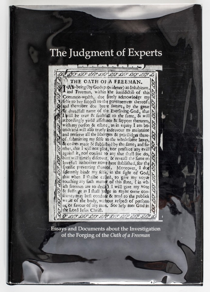
Mark Hofmann was a book collector and missionary turned forger and murderer in the mid-1980s. Several of Hofmann’s earlier forgeries purported to be documents of historical importance to the Mormon Church. In 1985, Hoffman showed a New York dealer a small broadside called The Oath of a Freeman. It had been long reported that a printing of the Oath was done in Cambridge, Massachusetts, in 1638/39. This would likely be the first thing printed in America north of Mexico, though no surviving copy was known to exist.
The cover of “The Judgment of Experts,” an AAS publication about Hofmann’s attempted con.
The broadside was offered to the Library of Congress for $1.5 million but ultimately the offer was declined because no conclusive evidence of the document’s genuineness could be found. The Oath was then offered to the American Antiquarian Society, who offered $250,000 with a number of stipulations requiring the dealers to try to establish the broadside’s authenticity at their own expense and to supply information about the owner of the Oath and its provenance. At this point negotiations ended.
Now that the sale had fallen through, Hoffman, heavily in debt, was desperate to free himself. In an effort to mislead authorities, he planted bombs which killed two people. He was severely injured when a third bomb accidentally exploded in his car. Subsequent investigations uncovered the forgeries and led to Hofmann’s conviction. He is now well known as a murderer and forger, yet his faked items have found a market of their own, some selling for hundreds of thousands of dollars.
What I became most interested in after reading about The Oath of a Freeman was the idea that some forgeries could yet have found their way into the AAS collection. With further exploration, I learned that the collection already contained forgeries, frauds, and even counterfeited materials ranging from vouchers, money, and checks to pirated papers, forged signatures, and even portraits. Still, there’s a question of whether or not AAS knew these items were frauds when they were acquired. (Discussions of these materials can be found in the AAS blog series “Fraud Week.”)
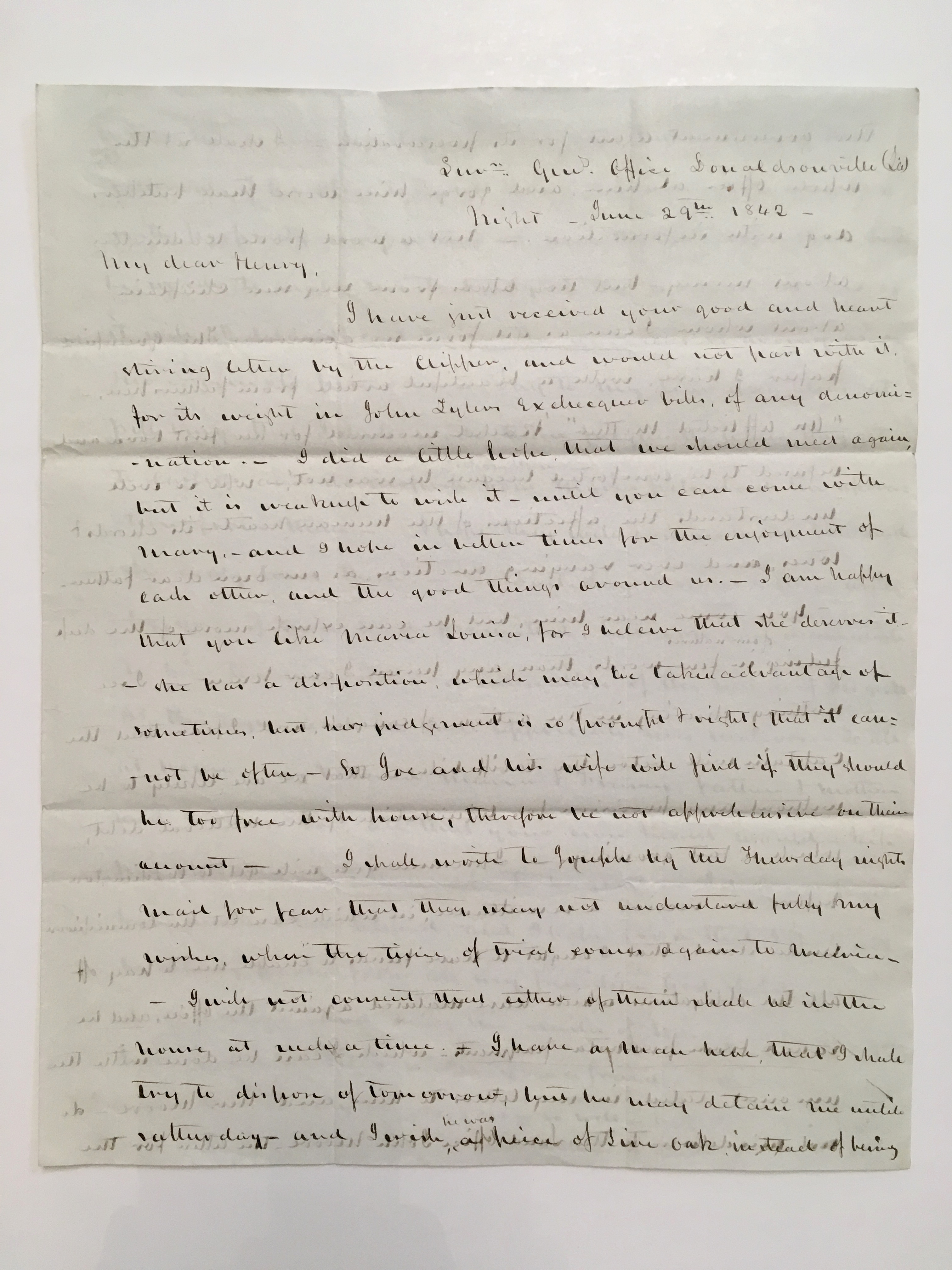
A page from a letter by Francis Dana Newcomb.
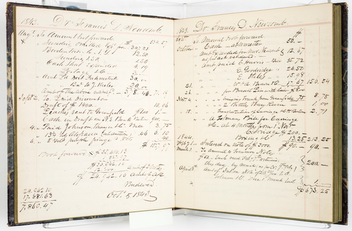
Stemming from these physical frauds, I began to look into collections at the American Antiquarian Society that dealt with forgers. My favorite was the Newcomb Family Papers, which range from 1824 to 1872. One of the Newcomb brothers, Francis Dana Newcomb, was a businessman of sorts. Arrested on several counts of forgery and embezzlement, Newcomb fled to Cuba in the late 1840s to avoid imprisonment. Within the Newcomb Family Papers collection are account books, legal documents, receipts, and letters detailing Newcomb’s illegal affairs and his time in prison.
Within his letters, Newcomb writes about how his finances steadily decreased when his brother, Henry Knox Newcomb, moved to Worcester, Massachusetts. Francis constantly complains to his brother about his decreasing funds, saying, “I find my office without money — and our affairs — in this city and throughout the state, are in a much worse condition than when you left.” His level of anxiety over his income is very evident in his exchanges with Henry. As a result, he forges checks and embezzles money to increase his finances.
The source documents are interesting because, in reading them, I was given insight into the lengths people will go to defend their reputation. In response to the accusations made against him, Francis says, “with a packed jury, I have been tried and found ‘guilty,’” yet he remains incredulous and heads for Havana, Cuba, to escape his debt and his accusers. But once in Cuba, Francis again finds himself in hot water, bankrupt and in debt. In addition to correspondence and legal documents related to Francis Newcomb’s fraudulent business transactions, the AAS collection of Newcomb Family Papers contains notes from family lawyers and promissory notes exchanged between Francis and Henry Newcomb. Henry tried to bail his brother out of debt on several occasions, but to no avail. Francis refused to repay any debt to his brother!
Francis Dana Newcomb’s account book.
Beyond these two examples, interesting still are all of the other materials in the AAS collection related to forgery and counterfeiting, such as counterfeit currency, forged letters and other fakes, and books on counterfeiting and hoaxes. But how does one accurately decipher whether or not something is a forgery? Nowadays, there are many ways to figure out what’s a fraud and what is genuine—namely advanced scientific methods such as ink and paper testing and handwriting analysis. Conversely, however, technological advances have allowed forgers and counterfeiters to create even more realistic duplicates.
Forgeries have a long history, which is one of the reasons why it can be so difficult to tell what is truly real. But to all those historians and collectors out there, don’t worry—fakes can still turn out to be important pieces of history nonetheless. Here at AAS, our frauds have a special place in the collections. After all, they may have shaped the way that history, and the world, both was and is perceived.
I’ve just returned from a visit to the British Library, where, in true antiquarian fashion, I couldn’t help but pretend to be Washington Irving’s Geoffrey Crayon learning the “Art of Bookmaking” and studying the “very act of manufacturing books.” In reality (though not unrelatedly), I was there to partake in a meeting with other institutions working with legacy data related to people in the printing trade from 1450 to 1850. These prosopographies, or mini-biographies, of people’s lives in and around the book trade were largely collected in the twentieth century, and we are all working hard to make them interoperable in the twenty-first.
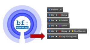
A continuation of conversations first begun in 2014 in Oxford at the “Mapping the British Book Trade” conference, this meeting gave me a great chance to update this group about what’s new with AAS’s Printers’ File. This project aims to make available a unique set of data on the printing trade in what is now the United States from first printing in 1640 through 1820. This information set, which was created in the middle of the twentieth century on index cards, has already been transformed into data, thanks to a group of assiduous summer staffers last year (read about their work here and here) and generous support from the Delmas Foundation. With more generous support from the Pine Tree Foundation and the Lapidus Digital Fund at AAS, we then partnered with Zepheira to transform the data into BIBFRAME, the library standard for Linked Open Data. The Early Printing Trade vocabulary builds on the BIBFRAME Lite vocabulary to support the description of people involved in all parts of the printing trades in the hand press and early steam press periods. The Printers’ File data now exists in a backend framework on Library.Link Network. Please find the data there, but know that it is not yet easy to search or extract. That’s what’s coming!
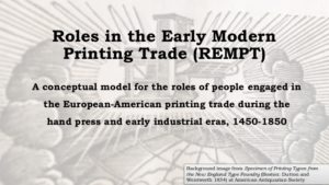
The Printers’ File project’s next phase is to make this data and its structures available by creating the Printers’ File Online (PFO), a front-end user interface to query, extract, and enhance the data.We will also develop an ontology to describe the complex relationships between people, their occupations, and the objects they produced. The Roles in the Early Modern Printing Trade (REMPT) ontology will render the Printers’ File data interoperable with preexisting large, international data sets related to print production in the hand press and early industrial printing periods. Formed in conjunction with partners at Oxford’s Bodleian Libraries, the Consortium of European Research Libraries (CERL), and the Stationers’ Register Online, REMPT will also pave the way for future projects interested in creating such data sets.
I went to the British Library to update the group on the developments of the Printers’ File, not as my imagination directed me: to ogle “a body of magi, deeply engaged in the study of occult sciences,” as Irving’s Crayon does. In the course of the meeting, I heard updates about a number of related projects that capture the lives of those involved in the early modern printing trades. These projects are at various phases of development, but it is still worth sharing these amazing research resources:
Anette Hagan presented on the Scottish Book Trade Index hosted by CERL, but compiled and maintained by the National Library of Scotland. This index lists the names, trades, and addresses of people involved in printing in Scotland up to 1850, including printers, publishers, booksellers, bookbinders, printmakers, stationers, and papermakers.
Giles Bergel then presented on the British Book Trade Index, a resource that has, in the course of its relatively long history, moved from Newcastle upon Tyne to Birmingham, and is now maintained by the Bodleian at Oxford. The BBTI, as it is commonly known, includes brief biographical and trade details of all those who worked in the English and Welsh book trades up to 1851.
Neil Jefferies spoke about the London Book Trade Index, which is currently under development by the Bodleian. This index was compiled from former Bodleian Head of Special Collections Michael Turner who entered all of this data into an Access database that he would share with friends and other libraries. Jefferies spoke of the use of Semantic Media Wiki to make the data more widely accessible; this platform allows for the concurrence of structured and unstructured data.
Ian Gadd updated us on his work with Giles Bergel to create the Stationers’ Register Online, which is neither a database of books or people, but instead of copyright claims. The SRO, as it will be known, is forthcoming by the end of the year. In the meantime, you can learn about the project here.
Justin Tonra ended the discussion with details of plans for the Irish Book Trade Index. This resource is still largely aspirational, but there is much enthusiasm for it. Its sources will be former Trinity College Dublin (TCD) Keeper of Early Printed Books Mary “Paul” Pollard’s Dictionary of Members of the Dublin Book Trade, 1550-1800, as well the extension of Pollard’s work into the nineteenth century by Charles Benson, retired keeper of rare books and special collections at TCD.
This meeting was an excellent chance to exchange ideas and share plans for linking these vast sets of biographical data on what Lisa Maruca has termed the “protagonists of print.” I look forward to thinking more about how the Printers’ File project and prosopographies generally can relate to bibliographic data on the “Digital Histories of the Book in America” panel at the Modern Language Association in New York in January 2018. The panel will feature the exciting work Jacqueline Goldsby and Meredith McGill have been doing on black bibliography, as well Mike Kelly’s work with the astounding Kim-Wait/Eisenberg Collection at Amherst College.
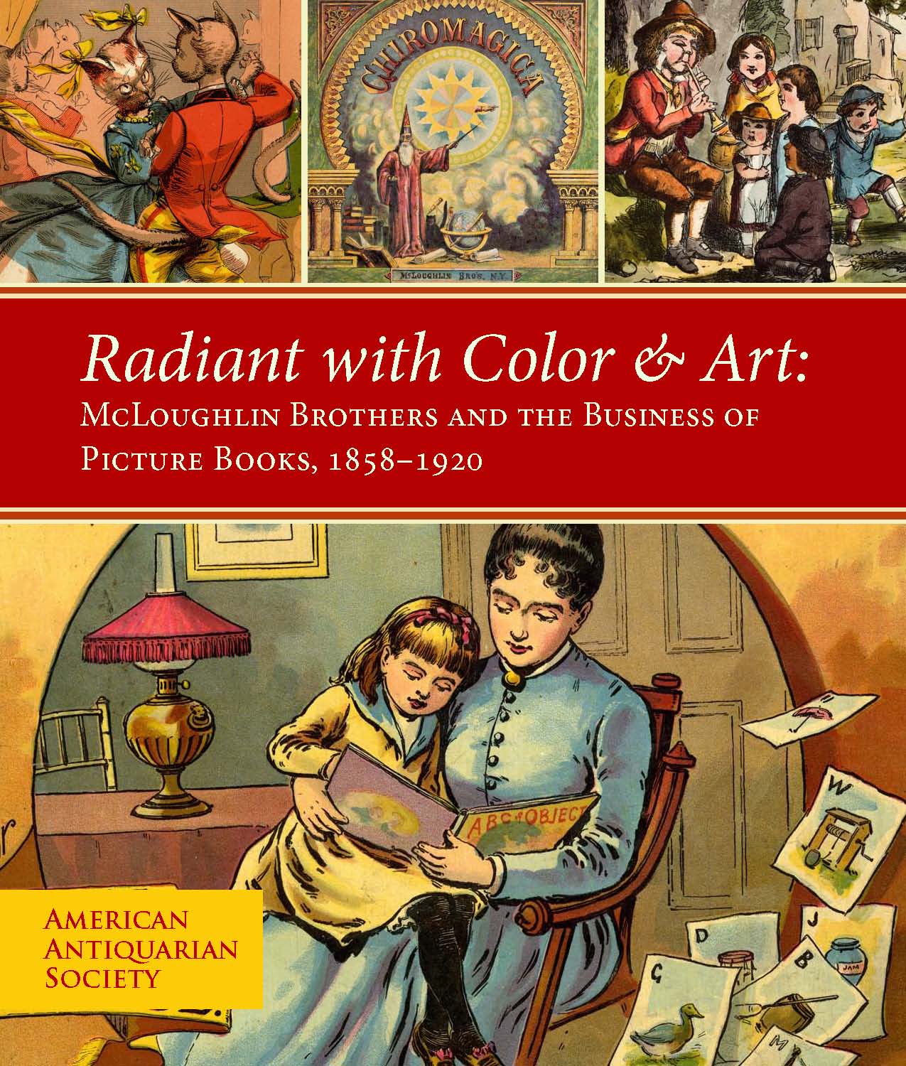
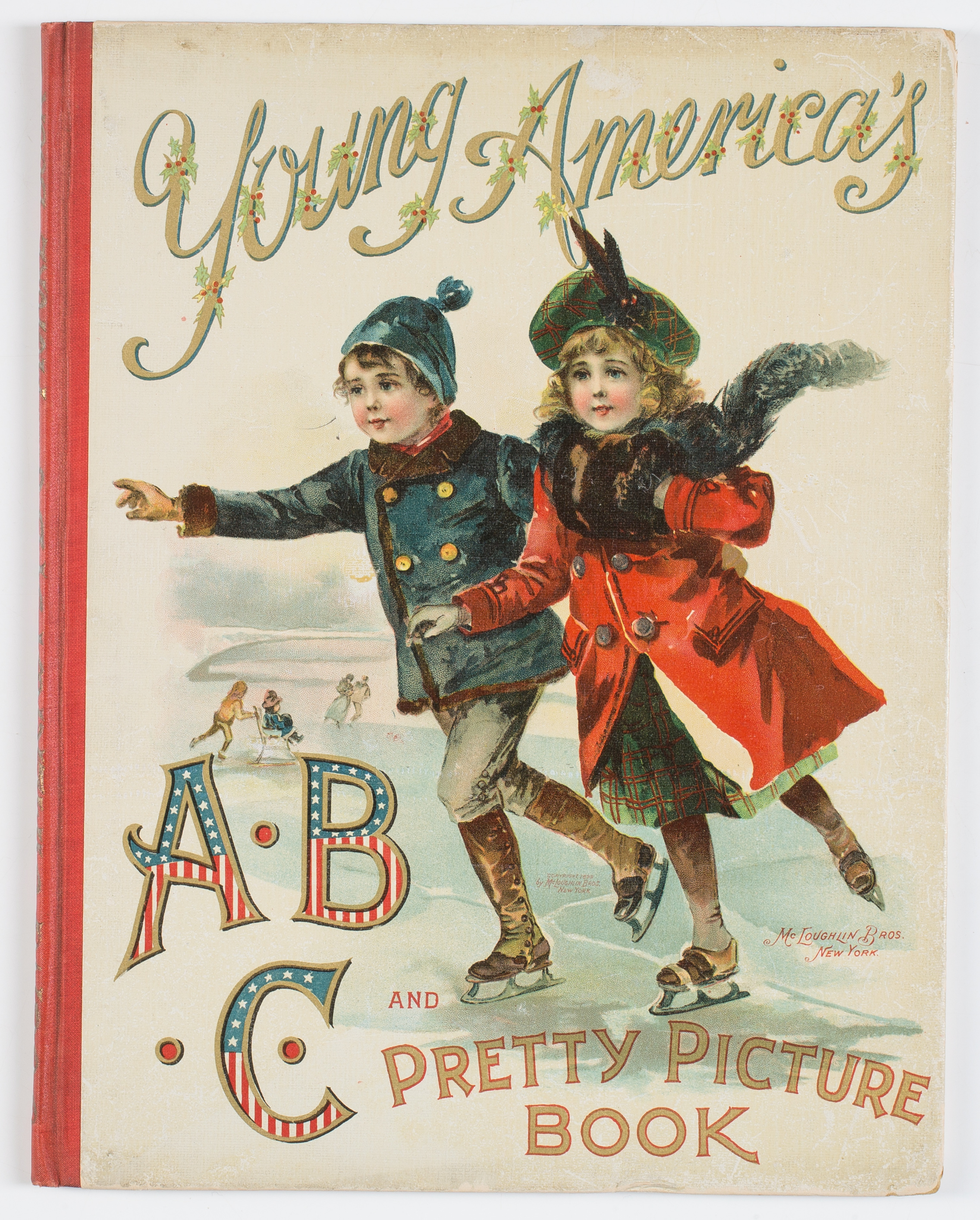
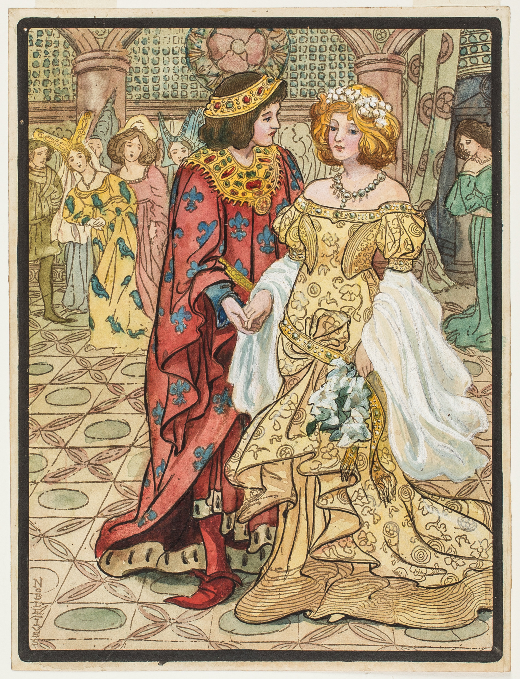
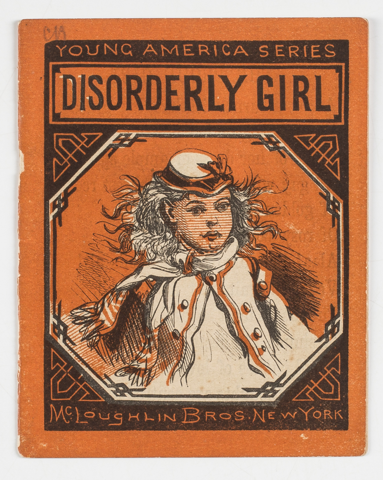
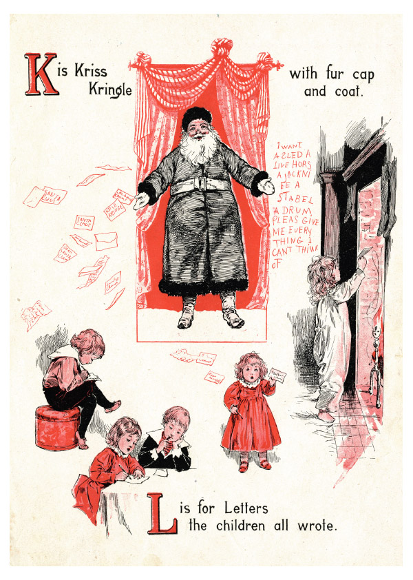
From December 6 through February 3, highlights from AAS’s stunning collection of some three thousand McLoughlin Brothers books, games, and artwork will be out of the stacks and on display at the famous Grolier Club (47 E. 60th St., New York) in the exhibition Radiant with Color & Art: McLoughlin Brothers and the Business of Picture Books, 1858–1920. The exhibition, which draws on the combined forty years’ experience at AAS of Andrew W. Mellon Curator of Graphic Arts Lauren Hewes and myself, will focus on the long-neglected history of the New York publishing house that gave us mass-produced picture books nearly a century before Golden Books. With the firm’s investment in cutting-edge technologies like steam-powered color printing, its sophisticated marketing strategies targeting every possible constituency through a range of price points (from one cent to three dollars), and its sharp use of artistic talent like Thomas Nast to popularize visual icons such as Santa Claus, the tale of McLoughlin Brothers is quintessentially an American story of ingenuity, creativity, and risk.
This exhibition will illuminate the international connections in the late nineteenth-century picture book market, including the American and European picture books that McLoughlin aggressively copied, produced, and sold at a fraction of the cost of the foreign original. It will also tell the little-known story of McLoughlin’s collaboration with fellow New York publisher D. Appleton & Company to manufacture Spanish-language picture books for the Latin American market. Non-book material, including paper dolls, board games, and blocks, will also be included in the exhibition to show how the McLoughlin brothers—John Jr. (1827–1905) and Edmund (1833/4–1889)—widened their market and promoted their products over time.
Sarah Noble Ives, “Cinderella,” for McLoughlin Brothers, ca. 1912“Disorderly Girl,” ca. 1867
Besides documenting the history of this understudied firm, Radiant with Color & Art will be a feast for the intellect and the eye. Proof copies, uncut sheets, mock ups, and illustrator’s drafts—many never before exhibited—will be used to explain the book-making process, the progression of the firm, and the history of the children’s book business in general. Working in consultation with AAS Conservator Babette Gehnrich, Lauren and I have carefully selected two hundred exhibition pieces (most of them from the AAS collections) for their relevance, rarity, condition, and presentation. The great proscenium and pop-up books from the end of the century will be featured alongside paper dolls depicting subjects as diverse as Uncle Tom’s Cabin and suffragettes, as well as artwork by professional women artists such as Sarah Noble Ives and Frances Bassett Comstock, who included McLoughlin Brothers among their many commissions.
A full-color exhibition catalog is now in press and will provide permanent documentation (and eye candy!) for this marvelous show; it will be available for purchase at the Grolier Club, at AAS, or through Oak Knoll Books at the affordable price of $30. (Keep an eye out for information about the release of the catalog.)
AAS has also just released a set of holiday greeting cards featuring images from McLoughlin Brothers’ rich Christmas-related works to coincide with the exhibition. These are now available for purchase and are the perfect greeting for any book-loving family and friends.
Most importantly, come to New York and discover McLoughlin in person!
Ali Phaneuf is a junior at Fairfield University and was a page in the Reader’s Services Department this past summer. As a journalism major and a studio art minor, Ali has always been an avid book reader and art enthusiast, and her love of books and creativity was able to grow through her experience at AAS.
As a Studio Art minor, I’m fortunate enough to be constantly exposed to new and unique art courses at Fairfield University. A class I took in the spring of my sophomore year proved to be one of my most challenging thus far, as I was thrust into a time machine that took me back to the art of nineteenth-century photography—well, for the most part. Throughout the semester I had the opportunity to create prints in nineteenth-century styles, including cyanotype, kallitype, and albumen; however, we simulated these nineteenth-century processes using digital technology.
When I returned to AAS after completing my sophomore year at Fairfield, I showed some of my prints to fellow co-workers in the Readers’ Services Department, who then directed me to photo albums of cyanotype prints in the AAS collections. Thanks to the help of Ashley Cataldo, assistant curator of manuscripts, and Lauren Hewes, curator of graphic arts, I was able to view the album of Lyford J. Chauncey and photos contributed by the Worcester Natural History Society. The AAS photo album of Lyford J. Chauncey includes 101 cyanotypes. Each cyanotype has a caption written underneath the mount, and most of the images are landscape views of locations in Spencer and Worcester, Massachusetts. These beautiful images inspired me to create some of my own cyanotypes as they would have been created during the nineteenth century.
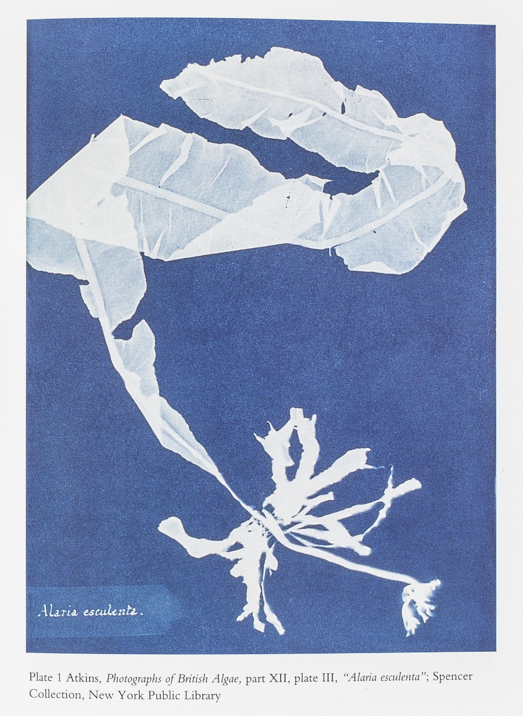
Anna Atkins, part XII, Plate III, entitled “Alaria Esculenta,” from her collection of “Photographs of British Algae.” As seen in Carol M. Armstrong, “Scenes In a Library: Reading the Photograph in the Book, 1843-1875” (Cambridge, Mass, c.1998).
Another book at AAS that was particularly interesting to me included the work of Anna Atkins, one of the first cyanotype artists. Rather than using cyanotype to develop a negative, Atkins used it to showcase botany through photographs. She would take flowers and plants and place them on the paper coated with the cyanotype chemicals. She then placed the contact frame outside in the sunlight, just as photographers would when developing a negative. After the print had reached its prime exposure time, Atkins would remove the plants from the frame and rinse the cyanotype under cold water to develop an image showing the shape of the flower or plant. Atkins’s creativity and ingenuity contributed to my enthusiasm for the cyanotype process.
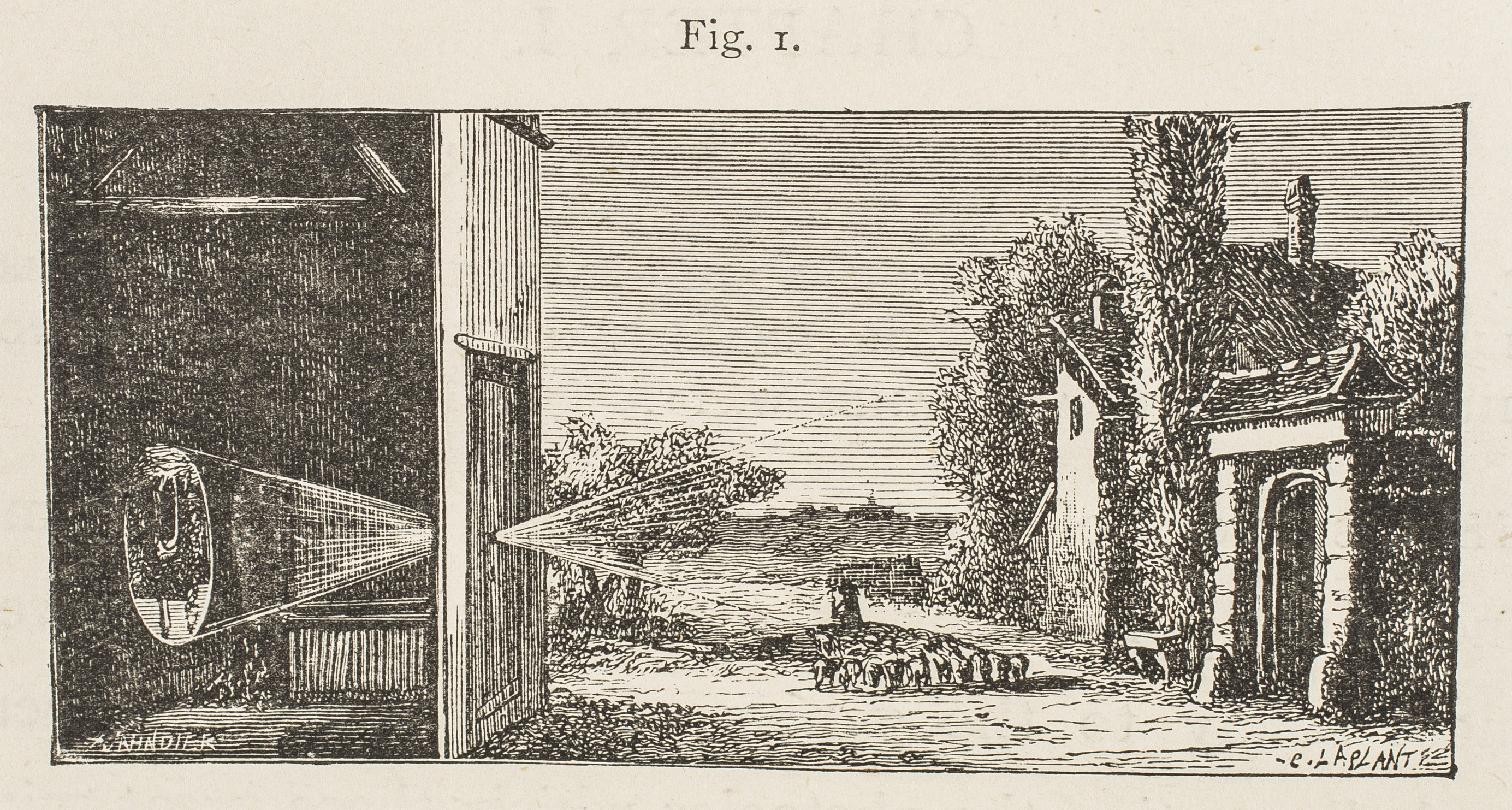
Many people are familiar with the term “camera obscura,” which literally means “dark room”, as explained by A History and Handbook of Photography by Gaston Tissandier, held at AAS. The concept of the camera obscura was first used in the later part of the sixteenth century by philosophers who discovered that making a small opening in the shutter of a window—which was so tightly closed no other light could get through—allowed the rays of light to penetrate through the small hole and project onto a white screen a reverse image of exterior scenery or objects.
An illustration of the original “dark room” camera obscura in which photographers would trace the displayed image projected through a small hole onto a white screen. From Gaston Tissandier, “A History and Handbook of Photography,” 1877.
Early photographers would use the camera obscura to then trace the image reflected into the room to create a dimensionally accurate illustration of the outdoors. Camera obscuras were later used in a portable manner. Eventually, light-sensitive material adhered to glass or fiber-based paper were used within the camera obscura to retain an image.
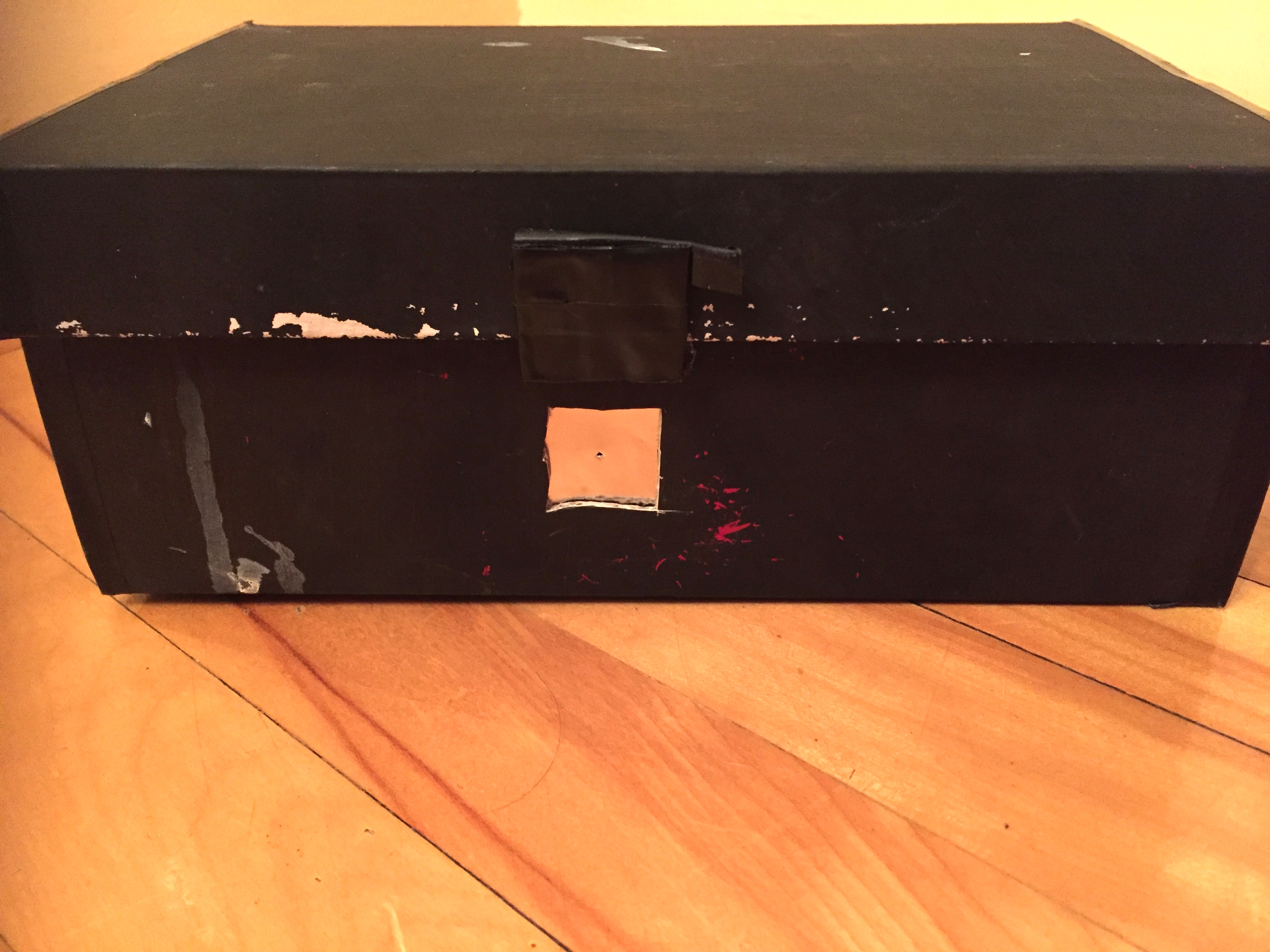
I created my own camera obscura by painting a shoe box completely black. I then used an X-acto knife to cut out a small square on one side of the shoe box, which I then filled with aluminum foil. To make my small hole in the camera, I poked a minute opening through the foil with a thumb tack. I had my own nineteenth-century portable camera obscura, also known as a pinhole camera.
My homemade camera obscura.
Before I could work with the light-sensitive paper, I had to somehow create a low-cost dark room. The place in my home with the fewest windows and the least amount of light is my dad’s basement workroom. There is only one small rectangular window, which I covered with a black trash bag to make the room completely dark. I unpacked the desk lamp I use at college and put a red light bulb in it so that I could see what I was doing while in my makeshift darkroom. I was finally ready to get started.
For light-sensitive photo paper, I used Ilford Multigrade black and white glossy paper and taped a piece to the inside of the shoebox opposite the hole. I then closed the box and covered the hole with a piece of black electrical tape so that light would not shine into the box prematurely. I went outside on a clear sunny day and set up the camera in my backyard. I removed the tape for a little less than one minute, placed it back on, and then went downstairs into my dark room. In order for the image to appear and remain permanent when in sunlight, I had to remove the paper from the camera and insert it into a tray filled with liquid developer composed of water, sodium carbonate, sodium sulfite, hydroquinone, and (methylamino) phenol sulfate. I then continued to put the print through a second tub of water, followed by a water, sodium thiosulfate, sodium metabisulphite, boric anhydride, and sodium tetraborate fixer. I then finished by rinsing the print off with more water. The results from my first attempt using a self-made camera obscura were less than underwhelming—a solid black image is what appeared.
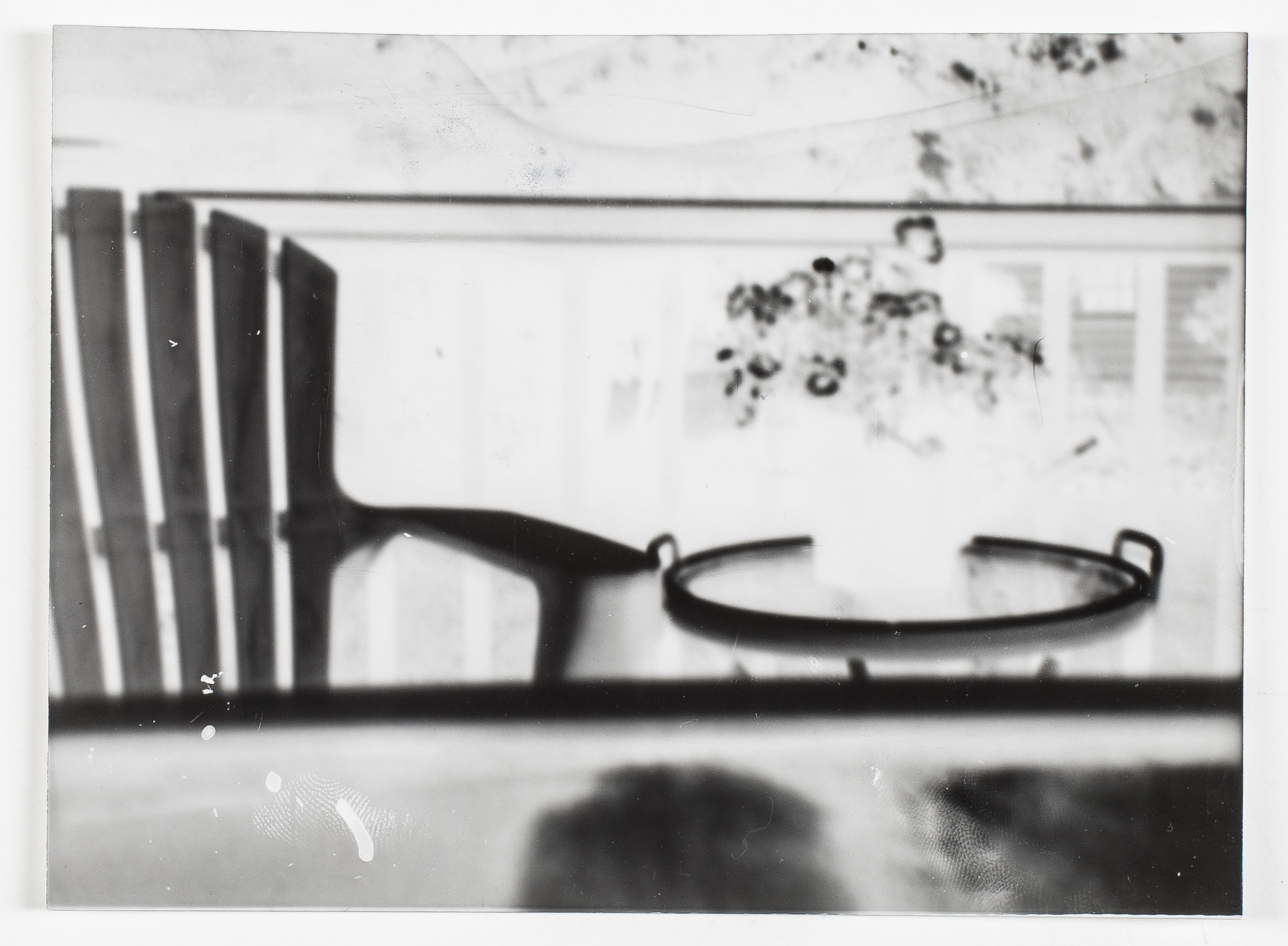
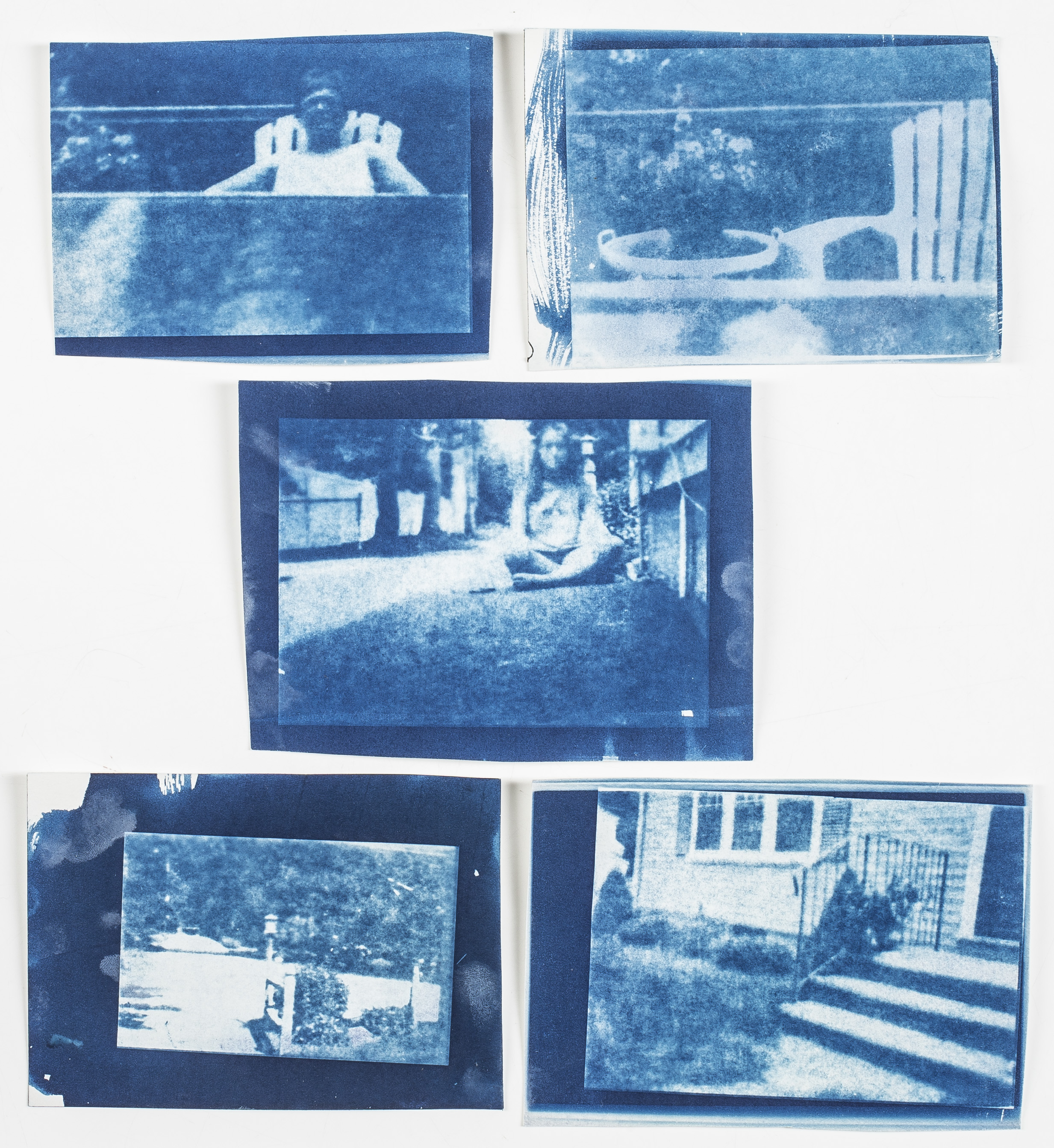
The above image shows negative print of a chair and flower pot in my backyard, taken via my own camera obscura.
This could mean one of two things: I exposed the image for too long, or my camera obscura was not sealed tightly enough and extra light was coming in through the sides. I decided to focus my energy on the latter issue. For my second attempt, I sealed my box tighter, wrapping all sides with black electrical tape. However, the results were yet again a solid black image. I then decided to shift my focus towards timing. I cut my exposure time in half and left the pinhole open for about thirty seconds. This time I finally started to see some sort of dull image. Then, I tried shooting my images from the shade, rather than from the direct sunlight. After opening the pinhole for about thirty seconds in the shade, I finally received a clear Image of my backyard — yes, this means I actually took a picture using a shoebox!
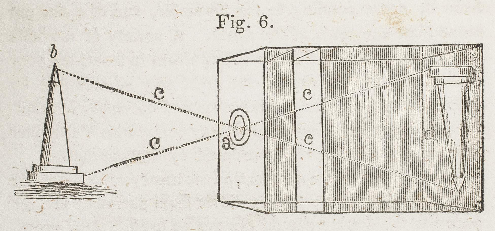
So, how does it work? Each point of the scene that the camera is angled towards emits light, which passes through the pinhole and creates a point of light on the back of box (onto the light-sensitive paper). The light-sensitive paper records the image that is projected onto the back of the box, which is how the picture is created.
This diagram, found in Henry Hunt Snelling’s “The History and Practice of The Art of Photography,” c. 1849, shows how an object is reflected onto the back of a camera obscura.
When light shining through the pinhole hits the Ilford photo paper, it causes a chemical reaction with the silver-halide crystals in the paper. This reaction causes the crystals to turn black when processed with developing chemicals, thus the parts hit with the most light (the brightest parts of the scene) turn the blackest. This inverted image is referred to as a negative. In order to make this negative image into a positive image, photographers would take the negative and develop it using an alternative process. I chose to use the cyanotype process.
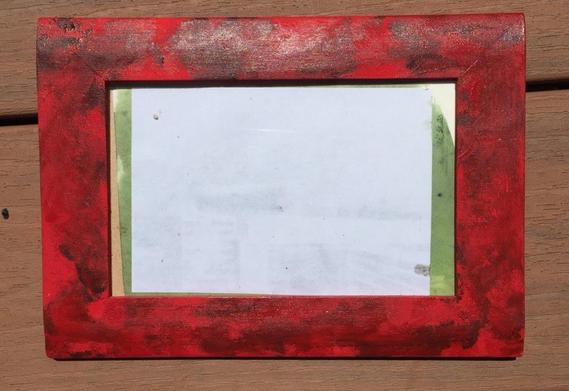
The cyanotype process was first invented by Sir John Hershel in 1842 and requires the use of natural fiber paper (I used watercolor paper). Hershel’s formula requires one mixture of 20g of ammonium citrate with 100ml of water and a second mixture made up of 16g of potassium ferricyanide with 100ml of water. The process then requires the artist to mix these two formulas together in a 1:1 ratio in an amount that’s only required to saturate the paper (for example, I used about 12 drops of each solution to make a small mixture). I then poured the solution that I mixed onto the watercolor paper and brushed it over the paper using a foam brush (the combination of the two formulas should result in a greenish color on the paper). I let the paper dry overnight, and the next day I was ready to print my image. I placed the negative image face down on top of the paper coated with the cyanotype mixture and put the two papers into a glass picture frame to press the two papers together, which I then laid outside in direct sunlight like so:
The above images shows the cyanotype-coated papers after they and the negatives were removed from the frame, inserted into cold water, and fixed with lemon juice.
When placing the negative image on top of the cyanotype, values are reversed to their original state as they appeared in “real life.” When light shines through the negative, the dark parts block the most light. This blocking of the sun results in those spots remaining the greenish color, whereas the rest of the image should appear dark silver. Once you see this silver color appear on your print, you can take the print inside to be developed. Unlike developing the negative, developing the cyanotype is a lot less complicated. I simply went back into my darkroom and put the print into a bin of cold water. The greenish color washed away (making those areas white) and the silver colors became blue. Once rinsed in water, the print is safe to bring back into the sunlight. As the print is exposed to light longer, the chemistry becomes darker and the tonal ranges intensify. To gain a greater Prussian blue, cyan color, I inserted the print into a wash of lemon juice to achieve my final product.
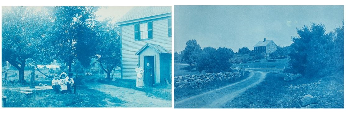
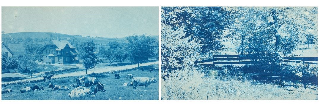
Lyford J. Chauncey’s photos were printed during the years 1885 to 1900, meaning that Chauncey may have used a camera that didn’t differ too much from my shoebox. Chauncey most likely used some sort of box camera composed of wood and metals. There were many different types of box cameras that emerged after 1880, including the Change-Box Camera, Magazine Camera, and Reflex Camera. The key difference would have been that Chauncey used a lens with his camera rather than a simple hole, which would have resulted in clearer images. It is also possible that Chauncey used a glass negative or even film, rather than the photo paper I used. However, after looking through the album, Chauncey’s work demonstrates some of the same struggles that I faced. Some of his images appear very dark—a result from a large amount of chemicals being used to saturate the fabric paper or overexposure in the sunlight—while other images appeared very faint—a result of not enough chemical solution or not enough exposure to the sunlight. Below are some Chauncey images that inspired my own cyanotypes.
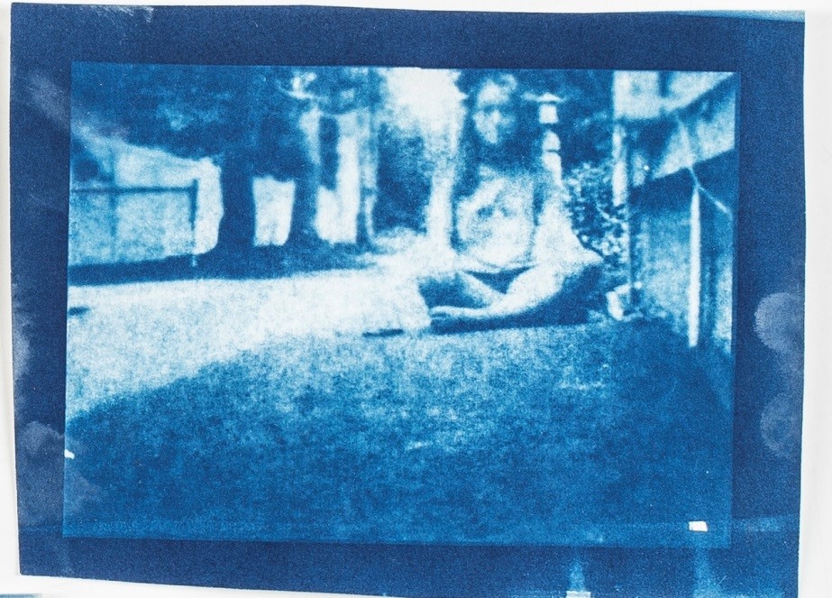
Four images from the album “Pictures of Early Worcester” taken by J. Chauncey Lyford, beloved and long-time principal at Windsor Street School at the turn of the century. Taken between 1887 and 1890.The above picture is the cyanotype print I created of myself.
I even made an attempt at a nineteenth-century “selfie.” I had to set up my shoebox on a milk crate in order for the pinhole to be the right height and have my face in view. Then, I quickly removed the black electrical tape from the pinhole, ran into place, held my pose for about one minute, and then ran back to the camera to re-cover the hole. I appear a bit blurred in the image because of my racing to uncover and recover the hole in the camera.
Throughout the summer I learned that photography is a complicated process that comes in many forms, styles, and appearances. From using a small portable box to not using a camera at all, photographs can be made with almost anything. Chauncey used a photographic process to capture the beauty of his surroundings, while Atkins worked to preserve the natural form of botany through this same process. How a photographer or artist hopes to preserve certain scenes, objects, or memories is an individual decision, which can allow their own thoughts to radiate through their work. I’ve learned that many factors went into nineteenth-century photography. Such elements as the chemical mixture, sunlight density, and exposure time all made these alternative processes a somewhat tedious, yet fascinating art form. This summer I was lucky enough to discover the beauty in practicing something old to create something new with the help of something blue.
The second in a two-part series, this blog post features an AAS-based undergraduate project, “Queering the Archive” at College of the Holy Cross. Under the advisement of Professor Stephanie Yuhl of the History Department, Carly Priest ‘18 and Emily Breakell ‘17 spent the summer searching for resources relevant to the history of transgender and gender-nonconforming people in the United States. Please find their first post here.
During our search for transgender-related materials in the archives of the American Antiquarian Society, we came across over 140 pieces that depicted cross-dressing in public. Unsurprisingly, the reception to cross-dressing in the nineteenth-century records we identified appeared overwhelmingly negative. Time and time again, we encountered police reports that equated cross-dressing with sexual deviance and spectacle, and sensationalist newspaper accounts that berated individuals for their aberrance from gender norms.
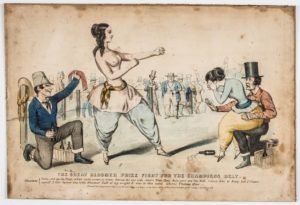
We found many of the sources that featured depictions of cross-dressing expressed social anxieties over the shifting role of white women in society. The voices of these concerns often characterized women who “masqueraded as the other sex”— who bent traditional gender norms through dress—as attempts to transcend gender roles, part and parcel of the fundamental threat facing the patriarchal structure of the emerging American democracy. One lithograph in particular, The Great Bloomer Prize Fight for the Champions Belt (1851), shed new light on some of these negative public reactions.
The Great Bloomer Prize Fight for the Champion’s Belt (1851)
The focal point of the lithograph is a caricature of Amelia Bloomer, social activist for women’s rights, editor of The Lily— the first periodical published for women, by women—and fashion icon. For all her roles in American political culture, many recall Bloomer for her contribution to female apparel: bloomer trousers.
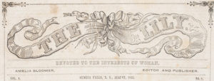
Masthead of The Lilly: Devoted to the Interests of Women
Bloomer trousers were loose-fitted pantaloons often paired with an overdress, worn by women and children. While many praised bloomers only as a less-constrictive clothing alternative for women, others embraced the bloomer-trouser style as a symbol of the literal movement for female mobility and equality in the public sphere. The Lily cited bloomers a political issue “too intimately connected with the elevation of women to be neglected.”[1]
The Lily, and other publications like it, were not without criticism. Many opposed bloomers as the vehicle for disruption to established social order. In this line of argument, women who wore bloomers did so to appear male and acquire the power naturally held by men in society. “Her Bicycle Clothes Didn’t Suit” (The Illustrated Police News, 1898) follows such narrative— the article detailed the story of Maggie White, who wore “men’s clothing in too extreme a style to suit the critical eye of the police” and was arrested for it. According to the apprehending officer, Sergeant Connealy, “[White’s] black coat was cut like a man’s; but the things she wore on her legs were too tight for the taste of any man.”[2] Connealy acted on his suspicions, and followed White for several blocks before arresting her on New York City’s Sixty-eighth street. The charge? Disorderly conduct. White donned pantaloons— likely bloomers—that closely resembled knickers (short pants worn by men).
Though published thirty years’ prior, The Great Bloomer Prize Fight for the Champions Belt reflects concerns similar to those expressed in “Her Bicycle Clothes Didn’t Suit.” The piece features a larger-than-life Bloomer engaged in a bare-knuckle boxing match, dressed in the pants that came to bear her name. A crying woman (also appareled in bloomers) frames Bloomer to her right, and sits on the knee of a male figure. On Bloomer’s left, a second kneeling man holds a bottle of alcohol in one hand and offers Bloomer the “Champions Belt” with his other.
In the piece, bloomers offer a visual clue to the absurdity of a woman who wants to act as a man. Though Bloomer shares the frame with three others, including two men, she towers over them, her body disproportionately large. Bizarrely, Bloomer appears both masculinized and hyper-feminized all at once— though with long limbs and macho stance, the artist depicts Bloomer with perfectly coiffed and curled hair. She wears a tight white shirt, her features clearly defined and her breasts emphasized.
The caption of The Great Bloomer Prize Fight for the Champions Belt offers a further critique of cross-dressing in society. Bloomer flaunts victory in the caption, and requests another challenger— specifically, Tom “Young America” Hyer. Hyer, a famous bare-knuckle boxer, beat the Irish-born James Sullivan in 1849 (two years prior to circulation of this lithograph). Though bare-knuckle boxing was illegal, the widely-publicized fight was one of the first organized boxing championship bouts in the United States.
The threat of disorder to society is the core theme of this lithograph— the two women in bloomers and the alcohol bottles held by the men make for a clear and deferential critique of low society. But, perhaps more compellingly, we see the suggestion that Bloomer is trying to become a man by participating in bare-knuckle boxing— an illegal sport in a distinctively male sphere. With her nipples exposed, Bloomer resembles male boxers— like Hyer and Sullivan—but her appearance becomes offset by the exaggerated femininity of her breasts and hair.[3] The intended effect of this portrayal— a larger-than-life woman who towers over the men frame— is a clownish figure, one which resembles both a man and a woman.
The Great Bloomer Prize Fight for the Champions Belt reaches further than just an aversion to cross-dressing. In the piece, we see the suggestion that Bloomer’s gender boundary transgression— wearing bloomers—bends gender norms in a way emblematic of a greater deterioration to American society. Bloomer suggests a corruption of American society. The creator of The Great Bloomer Prize Fight for the Champions Belt relied on the symbolic threats of amalgamation—alcohol-fueled fights and boxing as corruptive low-society influences to American sensibilities— to illustrate the danger of a woman who dressesand acts like a man. With this understanding, we may begin re-consider The Great Bloomer Prize Fight for the Champions Belt as more than just a critique of bloomers.
[1] THOMAS, MARY F. “DRESS REFORM.” Lily: Devoted To The Interest Of Women 4, no. 8 (August 1852): 70-71. American Antiquarian Society (AAS) Historical Periodicals Collection: Series 3, EBSCOhost (accessed July 25, 2017) and “LATEST FASHION.” Lily: Devoted To The Interest Of Women 4, no. 8 (August 1852): 71. American Antiquarian Society (AAS) Historical Periodicals Collection: Series 3, EBSCOhost (accessed July 25, 2017).
[2] “Her Bicycle Clothes Didn’t Suit.” Criminal Columns section of the Illustrated Police News, 16 July 1898, p. 6. Crime, Punishment, and Popular Culture 1790-1920, tinyurl.galegroup.com/tinyurl/4xQra0. Accessed 11 July. 2017.
In this episode of the Past is Present podcast we speak with Susanna Blumenthal, a professor in the law school and the Department of History at the University of Minnesota and AAS-NEH Fellow at the Society during the 2016-17 academic year. Susanna’s most recent book, Law and the Modern Mind: Consciousness and Responsibility in American Legal Culture, was published in 2016 by Harvard University Press. Susanna has published widely on psychiatry, consciousness, and the law, and her current project is an examination of the ways that American capitalism is intimately tied to fraud.
In this interview Susanna discusses everything from her early years as a graduate student in the law school and History Department at Yale, where she worked with David Brion Davis, to the philosophical foundations of her first book. She also talks about the important role AAS played in her efforts to understand critical legal cases having to do with fraud in the nineteenth-century U.S.
Guest blogger Nicole Mahoney is a Ph.D. candidate in American History at the University of Maryland, College Park, currently writing her dissertation, “Liberty, Gentility, and Dangerous Liaisons: French Culture and Polite Society in Early National America.” She recently attended AAS’s Program in the History of the Book in American Culture (PHBAC) annual seminar.
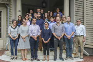
2017 PHBAC seminar outside AAS’s Goddard-Daniels House
This past July, the Society hosted “Other Languages, Other Americas, a week-long seminar focused on American print culture in languages other than English and on how different colonial and national cultures influenced, received, and translated early U.S. publications. Participants also discussed how scholarship today might incorporate multilingual sources into narratives of American history, literature, and cultural expression. As part of the seminar and my dissertation research, I examined French-language newspapers printed in the United States in the decades after the Revolutionary War as Americans grappled with national identity and varying foreign allegiances and alliances. One of the most remarkable of these newspapers, of which the American Antiquarian Society holds all twenty-six issues, was the Courier de Boston.
AAS’s complete run of Courier de Boston was acquired by Isaiah Thomas.
In September 1788, Paul Joseph Guérard de Nancrède made a long and eloquent plea to the American public on behalf of the French language and its service to the United States. “This language seems to be necessary to America,” he wrote in the Massachusetts Centinel.[1] Nancrède saw it as his mission to provide that essential language to the citizens of Boston.
Born in France, Nancrède served in the French expeditionary with the Comte de Rochambeau in the American Revolution, later settled in Boston and became a French instructor at Harvard. While teaching at Harvard, he found it difficult to put French texts in the hands of his students. Either the books had not yet been imported from France or American editions had not yet been published. His solution was to publish a French-language journal himself. The chief functions of the journal, according to an address to the public written by Nancrède, were to further friendship and commerce between the French and American people and to disseminate a digest of domestic and foreign news. The Courier de Boston would, he promised, be “the Interpreter, the Organ of every citizen–of every husbandman.”[2] He anticipated readers from Canada to the West Indies and from Europe to the United States. The subtitle of Nancrède’s journal was “L’Utilité des deux Mondes”—the utility of two worlds.
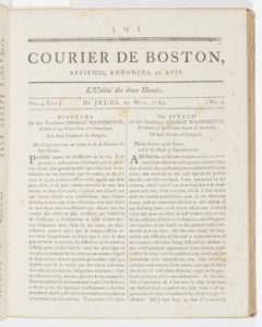
The May 14, 1789 issue includes George Washington’s inaugural address in both French and English.
Nancrède published the Courier de Boston weekly from April to October 1789. He abandoned the journal after six months and twenty-six issues. But that tenure was perhaps the most remarkable half year in the history of the Atlantic world. The first issue on April 23, 1789 reported on the first meeting of the new American Congress, the elections of George Washington as president and John Adams as vice president, and it printed a list of the first American senators and representatives. Two months later, the journal published the text of George Washington’s first inaugural address. Nancrède also translated and printed American congressional debates on the first amendments to the Constitution–the Bill of Rights.
The idea of France in turmoil provoked great anxiety for Nancrède and the journal increasingly focused on the outbreak of the French Revolution. During the summer of 1789, the journal published accounts of the opening and dissolution of the Estates General in Versailles, the subsequent formation of the National Constituent Assembly, and the “millions” of pamphlets in Paris concerning the political crisis–a testament to the ongoing fortitude of the liberty of the press.[3] It offered details on Lafayette and the Declaration of Rights, quoted Rousseau, and reprinted speeches given by King Louis XVI. On September 24, 1789, the journal announced: “France: Révolte, Massacre, Confusion, Tranquillité” followed by a precise account of the fall of the Bastille.
Despite its breathless reporting on the new American democratic government and the collapse of the French ancien régime, the journal did not prosper. On October 15, 1789, Nancrède announced abruptly the suspension of the journal. He disclosed in the last issue that two robberies had depleted his funds. But it was primarily an unimpressive list of subscribers—many of whom never paid for their subscriptions—that ended the journal.
Even though the Courier de Boston was short-lived, it coincided with the high point of publication of French newspapers and periodicals in the United States. The journal waged a battle, according to its editor, to free the new nation from linguistic and moral servitude to England under which it still trembled because inhabitants of the United States relied on English newspapers and spoke English. The key to independence, Nancrède wrote in the journal’s prospectus, was the French language. The publication of the Courier de Boston represents a critical moment in early American history when the post-revolutionary generation faced the tricky task of establishing both equality with and separation from Great Britain. By taking their eyes off the British and instead turning their gaze toward the French, Americans were perhaps truly employing the “utility of two worlds.”
[1]Massachusetts Centinel, 17 September 1788, page 4.
[2]Massachusetts Centinel, 3 January 1789, page 1. A husbandman is a farmer or a person who cultivates the land.
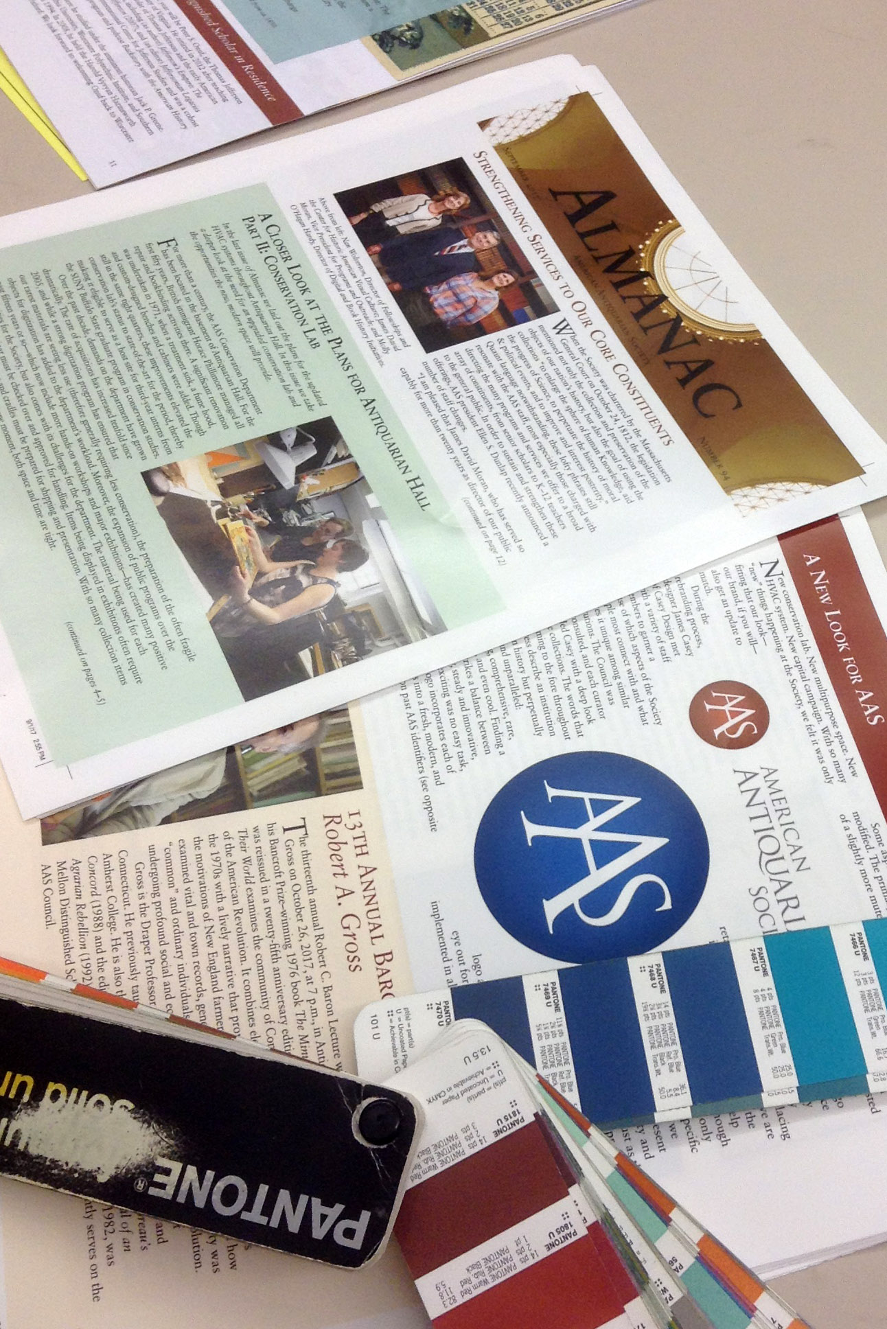
The fall issue of the AAS newsletter, Almanac, is hot off the press and ready for your reading! There are some great pieces in this installment including:
An update on the expansion and renovation of Antiquarian Hall featuring coverage of the groundbreaking and progress of the construction. This September edition also takes an in-depth look at the stunning conservation lab, including a full-page artist’s rendering of the new space.
We also have a feature on the history of the AAS seal and a reveal of the new emblem and logo! This item needed to be color-matched to make sure the color usage was correct with our new style guide. The Dylux and Epson Color proofs we received from the printer were matched to make sure the Pantone spot colors were correct (a true-printer geek out moment!).
There is also information about staff changes in our program division, our upcoming programs, workshops, and annual meeting lineup, including the naming of the next Christopher Columbus Baldwin Award recipient!
This was a wonderful issue to put together for readers – happy reading and we hope to see you at some of the exciting events this fall!
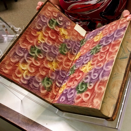
Jacob Wilhelm Imhof, 1651-1728. Historia Italiae et Hispaniae Genealogica. Nuremberg: Joannis Hoffmani and Engelberti Streckii, 1701. This volume has colorful daubed endpapers, with finger-made swirls.
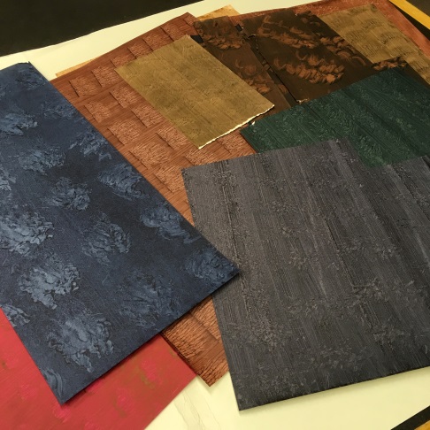
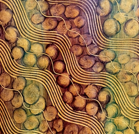
[Unused sheets of paste paper]. These paste papers were created by AAS conservation staff.After highlighting marbled paper in a blog post last year, I received this suggestion from several people: Why not explore another popular kind of decorative paper- paste paper? Paste papers are much simpler than marbled papers, but the art form has a rich history and has produced countless beautiful examples. I searched through the AAS collections and with assistance from our online catalog, found plenty of pretty paste papers, used as both covers and endpapers on books and pamphlets. Before I realized it, I was swept up in an obsessive search for these pasted decorative sheets. Forget marbled madness, this is pasted pandemonium!
Paste papers are one of the early styles of decorative paper used in bookbinding, becoming a popular feature in books toward the end of the sixteenth century. They remained popular into the early nineteenth century, but were gradually replaced by marbled papers as industrial processes made marbling easier. Nevertheless, just as with marbling, individual practitioners of the craft continue to produce beautiful handmade papers to this day. Paste papers (at least the simpler patterns) are relatively quick and easy to produce, and this meant that historically, bookbinders themselves would create the papers in their own shops. Further contributing to their popularity, paste papers were inexpensive to produce compared to other forms of decorative paper. Often, bookbinders would simply reuse their bookbinding paste to create the papers. By the eighteenth century, a wide array of patterns and techniques had emerged, and paste paper-making had developed into a dynamic art form as well as a practical component of bookbinding.
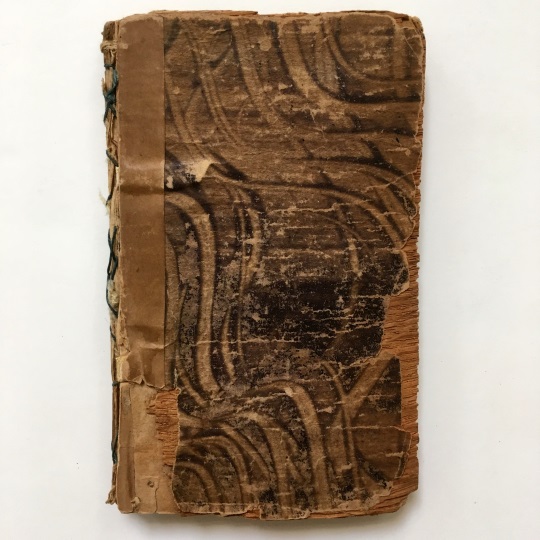
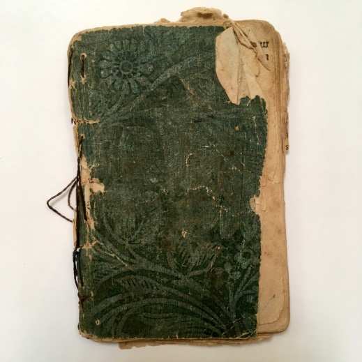
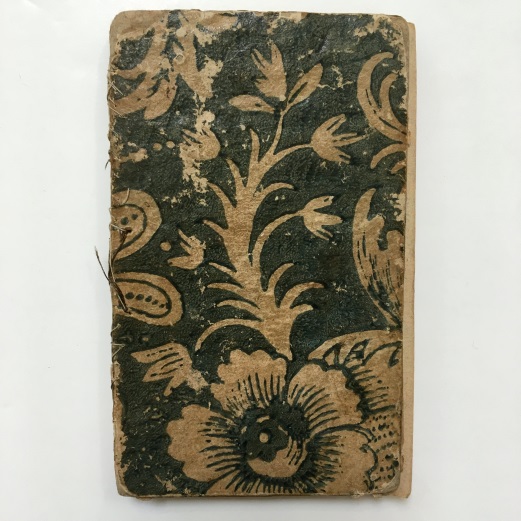
Friend of Youth. The Happy Family; or, Winter Evenings’ Employment. New Haven: Increase Cooke & Co., 1804. The boards of this small volume are covered with combed paste paper.The History of Little King Pippin. London: E. Newbery, 1793. The printed paste paper on this pamphlet has a floral design.
At its core, this craft is strikingly simple: colored paste is applied to a sheet of paper, and then the still-wet paste is manipulated in various ways to create a pattern. The paste is left to dry and voilà—decorative paste paper! Of course, the devil’s in the details, and there are countless ways for an artist to produce differing effects for their paste papers. The paste itself can be produced (usually with starch or cellulose) in varying consistencies, different amounts of pigment can be added to the paste (for more or less opacity), multiple colors can be combined, and—perhaps most importantly—various means of working the wet paste can produce markedly diverse patterns. An artist can use a virtually limitless number of tools, ranging from their fingers to brushes to stamps, to yield different and interesting effects.
[Modern paste paper with combed and fingerprint patterns]. AAS’s chief conservator created this striking paste paper.Combed, brushed, and drawn patterns—the most basic types of paste paper—involve the simple process of making lines and shapes in the wet paste using tools. A comb can be raked across the paste to create rows of intricate lines, a finger can be used to create spiral shapes, a brush can create subtle color-gradient effects, and so on. So-called “pulled” paste papers involve the use of two paste-coated sheets. The two pieces of paper (often of different colors) are placed together, rubbed gently against each other, and then gradually pulled apart. This results in a complex, veiny pattern that is very distinct. Daubed and spatter paste papers are unique from other patterns in that they involve a particular application of paste to paper, as opposed to the manipulation of paste already on paper. To create a daubed pattern, an artist applies pigmented paste to a sponge then uses it to repeatedly blot a paper with color. With spatter papers, an artist runs a paste-covered brush across a sieve, keeping the paper underneath. This results in a fine, speckled pattern on the sheet of paper below.
John Bunyan, 1628-1688. Divine Emblems: or, Temporal Things Spiritualized. Philadelphia: Mathew Carey, 1796. This printed paste paper has a beautiful floral motif.
There are two other key paste paper techniques, both of which involve printing. Printed paste papers are created by applying a woodblock or metal plate to the sheet covered in paste: the colored paste is displaced in a particular way, leaving the desired pattern. Designs cut in relief or intaglio can both work for this purpose, each imparting a different effect. On the other hand, “prints in paste” require a process more akin to traditional printing: an artist takes colored paste and applies it directly to a plate or woodblock, then uses a press to produce prints in the typical way. Prints in paste are usually elaborate and often include repeating floral designs and multiple colors.
The appeal of paste papers lies in both their simplicity and the potential for creativity they offer. Just about anyone can acquire some paste, pigments, paper, and a brush and begin producing their own creations. Importantly though, an artist can start to experiment with different tools and techniques to produce increasingly complex and unique patterns. When anything from a fork to a sponge can be used as a tool for creating patterns, the creative possibilities are truly endless. With some imagination and a few household objects, any of us can create our own unique (and hopefully beautiful) decorative paste papers!
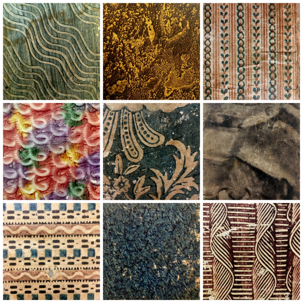
Top row, left to right: Combed pattern, Pittsfield, MA, 1816; Pulled paste, New York, 1849; Print in paste, Hartford, 1801. Middle row, left to right: Daubed with swirls, Nuremberg, 1701; Printed paste, Philadelphia, 1796; Brushed pattern, Boston, 1810. Bottom row, left to right: Print in paste, Baltimore, 1806; Pulled paste, New York, 1818; Combed pattern, 1783.
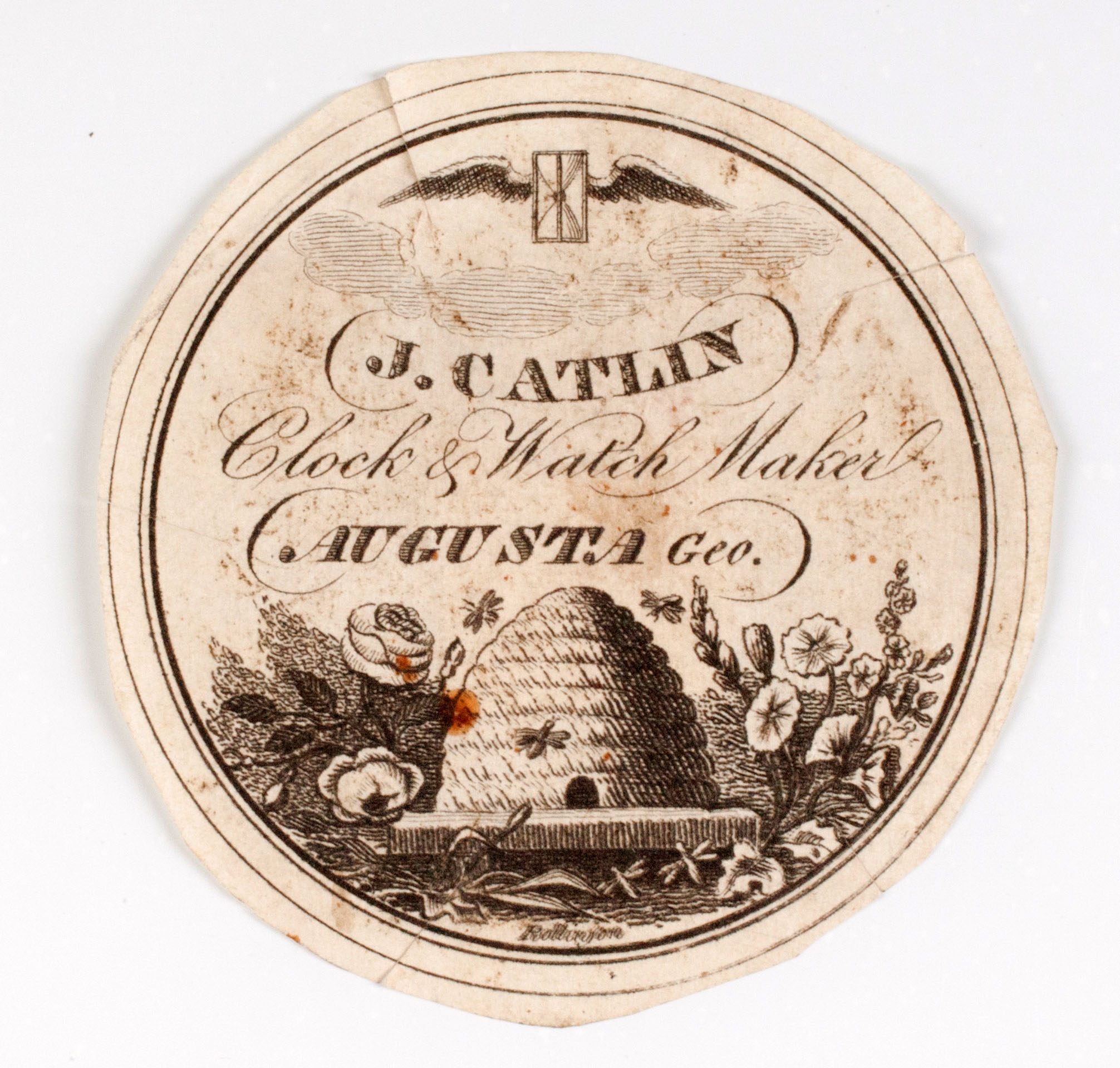
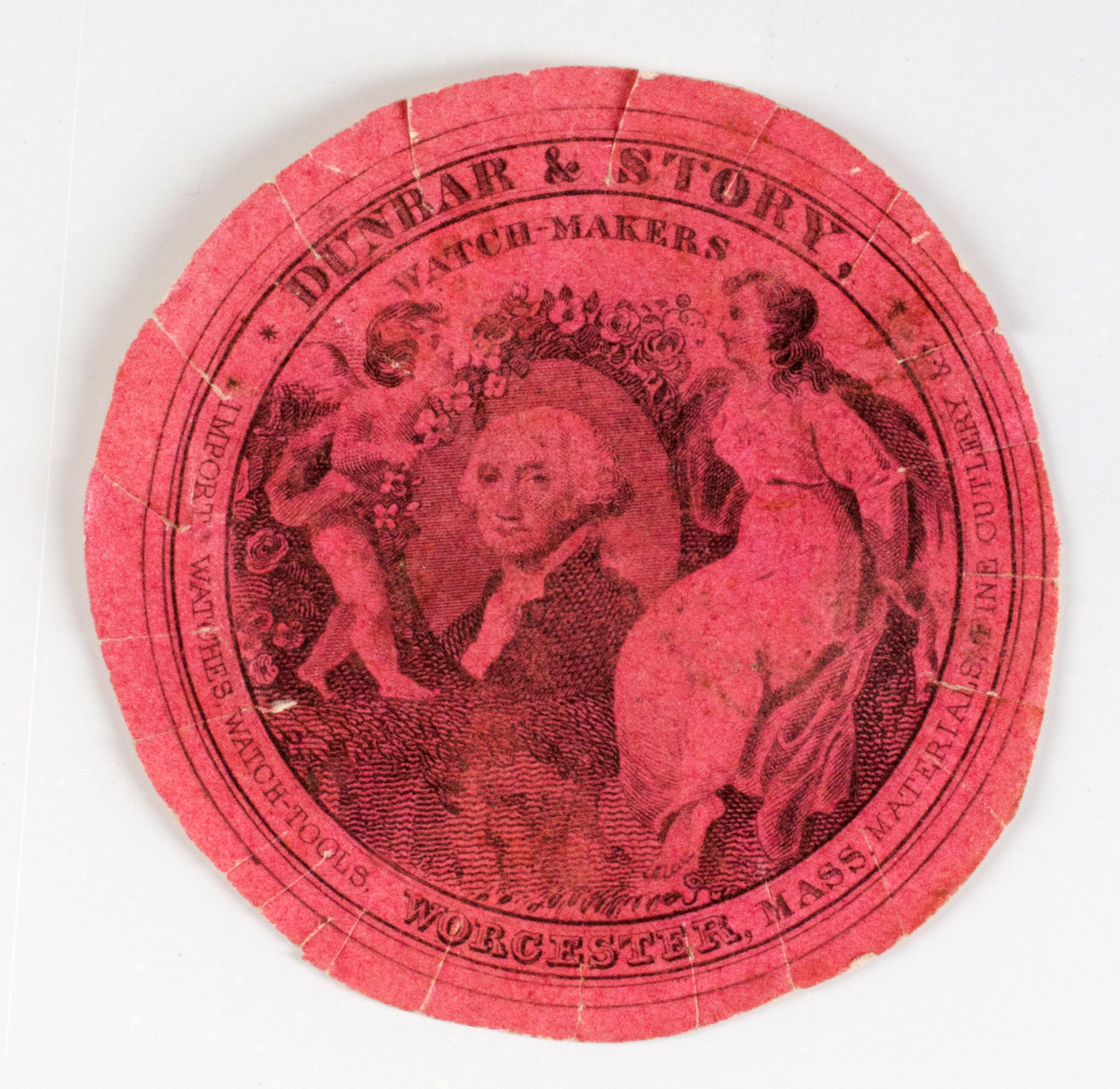
After many years of inventorying, identifying and digitizing, the Society’s collection of nearly 500 watch papers are now available as an illustrated inventory! Watch papers are small, decorative pieces of paper or cloth that are meant to protect the mechanisms of watches, and were also used to indicate when a watch was last repaired and by whom. The subjects of the images are varied, and include scenes of Father Time, beehives, horses, factories and of course watches.
In 1951, AAS staffer Dorothea Spear cataloged all of the watch papers in the collection, publishing her findings in the Society’s Proceedings that year. It wasn’t until 2011 that Wellesley College intern Dominique Ledoux took on the challenge of updating the list, making an editable digital list. At the same time, our photographer digitized the fronts and backs of each watch paper. All of that information has once again been updated and has come together to create an easily searchable visual inventory.
New to this exhibit is the “Browse” tab. As there are so many items in this inventory, this feature makes it much easier to sort the items by the watchmaker/jeweler. Simply click on the tab, and click on “Creator” in the “Sort by” menu. This will present an alphabetized list of all 493 items. As with all of the Omeka illustrated inventories, clicking on a tag will present a list of all of the other items that fall into this category, whether it be by watchmaker, location or subject matter. For a list of the other illustrated inventories available online, click here!
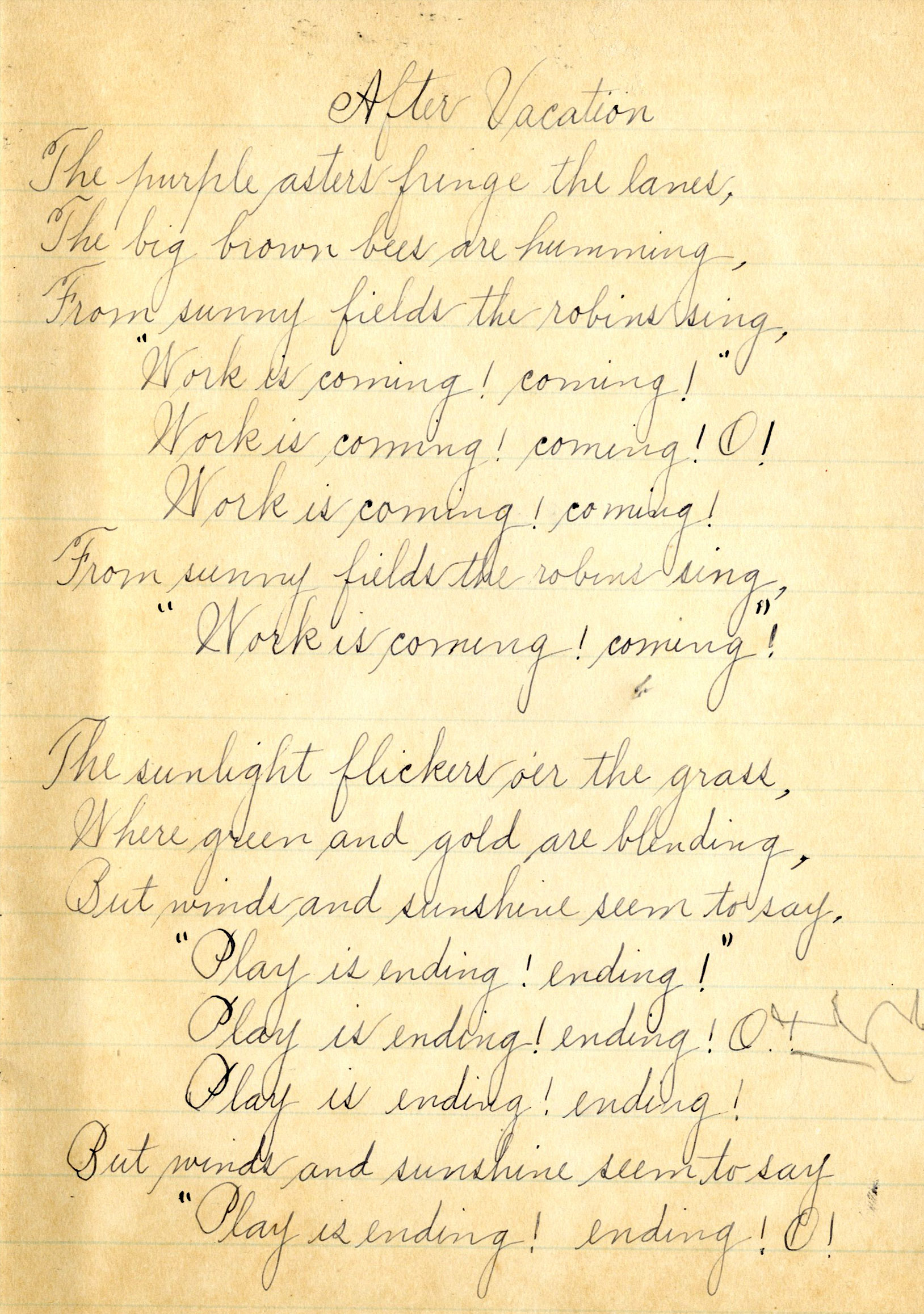
In the AAS Penmanship Collection, a group of penmanship exercises and copy books by various students, there is a poem titled “After Vacation” by an unknown pupil from the Parkerville School in Westford, Massachusetts. The poem is on the first page of one of the mostly-filled volumes and captures an adieu to summer with the refrain: “Work is coming! Coming! O!….Play is ending! Ending! O!”
The bittersweet (but lovely!) poem has put us in the mood for an archive-inspired back-to-school supplies hunt. We hope you will enjoy this selection of items pulled from several of our favorite collections and worked against a (contemporary) school’s supply list. We tried to find versions of composition books, erasers, packs of pencils, cases, and other items which (we hope) will make us leader of the class.
Let us know if there is anything missing which you’d like to see checked off!
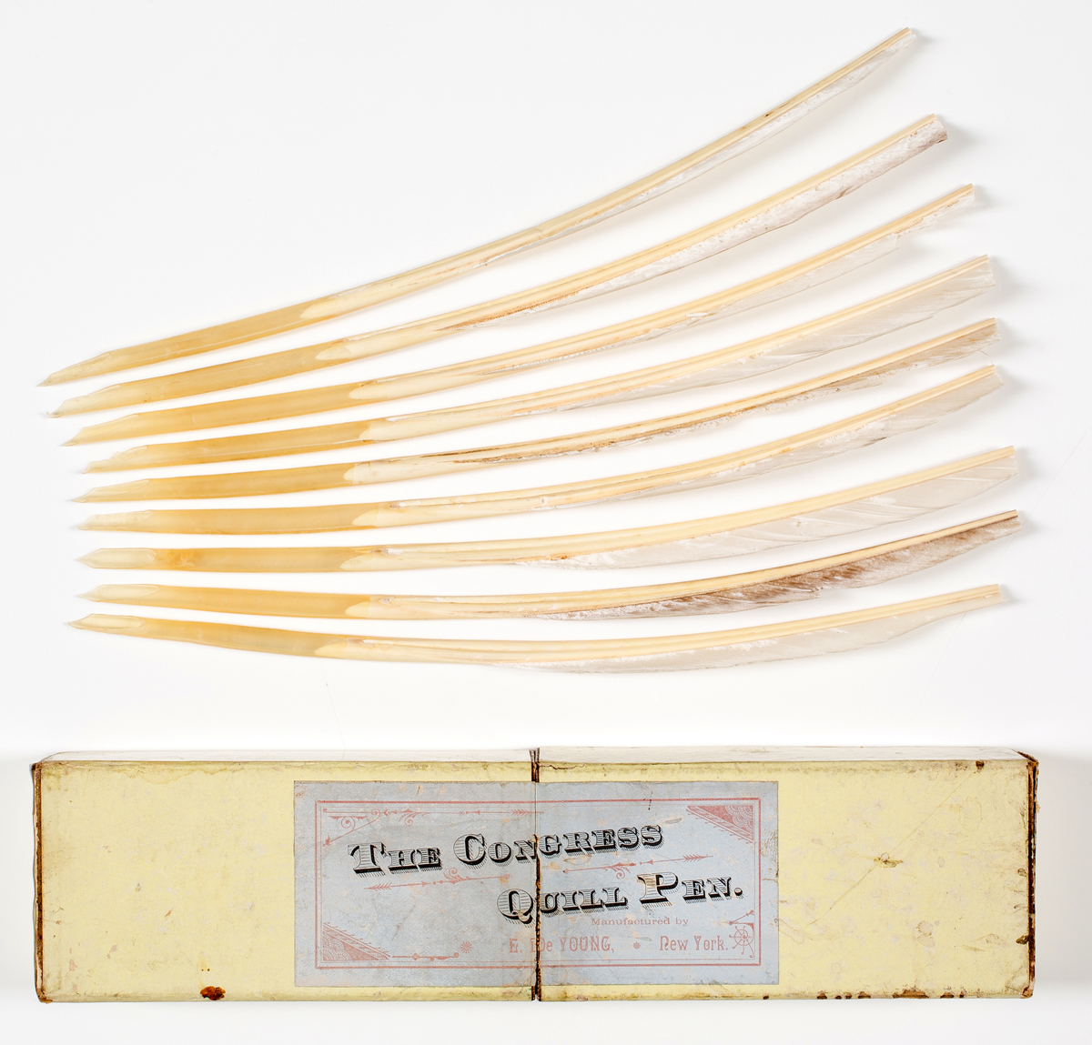
Are pens and pencils near the top of your list? We got that. We have a set of nine quill pens in a box that slides open; the “Congress quill pens” were manufactured by E. De Young in mid-nineteenth-century New York.
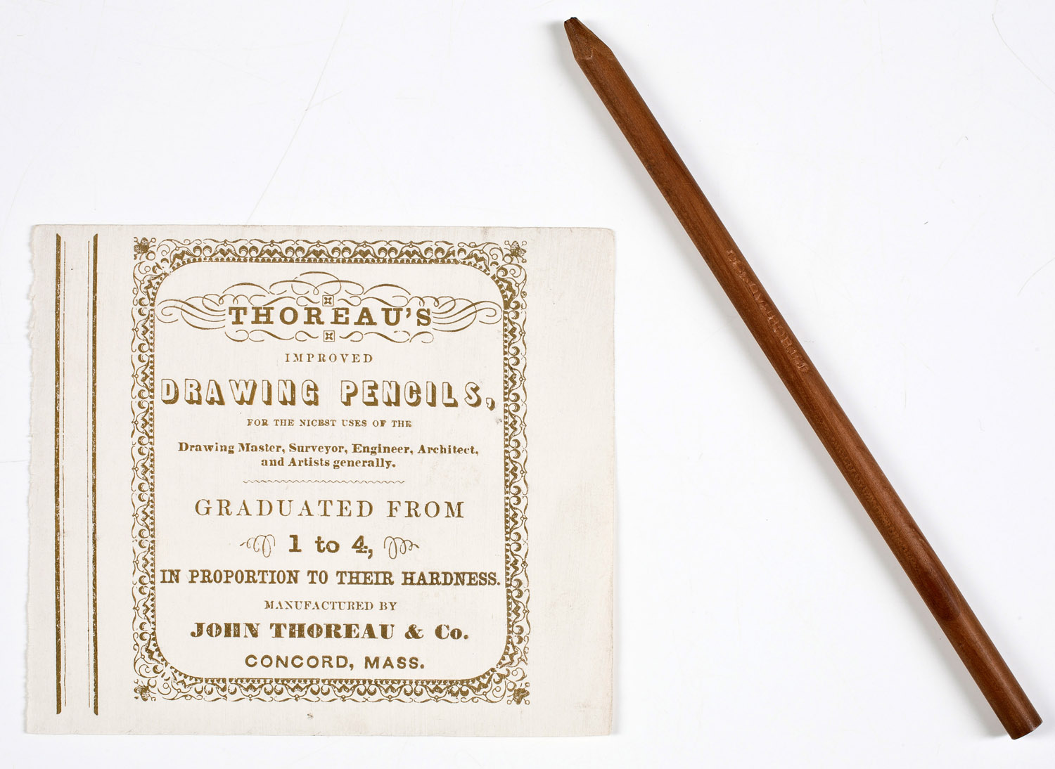
If a good name-brand is your game, might we interest you in the pencil we have made in Concord by Thoreau & Co. (yes, the same family!) This pencil and label for “Thoreau’s improved drawing pencils” is from a set of four (we alas, have one) but is “for the nicest uses of the drawing master, surveyor, engineer, architect, and artists generally: Graduated from 1 to 4, in proportion to their hardness.”
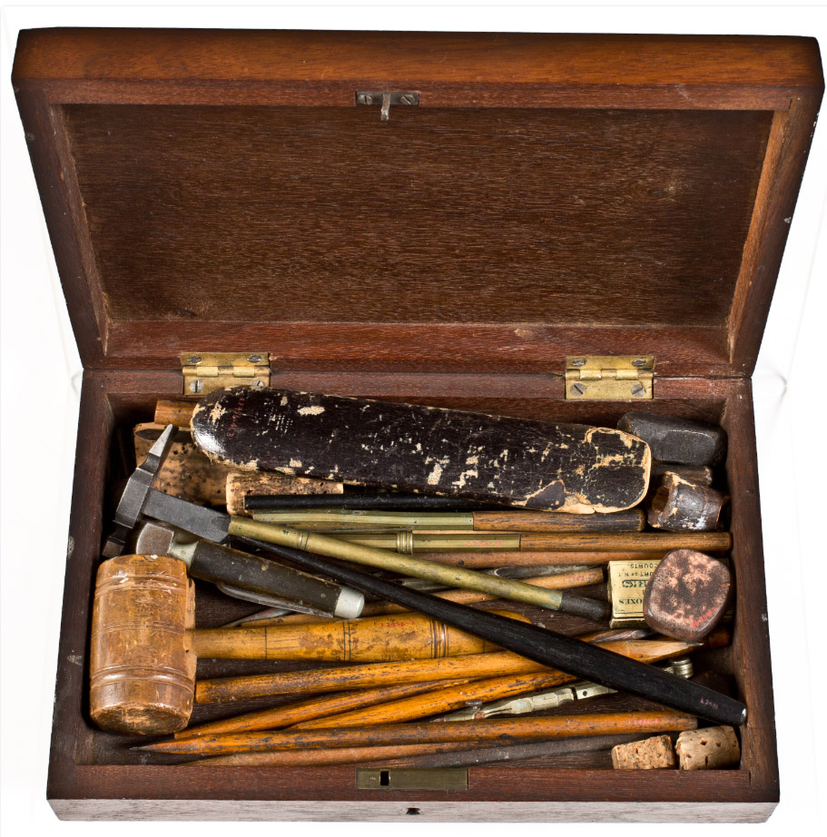
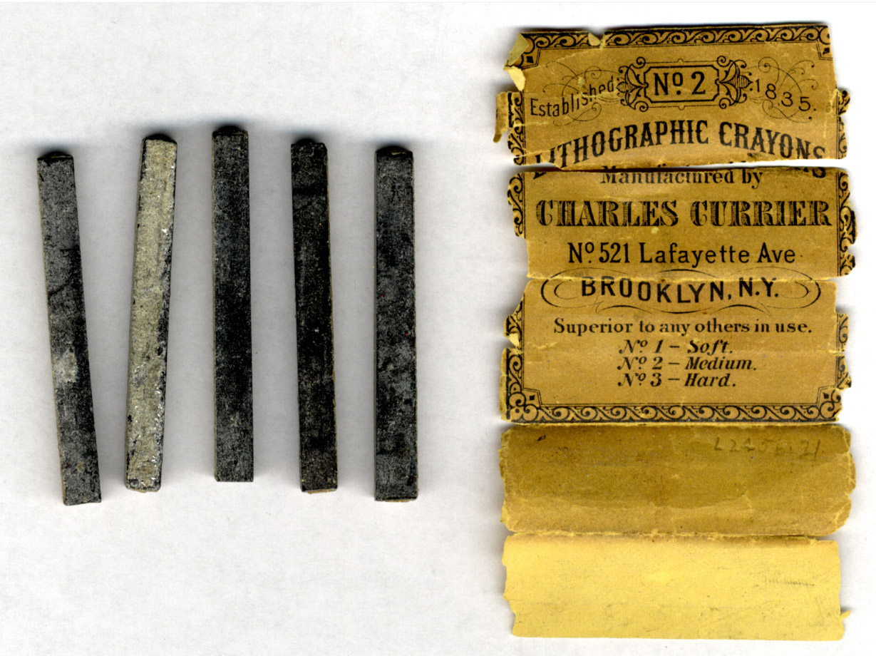
Do you require a box to store your supplies? You might find this one appealing – the Louis Maurer Archival Collection dating from 1850-1932 contains boxes (and as you can see, boxes of boxes!) of material. Pictured here is also a package of Charles Currier Lithographic crayons, No. 2 with the crayons and a label as well as the wooden toolbox; an inventory of the items contained can be found here.
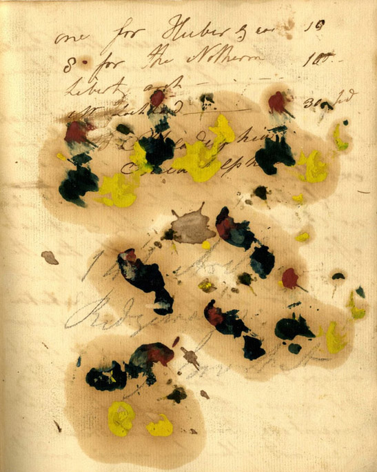
Crayons not enough to satisfy the fine art supplies you demand this year? Might you also need some blotter paper? We have some paints in an account notebook from Bass Otis (1784-1861) which is a DIY-version. Otis, a Philadelphia artist and portrait-painter, as well as lithographer, took notes in the volume on artistic-technique in addition to using some inner pages for oil-testing.
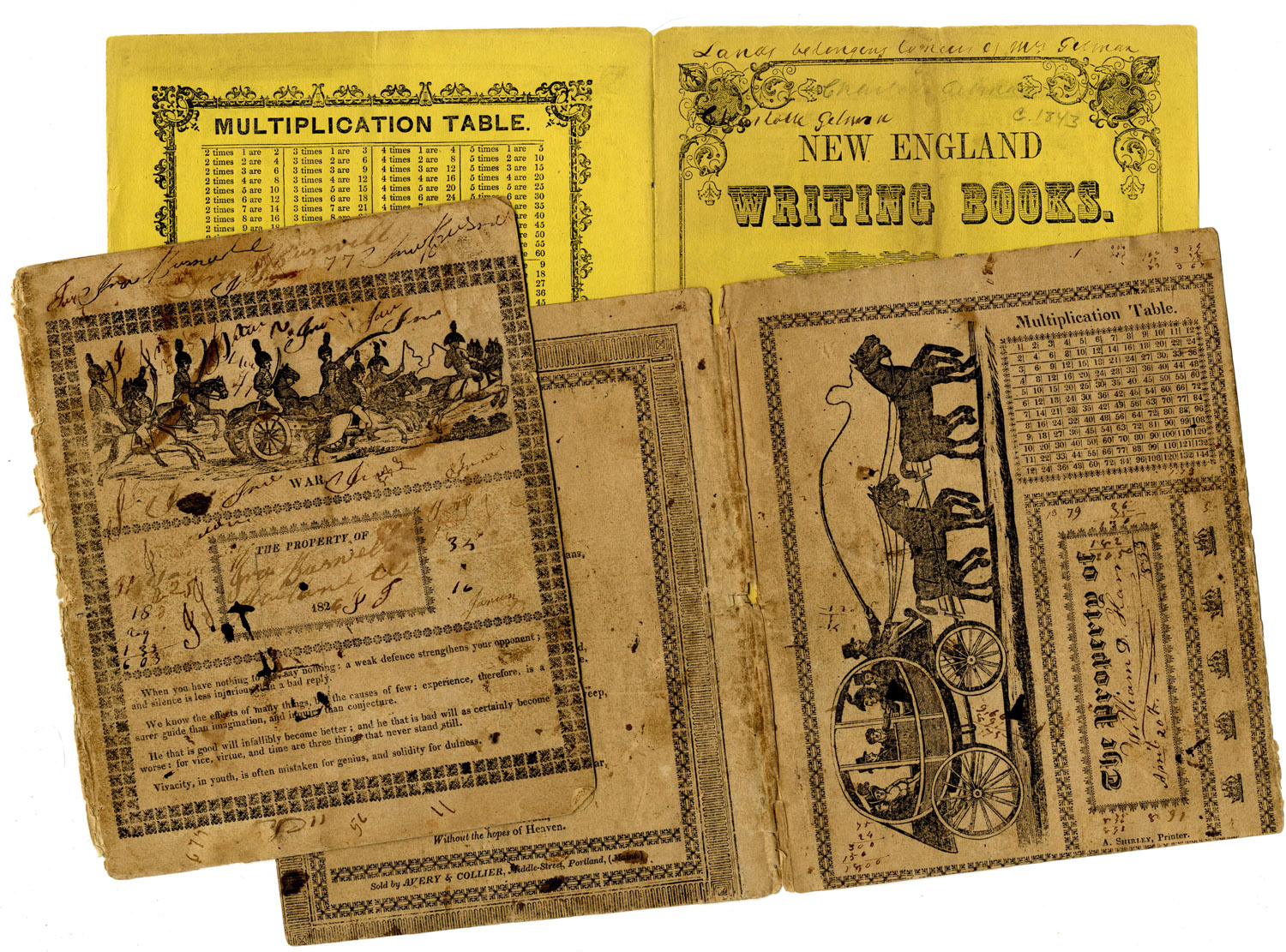
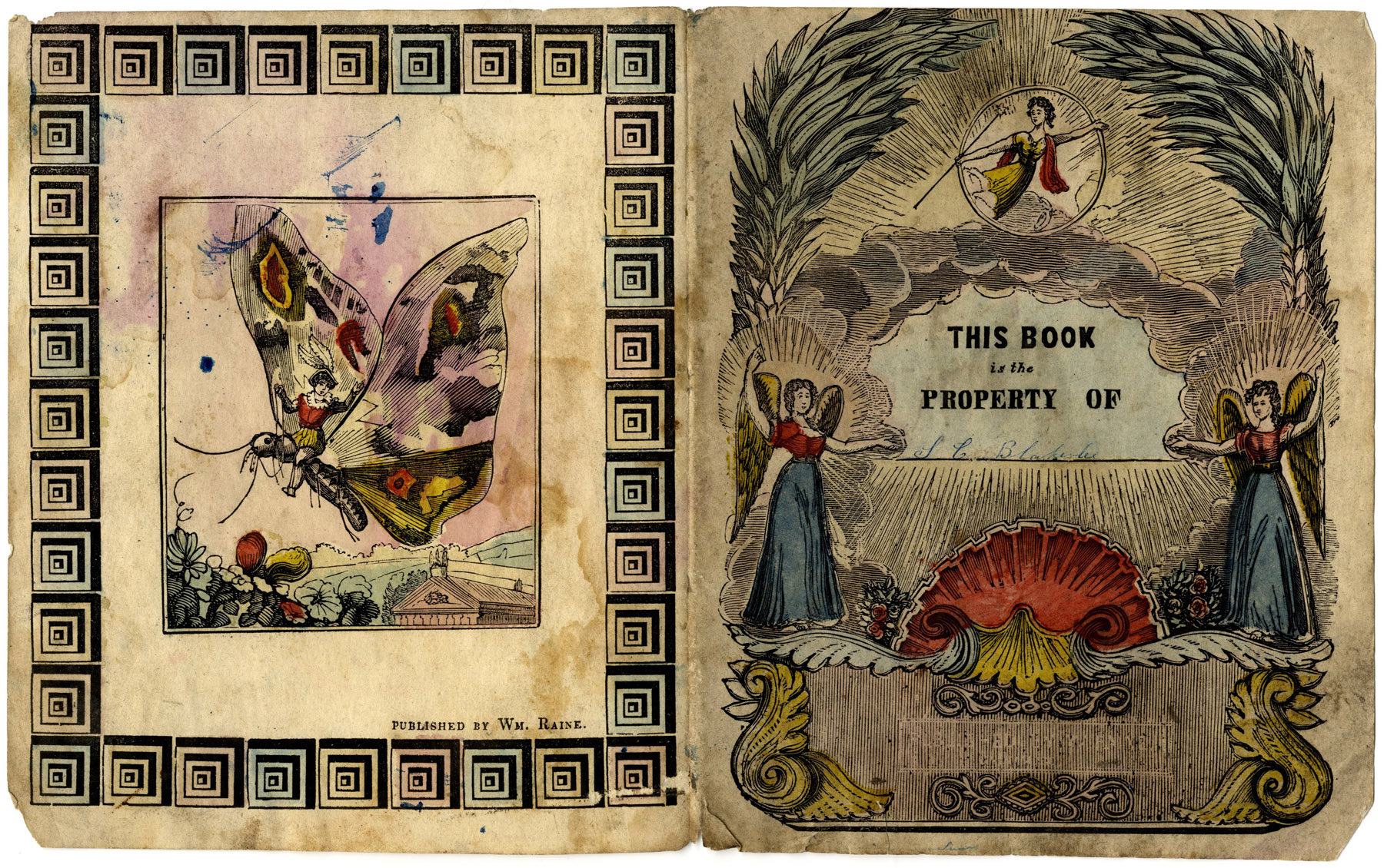
Need inspiration for your workbooks, nameplates, desk tags, or other classroom belongings? We’ve got you covered – literally. Presented here are examples from the copybook cover collection. The Society has three boxes of copy, drawing or writing book covers – many with aids for learning such as multiplication or mathematical tables and a place for the pupil to inscribe his or her name (such as the hand-colored example, bottom). These printed wrappers were originally from blank composition books which were made into their own collection because of their rich printed imagery. You see these covers at work protecting content in the Society’s penmanship collection.
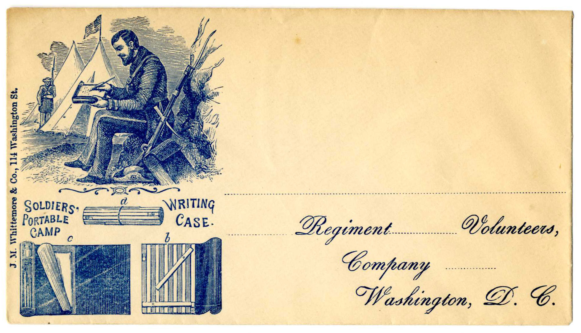
Have a special interest in portability? We don’t have laptops, cases or tablets, but we do have a mobile device – this Civil War envelope shows the Soldiers’ Portable Camp Writing Case printed by J.M. Whittemore & Co. in Boston during the Civil War years. The image on the envelope shows illustrated details for writing instrument and paper storage (and how it rolls up).
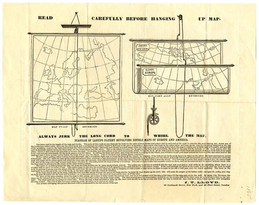
Need a way to safely display your hanging posters? This 1865 advertisement for “Diagram of Lloyd’s patent revolving double maps of Europe and America” is pretty handy and illustrates in detail how to jerk the cord to roll the map.
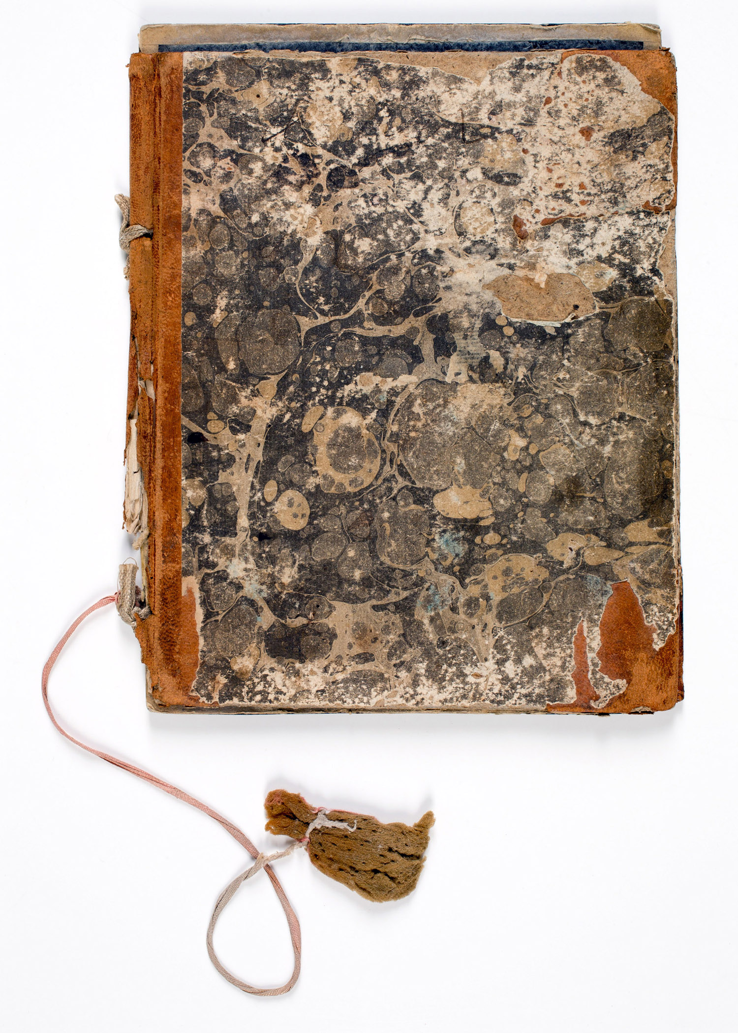
Want to go old school with your supplies? Do you require a slate? We have a ca. 1811 one which has its original sponge eraser. This example with marbled boards is over a sheep-back spine; there are also faded chalk notes with sums. Make sure to do your own work!
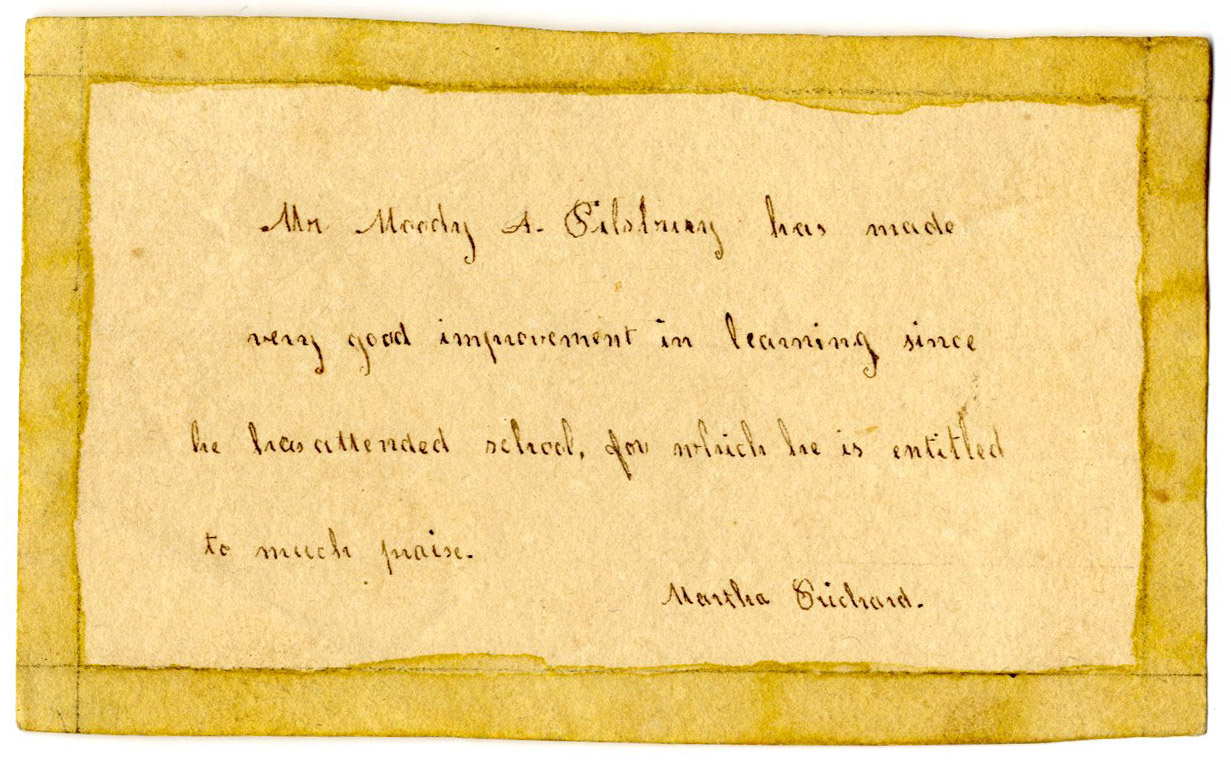
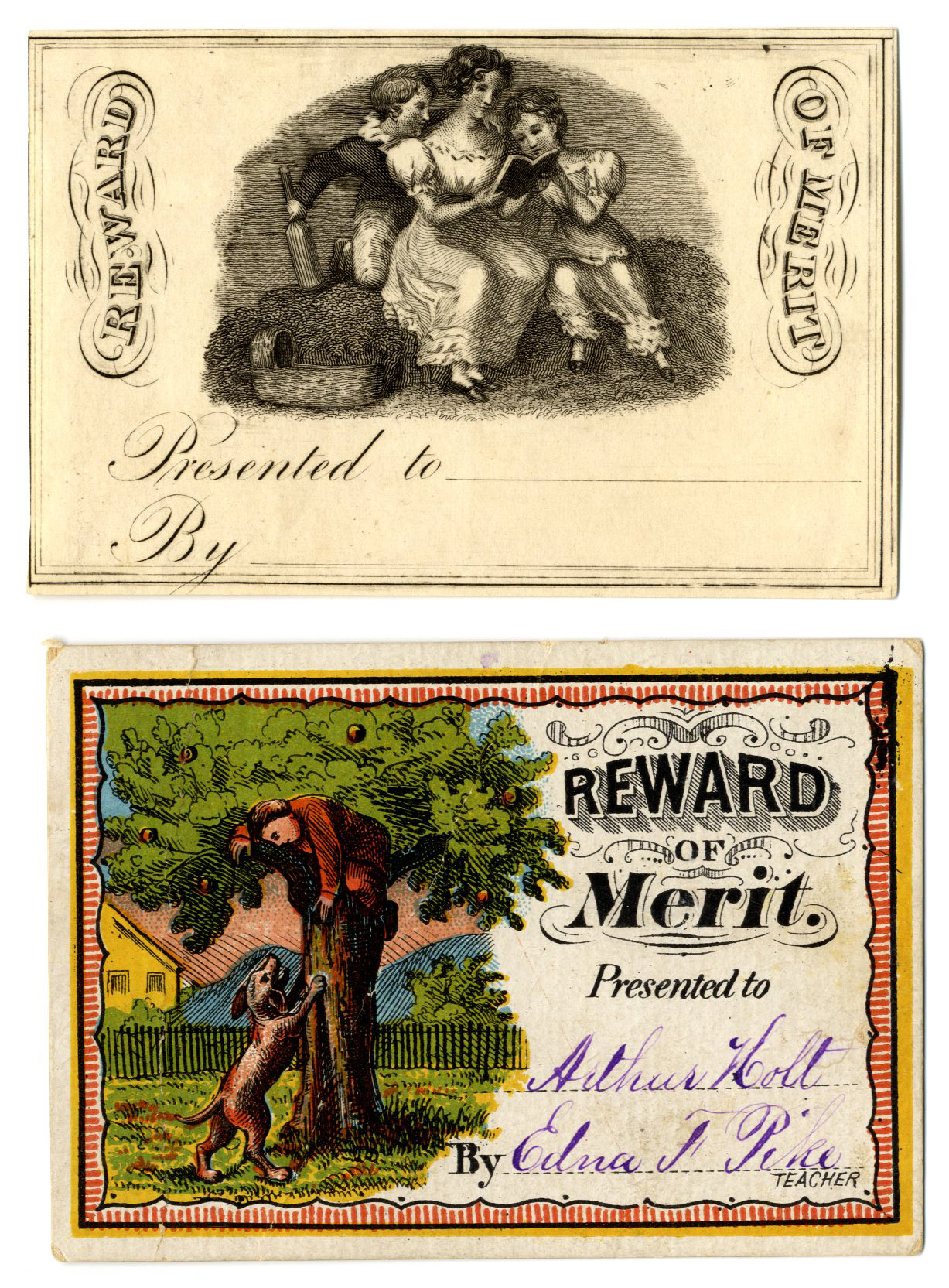
Teachers: are you looking for stickers or other incentives for your students? Look no further than our reward of merit collection! We have lovely ones filled in for students and blank ones ready for you to heap praise on your favorites for anything from spelling to punctuality. Several are handmade beauties, such as this top one, “Mr. Moody A. Pilsbury has made very good improvement in learning since he has attended school, for which he is entitled to much praise. – Martha Prichard”
….while another example here presented on the bottom to Arthur Holt by his teacher Edna F. Pike shows a boy chased up a fruit tree by a dog – there has to be an easier way to get an apple for your teacher, Arthur!
With the summer staff returning to college (and before the new crop of academic fellows join us in the reading room this fall) we enjoyed collecting items for our own mini-back-to-school. Yes, the bug bites us all. And no, fear not! There won’t be a quiz later!
Guest contributor Adam Fales grew up in Kansas and recently graduated from Fordham University. He is currently an AAS digital scholarship intern sponsored by the English Department at New York University and is a manager at Book Culture in New York City.
“And, indeed, if there is a counterpart to the confusion of a library, it is the order of its catalogue. Thus there is in the life of a collector a dialectical tension between the poles of disorder and order.”
Walter Benjamin, “Unpacking My Library”
Working in an independent bookstore and pursuing archival research as an undergrad, I had a set idea of what a collection of books looked like. In my earliest research experiences, I idealized the elegant Rose Reading Room at the New York Public Library. As a freshman, I wondered with a professor at the generations of scholars and writers who had worked in that same room. He asked me, “Can you imagine?”
I’ve spent my time since then trying to do so.
Even with the ongoing digitization of archives, we conjure a similarly majestic place in our minds. The home page of Readex’s Early American Imprints adorns its search function with famous paintings of American historical subjects, like William Henry Powell’s The Victory on Lake Erie.
Home page of Early American Imprints, Series II, featuring The Victory on Lake Erie
Log in enough times, and the images cycle through other subjects, but their message remains the same: this archive exists alongside history’s grandest events. Commodore Oliver Hazard Perry points his ship towards victory (and the American flag), just as Readex’s archive will point us toward a victorious understanding of the past (and primary documents).
Actual archival research is less grandiose (and, often, less victorious). This past summer, I’ve worked as a digital research intern for AAS. I worked with some of the North American Imprints Program’s bibliographic metadata, matching various catalog records. In my work, an archive looks quite different from a reading room or an historical painting; it looks like a spreadsheet.
Screenshot of a spreadsheet of metadata, featuring an announcement of “a most brilliant aval [sic] victory on Lake Erie.”This work is less exciting than we imagine archival research (and significantly less exciting than fighting a battle on Lake Erie). But as I worked with this metadata, I gained a greater appreciation for its ability to tell stories of its own. Scholars tend to distantly read large swathes of data or closely read individual texts. But for my work, I stayed in an intermediate space, neither looking intently at individual books nor distantly reading the catalog records of all these books. Instead, I looked closely at the metadata itself, gaining something of a bird’s eye view as I progressed through early American printing.
Rather than, say, see all the books printed in New York between 1801 and 1804 and then break those books down by subject, I proceeded more slowly through each year, examining the metadata of books, one by one. In the process, I got a portrait of Early American printing in the United States, as it unfolded in time, following narratives that I might have missed otherwise. For example, I was able to chart the development of scientific and medical knowledge through a series of
Inaugural Dissertations. These books, printed by colleges like Columbia to promote the research of newly minted doctors of physic and medicine, charted the accumulation of early nineteenth-century medical knowledge, as scholars researched yellow fever, lumbar abscess, and pulmonary consumption.
While a catalog search for “inaugural dissertation” might yield the same understanding of this scholastic development, my progress through these books, year-by-year and city-by-city told this story in a manner similar to how people would have lived it (albeit at an accelerated rate, as I proceeded through twenty years of books in one summer). In this way, I appreciated the developing use of purple foxglove in medicines, as doctors’ understanding developed from Jacob V. Brower’s Inaugural Dissertation (New York, 1802) to Lewis Burwell’s Observations (Philadelphia, 1805) to Thomas Edward Steell’s subsequent Inaugural Dissertation (New York, 1811). As I proceeded through each record in my spreadsheet, I appreciated the accumulation of knowledge on certain subjects, as a reader following a field might.
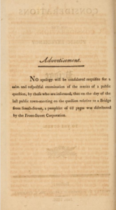
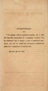
In some cases, this process brought me knowledge that scholars have already reached, but in a different way. For example, the prominence and republication of Isaac Watts’s collections of hymns and songs have been the object of much scholarly attention (such as recent Past is Present podcast guest Chris Phillips). Working with the metadata instead, I felt the sheer number of editions of works by Watts, as I worked with each record individually. This process yielded both appreciation and exasperation, as I grappled with the proliferating editions of each work. Experiencing the archive through metadata, I also felt amusement, such as with my discovery that William Tudor’s Considerations on the Public Expediency of a Bridge from One Part of Boston to the Other was met with An Answer to a Pamphlet, Entitled, “Considerations on the Public Expediency of a Bridge from One Part of Boston to the Other.”When I happened upon the latter some time after working with Tudor’s original pamphlet, I appreciated the biting parody, as Tudor’s detractor not only mimicked his title but also aped his opening “Advertisement.”
The “Advertisement” from ConsiderationsThe Advertisement from An Answer to…”Considerations”
Again, this knowledge could be gained through more standard catalog searches and archival research, but my plodding through the metadata afforded a feeling of serendipity that I don’t think could be replicated. It brought me these works in a similarly disorganized manner to how readers find books. The pang of surprise increased my appreciation of the variety of works available to Early American readers, in a way that oddly resembles my day job as a bookseller in the twenty-first century. The appreciation, surprise, and exasperation that I feel shelving books and perusing publishers’ catalogs parallels how I feel sifting through metadata and identifying catalog records.
While the sanitized spreadsheet loses much of the sense experience of a used bookstore, with its musty smells and precariously stacked books, the two share an odd number of similarities. This results from the way metadata structures both spaces, determining how we organize archives and shop for books. Whether in the nineteenth or twenty-first century (or earlier), metadata has always been there. Place of publication, title, and author are integral parts of books, but now, in the age of spreadsheets, these parts have become hyper-visible. Reading for metadata will hardly replace the knowledge afforded by archival research, but it provides some narratives and sensations that might be missed otherwise. An archive does not just look like its metadata, but it would certainly look (and feel) differently without it.
Nigel Lepianka is a graduate student in the English Department at Texas A&M. He recently spent a month under the generous dome researching his dissertation, “‘Yet of Books There Are A Plenty’: The Bibliography of Literary Data.” Nigel and AAS Director for Digital and Book History Initiatives Molly Hardy co-authored this post.
The trend towards using catalog data to analyze bibliographic data continues as the Library of Congress recently announced that they have “opened their catalogs to the world.” This means that they have made 25 million records created between 1968 to 2014 available in bulk. We at AAS who work on the American printing record prior to 1900 don’t deal in such largess, and yet, data downloads of any size can be daunting. How do I know that I am getting all of the records for a given set of criteria — say, all books printed in Philadelphia from 1790-1800? When the criteria are temporal and spatial and when you are working with a comprehensive data set like the North American Imprint Program (NAIP), you can be pretty certain. But, what about when you are looking for types of authors or of books? Just as we are underway to enable increasingly users to be able to search for “blacks as authors” or have made it possible to search American reprints of English prose and verse before the Revolution, we also want to make it possible to search for “fiction” as a category. As a genre term, “fiction” can be very sticky, and so rather than reassessing thousands of records ourselves and deciding which to label as fiction, we did what we often do: we included citations to the definitive bibliography on the subject. In this case, we used volume two of Lyle Henry Wright’s three-volume American Fiction, 1774-1900. In volume two, Wright lists “the American editions of novels, novelettes, tales, romances, short stories and allegories, in prose, written by Americans” from 1851 to 1875. Wright excludes from his list “annuals and gift books, publications of the American Tract Society and the Sunday School Union, juveniles, fictitious Indian captivities, jestbooks, folklore, collections of anecdotes, periodicals, and extra numbers of periodicals.”
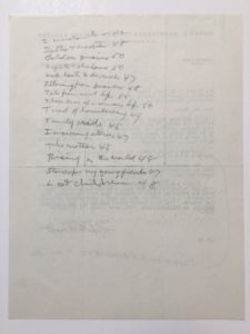
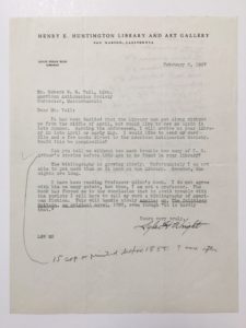
Using Wright as a basis for the improvement of fiction title metadata is a choice that is far more precedented for the Society than one might imagine. During the composition of the bibliography, particularly the first volume covering 1774-1850, Wright spent a decent portion of the leave he received from the Huntington Library at the AAS. Several decades of both publishing and revising the three volumes produced a robust collection of letters between Wright and AAS staff inquiring about titles, potential authors, editions, and the various minutiae of bibliographic detail amidst more genial discussions of the how-is-the-weather sort. These letters even include a suggestion by Robert Vail for Wright to read Arthur Hobson Quinn’s American Fiction: An Historical and Critical Survey (1936), which would ultimately inform Wright’s decision to use the term “fiction” over “novel” in the bibliography “to avoid trouble with the purists.”
Verso of Wright letter with Vail’s notes towards a responseLetter from Wright to Vail, February 2, 1937. AAS Records, Box 171.
AAS itself has invested in the Wright bibliography periodically to inform its holdings. Several copies of the first and second volumes of American Fiction are held in the AAS; they point to both physical, intellectual, and institutional labor spent in thinking about Wright’s listings. For the first volume, there are four copies of the published bibliography and a mimeograph checklist composed by Wright before publication. These copies include handwritten annotations and notes for particular titles listed by Wright as the Society acquired them. Wright already included in his descriptions the libraries in which he found a particular title, but the AAS staff in several cases continued to point out the evolution of their holdings in respect to American fiction. As Wright revised the first volume for the 1948 edition, he incorporated approximately 600 more titles and editions. Of these, close to 100 titles were found penciled in by AAS in the earlier 1939 edition. In the flip book below, see for example, the expansion of the entries for “Goodrich, Samuel Griswold” from half a page in the 1939 edition to two pages in the 1948 edition to three pages in the 1969 edition based on Clarence Brigham’s pencilled notes in the 1935 edition.
[book id=’29? /]
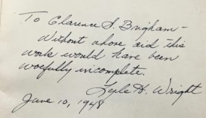
It is no surprise then that Wright included this dedication to the 1948 edition of his bibliography he gave to the Society, “To Clarence S. Brigham — Without whose aid this work would have been woefully incomplete.”
Wright inscription to Clarence Brigham in 1948 edition of his bibliography
This sort of collaborative effort would continue, as acquisitions of fiction would continue to be described as either “Found in Wright” or “Not in Wright.” The 1969 edition would feature corrections grafted physically into the book that attempted to append authors to anonymous titles.
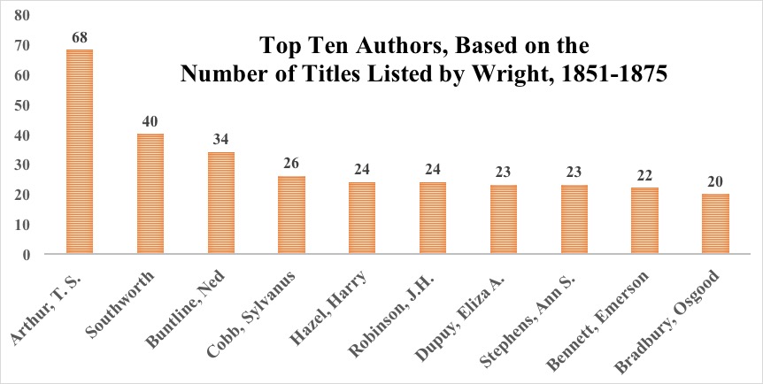
Given AAS’s longstanding relationship with Wright and his work, the Society has been including Wright numbers as catalogers came across records for included titles, either in cataloging nineteenth-century imprints or in enhancing recon records. But, thanks to the University of Indiana’s Wright American Fiction 1851-1875 project we now have comprehensive records for volume 2 of Wright. The Indiana project includes 2,340 texts included (2,040 unedited and lightly encoded, 300 fully edited and encoded). The University of Indiana library generously gave us their MARC records for these texts. These records include links to each of the images of and encoded texts in Wright II, but they also enable analysis of the bibliographic data contained in the records. We have enhanced the records by adding to each a field (or fields) listing in hierarchical fashion the place (or places) of publication named in the imprint (e.g. United States–Pennsylvania–Philadelphia). This enables the geo-locating of these records. We are in the process of further enhancing the records by adding the heading “Women as authors” to all works written by women. Already, we can see the top ten authors based on the number of titles Wright lists.
These names might come as a bit of a surprise. Timothy Shay Arthur and not Harriet Beecher Stowe? Really? It is hard to imagine that Arthur’s Ten Nights in a Bar-Room, and What I Saw Therecould beat out Uncle Tom’s Cabin, say. Wright himself acknowledges this when he reflects on his work for the second volume in the AAS Proceedings, describing Arthur as a “classic example of an author who ground out one hundred or more books during his lifetime, yet was unable to attain the rank of a literary craftsman.” Wright nevertheless acknowledges Shay’s success, writing “…it cannot be denied that his saccharine tales were tremendously popular and influenced the thinking of a large body of his readers.” Repeated Wright entries are indeed indications of proliferation. Multiple editions of a given book did not receive their own entry; instead, they are merely listed under the original edition’s entry.
While Wright’s bibliography is a hallmark of both traditional bibliography and American literary study, it has gained new life in an age that has increasingly seen scholars turn towards questions of scale, database, and distant reading. The composition of Wright’s work as a classical enumerative bibliography demonstrates an ethos that more contemporary distant reading scholars have recently professed. A bibliography such as a Wright’s, while not perfect when you consider his exclusions (i.e. Walt Whitman’s Franklin Evans or Louisa May Alcott’s Little Women) and problematic inclusions (i.e. Harriet Jacobs’ autobiographical Incidents in a list of fiction), represents effort, attention to, and documentation of what Franco Moretti calls the “Slaughterhouse of Literature”, though more recently scholars such as Ted Underwood would question the ethos of the slaughterhouse over more controlled collections. The point, however, is Wright produced a dataset, that can be explored, modeled, and read (and IU and now NAIP have assisted in delivering this). Within this dataset there is an attempt (at the least) to describe those that exist beyond the canon in a way that is synonymous with the democratic “one vote” principle: Moby-Dick, The Scarlet Letter, and Uncle Tom’s Cabin receive one entry. Wright himself embodies this ethos years before when he, echoing the sentiments of the New Bibliography tradition, asserts that it is a “bibliographic impossibility” to say that a text should not be described in a list.
 A large number of unidentified diaries have been purchased by or donated to AAS in the last several years, and it’s been a fun challenge for those of us cataloging manuscripts to attempt to identify the diarists by searching for any clues that might spoil the anonymity of the writers. We can then move the diaries to the identified category, thus making them more accessible to researchers.
 of a prosperous merchant and farmer who had also served in the Revolutionary Army. What is especially interesting about the diary is Wheeler’s reference to Conradt Burghardt, who owned the mill that processed Wheeler’s wood in Great Barrington, Massachusetts. Knowing that the sociologist, historian, and civil rights activist W.E.B. DuBois (1868-1963) was from Great Barrington and that the “B” in his name stands for Burghardt, we were able to determine, following additional research, that Conradt Burghardt’s Dutch colonial ancestors, also named Conradt, had been the owners of a slave named Thomas, who assumed the Burghardt surname and settled in Great Barrington as a freeman after serving in the Continental Army. He was the great-great grandfather of W.E.B. DuBois, although the diary does not appear to have any references to the “black Burghardts” of Great Barrington (DuBois’s grandfather, Othello Burghardt, was living in the town in 1817).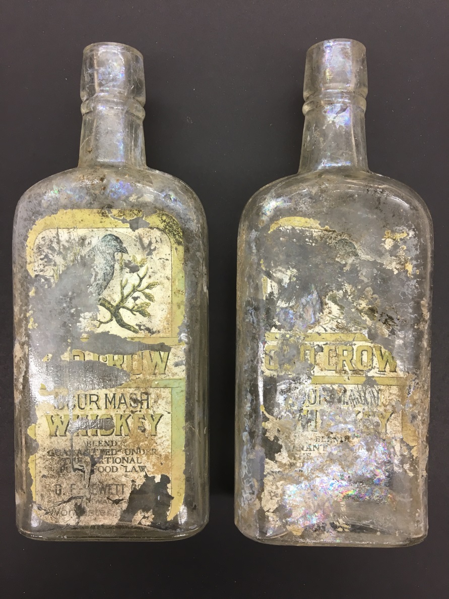
 In this episode of the Past is Present podcast we speak with Susanna Blumenthal, a professor in the law school and the Department of History at the University of Minnesota and AAS-NEH Fellow at the Society during the 2016-17 academic year. Susanna’s most recent book, Law and the Modern Mind: Consciousness and Responsibility in American Legal Culture, was published in 2016 by Harvard University Press. Susanna has published widely on psychiatry, consciousness, and the law, and her current project is an examination of the ways that American capitalism is intimately tied to fraud.