Mocked by its own title.

516375_0001One feature that makes working at the American Antiquarian Society a joy is the number of resources available at our fingertips.   Our reading room abounds in reference books and bibliographies. Our stacks are filled with county and local histories, city directories, genealogical publications, and other publications. We have access to numerous online databases. When an unusual imprint or unrecorded publication arrives, we are able to find out some information about the publication, publisher or printer.

Then there are the rare times when we are flummoxed.

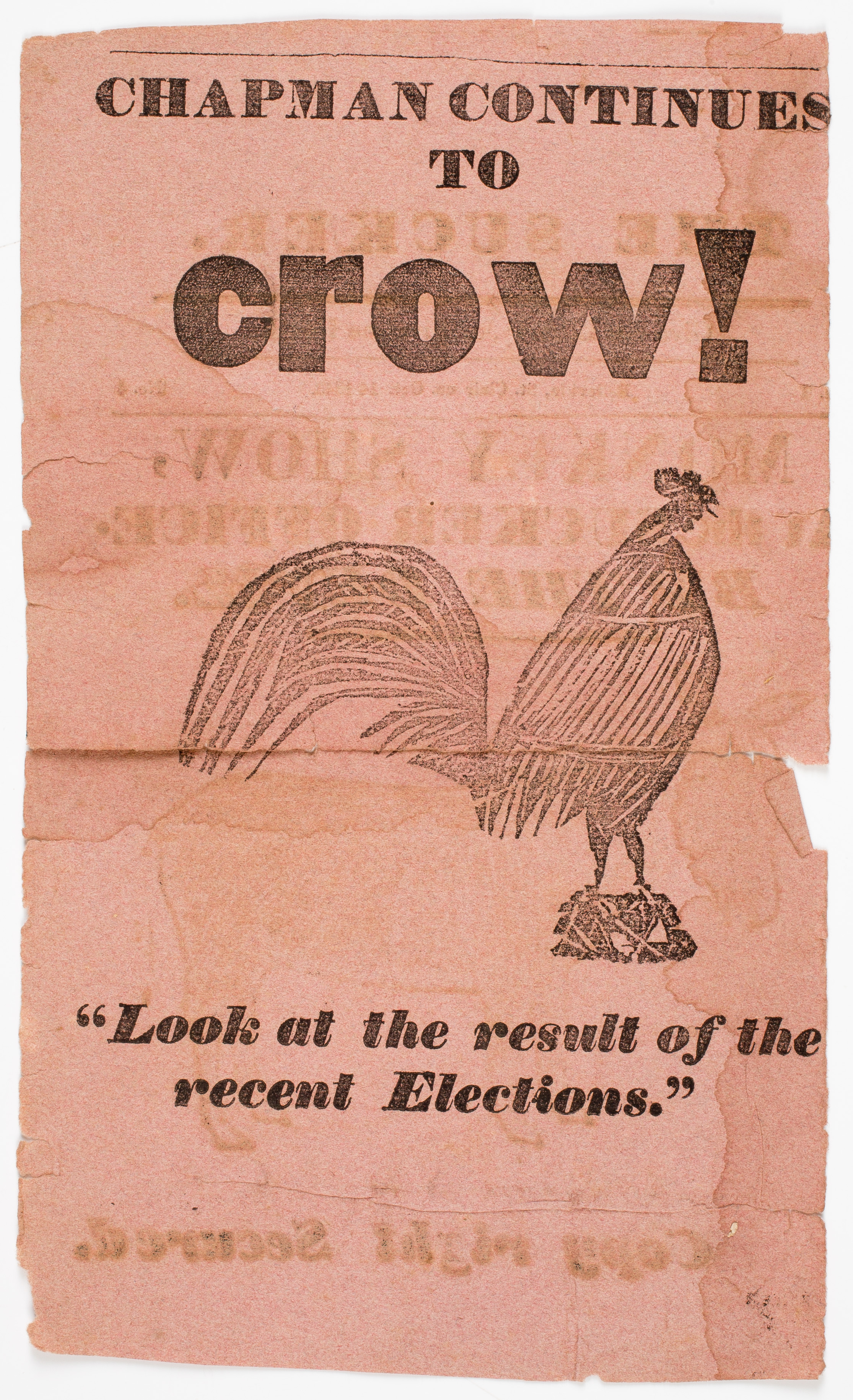
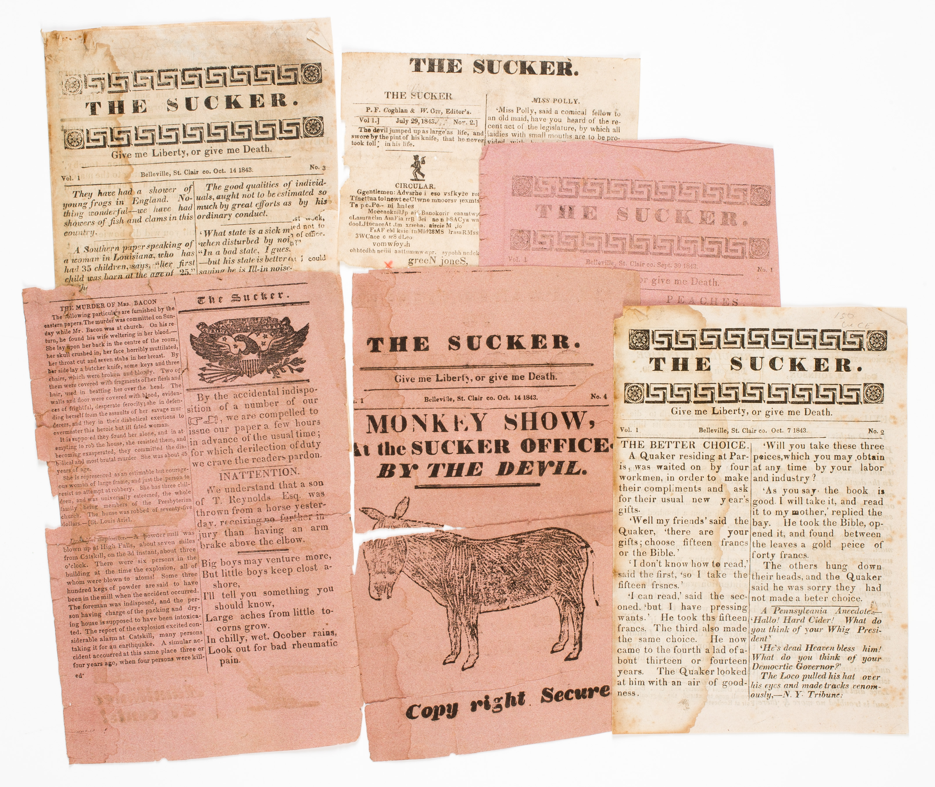
At a recent ephemera fair at Boxborough, Massachusetts, a dealer sold us some issues of The Sucker, published in Belleville, St. Clair County, Illinois in 1843.   They are small pieces (7 ½” x 5”), crudely printed. Under the masthead is the cry, “Give me Liberty, or Give me Death.” Two of the pieces are complete and have as the editor “Devil & Co.” There is one fragment dated July 29, 1843, that has P.F. Coghlan & W. Orr as editors.   Some of the content is political, poking fun at cand516375_0002idates. There are some pretty good jokes among the issues. For example:

‘My dear,’ said a gentleman to a lady whom he thought to have married, ‘do you wish to make a fool of me.’
‘No,’ replied the lady, ‘Nature has saved me that trouble.’

Spunky. – If a man is rude to a lady in Pittsburg, she smacks his mouth with her hand. If he is civil, she gives the smack with her pouters. Sensible and spirited.

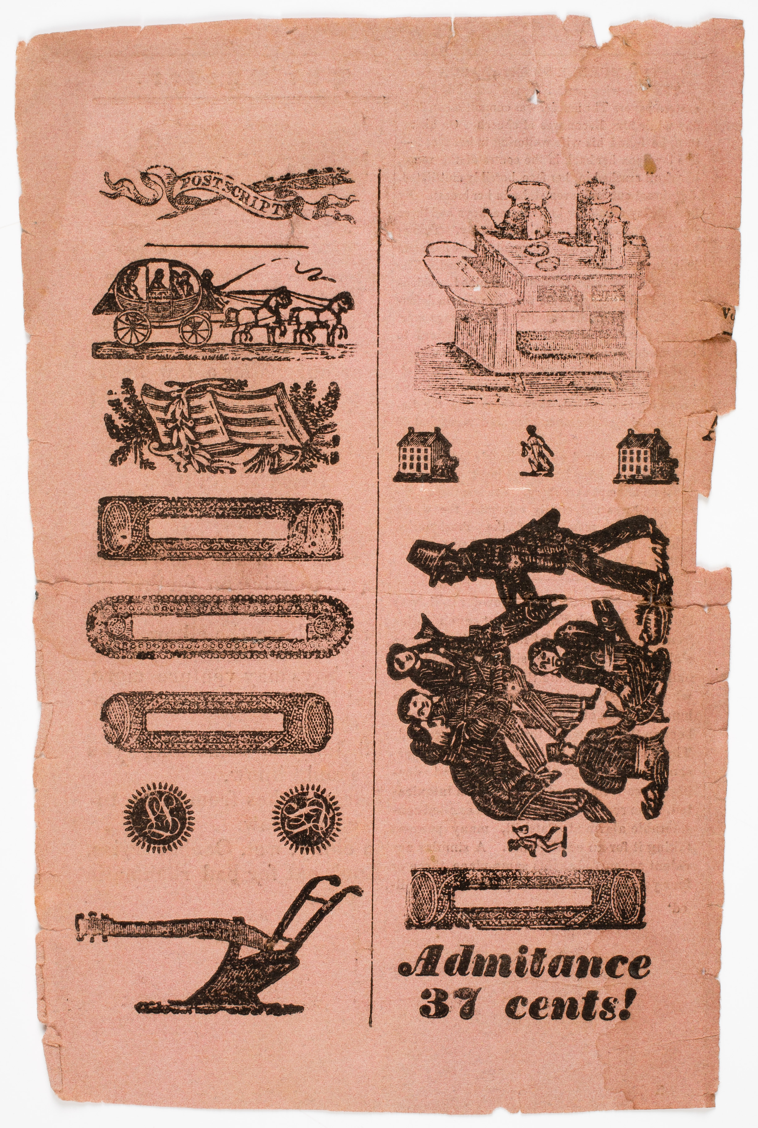
One of the scraps has two crude woodcuts; one of a donkey and the other of a rooster. For some reason, one page is filled with nothing but stock illustrations, as if the editor ran out of things to write and used them to fill up a page (below right).

516375_0003Only one other library—the Abraham Lincoln Presidential Library in Springfield, Illinois—has any issues of this short-lived oddity.

When it arrived I spent some time researching it. It isn’t listed in any bibliography of Illinois newspapers and periodicals. The title and the editors are not mentioned in the county histories. No mention of the paper could be found in contemporary newspapers by searching the Readex America’s Historical Newspaper database.   Every resource at my fingertips turned up no information on this publication. It is as if the title was mocking me for daring to try and find out who was behind “Devil & Co.”

Gentle readers, do you dare take a crack at this puzzle while the masthead sits there waiting to mock your efforts?

The Acquisitions Table: The Album

The Album. New York: F. & R. Lockwood, [between 1818 and 1822]

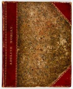
The AlbumPrimarily used for recording poetry, this album consists of an engraved title page followed by blank sheets, all bound up in a bespoke binding personalized for Adeline Morgan. It appears to be one of the earliest albums issued thus (in a decorative binding, with a title page) in the U.S. The paper is watermarked 1818 and the earliest date in the book is 1822. AAS acquires such volumes for both their insides and their outsides. The manuscript content of such commonplace books or friendship albums sheds light on education practices and print and manuscript circulation patterns. The binding complements others already at the Society, especially from the Michael Papantonio collection. It is three-quarters crimson straight-grained morocco with marbled paper boards and endpapers, and generous gilt tooling. The wove paper is watermarked “Butlers & Ward 1818,” indicating it is the product of Simeon and Asa Butler’s Eagle Paper Mill in Suffield, CT.

Under Their spell: The AAS Collection of Halloween Postcards

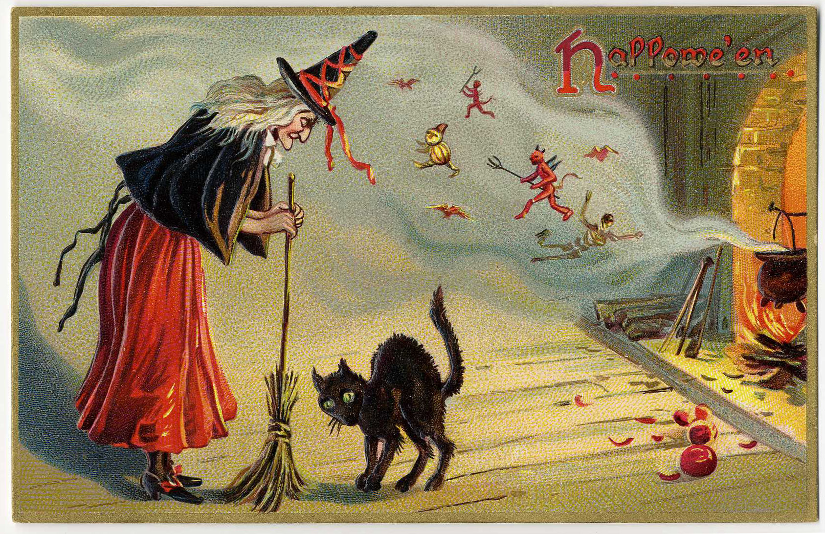
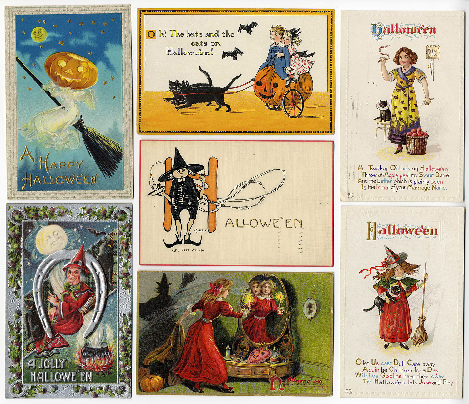
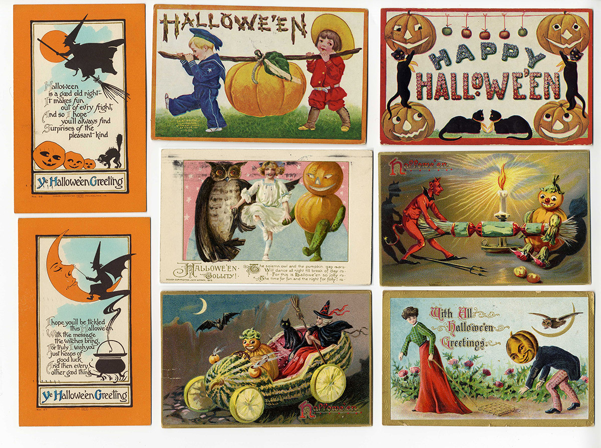
halloweenpostcards1In the same vein as last year’s ghostly stereocards blog post, we offer another Halloween treat for you! Have you thought about sending someone a light-fright this October? If you’ve been in any stationary or card aisle recently, you would notice most holidays serve as an excuse to send a greeting. Although conservative in number (sixteen unique; seventeen in total), the AAS collection of Halloween postcards documents another era of this fad. Many are between members of the Weir Family of Worcester, Mass., dated 1910-1913. Here, the fronts and backs (including some charming drawings of pumpkins) have been digitized and linked in our digital image archive, GIGI.

These postcards illustrate a snapshot in time between Halloween as a belief in spirit possession (i.e. the All Hallows Eve events) and the costumed-candy-revels of the twenty-first century. In Halloweenpostcardsthese images, participants are no longer attempting to frighten roving souls, but rather join them. The cards are more than just pretty images of youthful flirtation with the spirit world; they also have historical depth.

The postcards are representative of what Daniel Gifford, author of American Holiday Postcards, 1905-1915 (2013), refers to as the cards’ Golden Age. The Society’s collection is American, British, and German in origin. Gifford describes the international exchange of these objects, which was disrupted by World War I when the printing and import of cards from Germany ended. In the Society’s collection are several beautiful German examples – “A Jolly Halloween,” “With All Halloween Greetings,” and the hand-embossed “Halloween” postcard by the firm H. L. Woehler. The choice of Halloween lends itself to the riches of color printing; the holiday, paired with autumnal festivals and harvests, provides a bountiful palette of colors, including reds, gold, oranges, blues, blacks, and greens.

Halloweenpostcards_003snThe picture postcard, as historian David Henkin puts it in his text The Postal Age (2006), shows a “traveler’s implicit claim to have encountered scenes of interest” (Henkin 129-30). Without a doubt, holiday postcards are an entirely different animal from picture postcards (for interested readers, Gifford’s monograph does include a treatment specifically of these holiday postcards). Likely no one sending a Halloween postcard encountered a witch, devil, goblin, or ghost, but these images offered the opportunity for the creator to explore these subjects visually (subjects the sender/recipient might hope to encounter only in print!).

In his article “Star-Spangled Turkeys” Gifford states, “at the peak of their popularity billions of postcards were circulating through post office networks of kin and friends, and into boxes and albums” (Gifford 14). Since the AAS collection of uncatalogued postcards includes both picture postcards and holiday pieces interfiled together, it allows us to study one small network in action as we can see through the grouping how they were selected, sent, received, and ultimately collected.

The Society’s collection of postcards is an area of the Graphic Arts Collection that extends beyond the 1876 cutoff date (how devilish!). So be sure to browse the digitized cards to send something spook-tacular to someone who might like a Halloween greeting! They’re so beautiful, it’s almost scary!

Works Cited

Gifford, Daniel. American Holiday Postcards, 1905-1915: Imagery and Context. Jefferson, North Carolina: McFarland & Company, Inc., Publishers, 2013.

—. “Star-spangled Turkeys: Patriotism in Thanksgiving Postcards.” Ephemera Journal. Sept 2014, 17:1, 14-18.

Henkin, David M. The Postal Age: The Emergence of Modern Communications in Nineteenth-Century America. Chicago: University Of Chicago Press, 2006.

Photography: Printers at Work

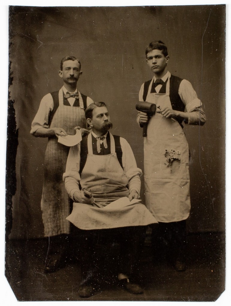
printers_amherst_0001Recently, AAS purchased two photographs depicting American newspaper printers, one on eBay and the other at a local auction in central Massachusetts.  These images capture working men posed in photographic studios, holding props and tools of the trade.  When viewed with two additional photographs already in the collection, these portraits capture the likenesses of people who produced small regional newspapers and job printing around the turn of the twentieth century, from Quebec to central Alabama.

The earliest image in the group is a ca. 1890 tintype of three men. Edward Wilton Carpenter is seated at center and is flanked by two unidentified men, who stand and hold tools and paper. Carpenter was a resident of Amherst, Massachusetts, and was also the co-publisher of the Amherst Record.  The Record started in 1868 and had gone through several owners before it was purchased by Carpenter and a partner in 1890.  Carpenter was also an author and in 1896 he wrote The History of the Town of Amherst, a general narrative about the town with a reprinting of town meeting records going back to the eighteenth century.
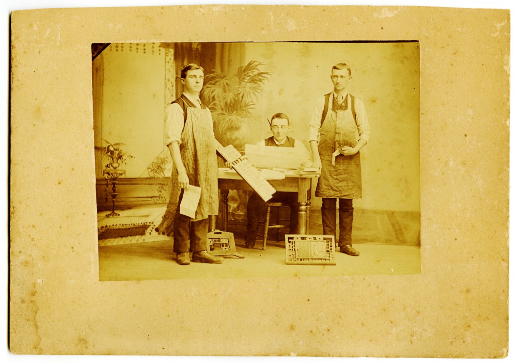
printers 1The second image, also from the 1890s, shows three unidentified printers in a different photographic studio.  The bespectacled central figure is seated, but instead of looking at the camera, he is intent on reading a copy of the Slatington News, published in Slatington, Pennsylvania. Two printers wearing ink-soiled aprons stand on either side.  The man at left holds a line of large wooden type which reads JOB PRINTING.  Displayed on the floor are two printing chases with locked-in type. None of the three men are identified and the history of the paper, like the Amherst Record, contains numerous changes in ownership and editors starting from the founding (1868) up until the twentieth century.  The style of the men’s clothing and photographic details indicate an 1890s date.  James Rauch bought the paper in 1898 after working as the editor there for at least ten years, so one of the men could be a young Rauch.
printers 2

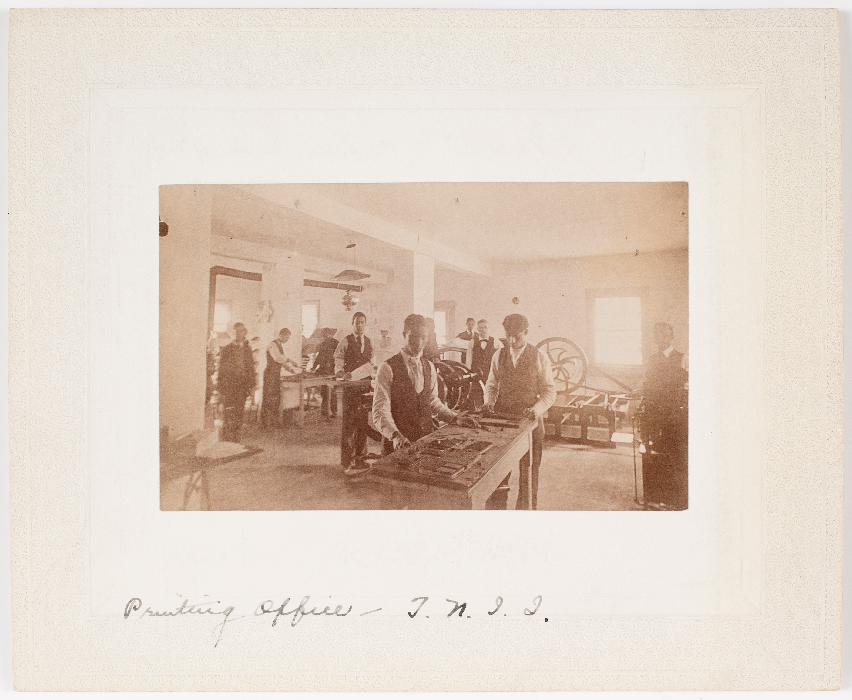
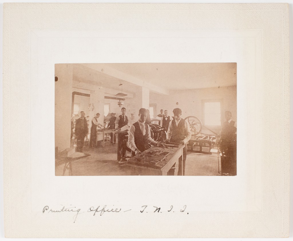
These two images join two other photographs of printers already at AAS.  In 1894, an unknown photographer made the image above of African Americans learning the trade of printing in an educational print shop.  One of a collection of over fifty views showing the Tuskegee Institute (today Tuskegee University), founded in 1881 by Booker T. Washington, this image brings the viewer out of the studio and into the printers’ work space. The photograph includes nine students, two setting type in the foreground with others posed near belt-driven presses.  This shop produced annual reports, invitations, and notices issued by the Institute, as well as the Southern Letter, a small paper that followed the progress of the school’s leaders and students in the 1880s and 1890s.  Here the students do not wear aprons but instead are working in vests and shirtsleeves, learning by doing, and helping disseminate information about their school in the process.
printers_quebec_0001

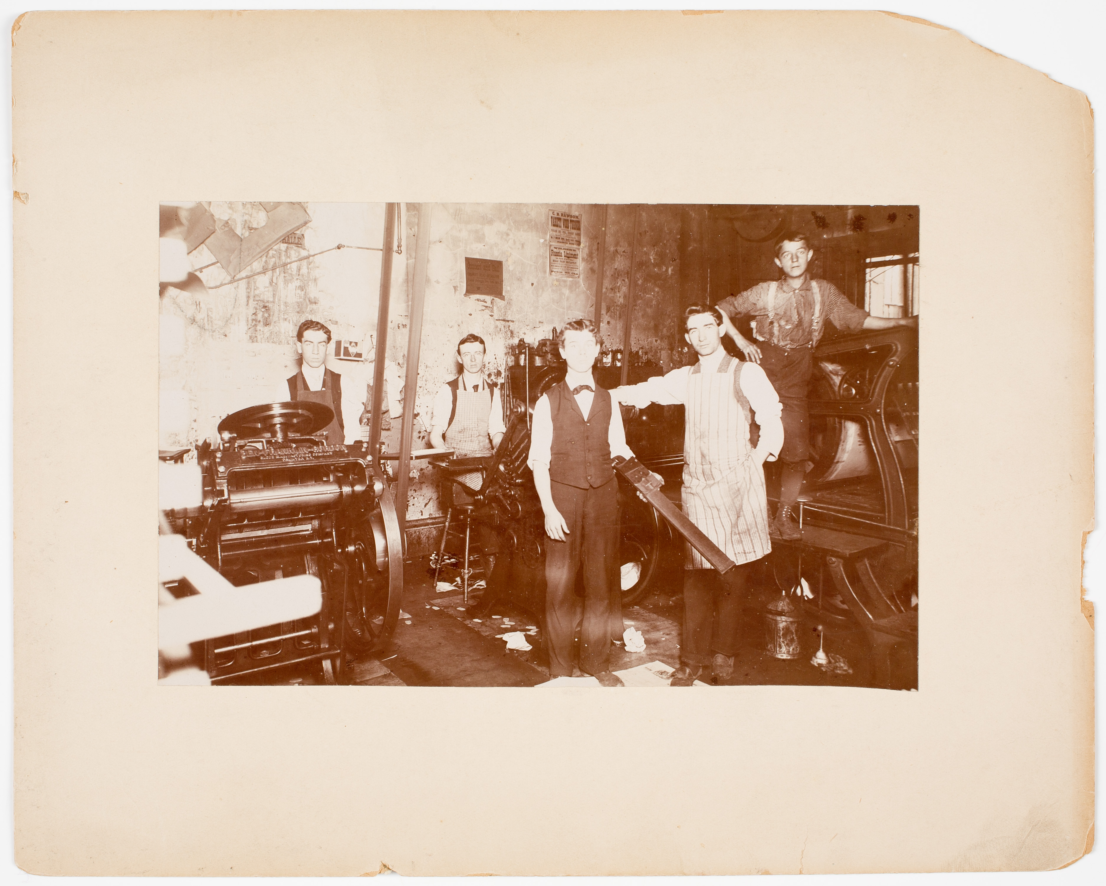
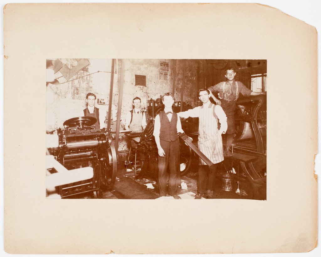
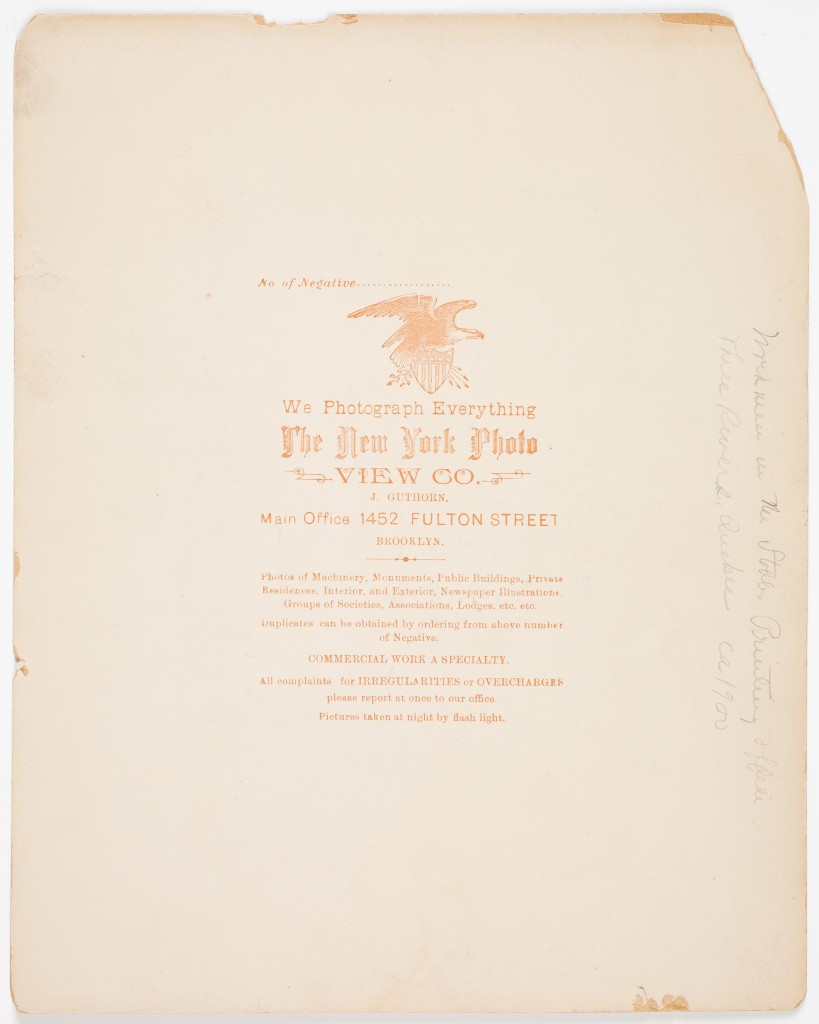
Finally, the fourth photograph, also already housed at AAS, brings the viewer into a commercial print shop.  This image is the latest in the set, taken around 1900 in a Three Rivers, Quebec, business.  The photographer, J. Guthorn of the New York Photo View Company, employed the recently invented technology of flash powder, evident in the reflections on the presses and the washed out appearance of the fellow at center holding the large composing stick.  The printers_quebec_0002photographer’s label promotes this new technique stating, “Pictures taken at night by flash light.” Unlike the earlier studio images and the Tuskegee promotional shot, this photograph gives the viewer a good sense of the interior of a typical small commercial printing house, with heavy presses set on the ground floor, dim light, oil cans at the ready near the machinery, and discarded paper all over the floor.  The printers clearly occupied tight quarters during working hours.  In this shot we have five employees, three presses, and examples of printed work pinned up on the wall.  An inscription on the back of the picture indicates the space was owned by the Stobbs Printing Office, which was founded in the 1850s.
Taken together, these four occupational images of printers tell us a lot about printing during the last quarter of the nineteenth century and the beginning of the twentieth.  In local history texts or accounts of historical newspapers, these print shops are usually reduced to the name of the editor or owner, the type of work they produced, circulation size for newspapers, and other facts of interest (location, political party, etc). With the photographs, we get the faces and forms of the workers themselves.  The men are shown in their aprons or shirtsleeves, with the tools of the trade in hand, near their co-workers or presses, not with their family in their Sunday best.  They are likely proud of their work, they can read and write, can set type, and can use the power of the press to record and perhaps influence events in their home town.  The industry was a perilous one, with papers changing hands, going bankrupt, failing and restarting all the time.  Steady work at small presses often meant changing shops, moving, learning new technology.  In today’s era of Snapfish and Shutterfly, it is something to look at images of workers, pressmen, students —  if nothing else, as a reminder of the physicality of the people (especially the young ones with their skinny necks and slim shoulders) who worked as printers and newspaper men long before Slate, CNN, and the Huffington Post.
The Antiquarian in the Twenty-First Century

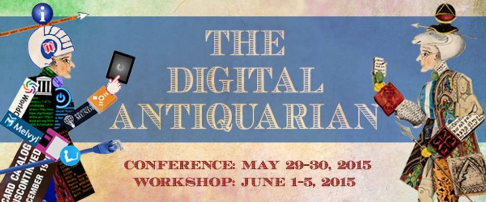
digital antiquarian

Printed by Senefelder Lithography Company in 1830, the image on the right in the banner above recalls a transatlantic moment when antiquarianism was both a popular fad and an object of ridicule (think Walter Scott’s The Antiquary or Friedrich Nietzsche’s description of the antiquarian as “the mad collector raking over all the dust heaps of the past”). Fascination bordering on obsession with the past, with history’s many mysteries, is the hallmark of the antiquarian. Collecting materials of our cultural heritage, the antiquarian seeks to establish and maintain a historical relation to the past. So too he adorns himself in its pieces, fashioning from the fragments of the material record a costume, an identity, a disposition, an ethos — lending artifacts, texts, and objects the life of his persona, transforming evidence of the past into habitus in which we might live and move.  Since 1830, the work of the antiquarian has been dramatically transformed by changes in communication technology. Where the stuff of antiquarianism used to be manuscript scrolls and books, it is now online union catalogs and flash drives. Where the antiquarian always has his nose in a book (and the figure in the period is always coded male), oblivious to the world around him, the digital antiquarian stares at a screen, equally absorbed. But if the tools and methods we use to encounter the past have changed, the antiquarian’s quest remains the same: to cultivate intimacy with the historical record, through curiosity and the care we bring to its preservation and interpretation.

With changes in communication technologies have come changes in the scale and complexity of the antiquarian’s methods, reflecting the development of modern institutions and processes of knowledge work.  At the American Antiquarian Society, and indeed at other special collections large and small, diverse kinds of labor unfold on both sides of the circulation desk. Scholars from many academic disciplines bring diverse research questions to rare books and manuscripts, newspapers and graphic materials, with hopes to carry what they find into the worlds of academic scholarship and public humanities.  There are scholars as well on the other side of the circulation desk — curators, catalogers, and database designers, among many others, who develop and maintain the information architecture on which the process of discovering new knowledge depends.  The very image of an individual figure belies the collaborations that have furnished and organized the habitus of the archive.  The antiquarian now moves within systems and networks of knowledge work that, since 1830, have been continually transformed by standards and tools of library and information science.  As historical scholarship migrates online, and catalogs have become databases, standards and protocols of archival preservation have become integral  to the process of making materials of the past accessible — visible and meaningful in digital environments for research and communication.  So what, then, does the twenty-first-century antiquarian need to know now to inhabit the past, to develop critical, creative, and practical competencies to move amongst its materials?  Knowing how to read MARC records, understanding the functions of controlled vocabularies, searching for images online, recognizing the codependence of the searcher and the person who created the search engine — such methods and concepts have become essential to effective collaboration of students and scholars, curators and technologies, in the stewardship of archives in the twenty-first century.

To assess needs and opportunities for archive-based scholarship across fields of critical bibliography, history of the book, and the digital humanities, we have organized a conference on “the Digital Antiquarian” to be held on May 30-31, 2015. Ideas and projects presented at the conference will be more deeply explored in a five-day workshop, designed to introduce students and scholars to methods and concepts of archive-based scholarship through practice-based learning in digital humanities learning. Led by AAS curators and guest instructors, the workshop will explore fundamental questions about how data is organized and used in special collections development and research. We very much hope that you will consider joining us for the conference and applying to the workshop. To learn more about both, please visit the “Digital Antiquarian” events page.

– Thomas Augst and Molly O’Hagan Hardy

Thomas Augst, an AAS member and associate professor at New York University, is the author of The Clerk’s Tale: Young Men and Moral Life in 19th Century America (Chicago, 2003), co-editor of Institutions of Reading: The Social Life of Libraries in the United States (UMass, 2007), and co-editor of Cultural Agencies and American Libraries (2001). Tom was a National Endowment for the Humanities fellow at AAS for ten months last year.

Molly O’Hagan Hardy is AAS digital humanities curator and an ACLS public fellow.  

America’s Sherlock Holmes

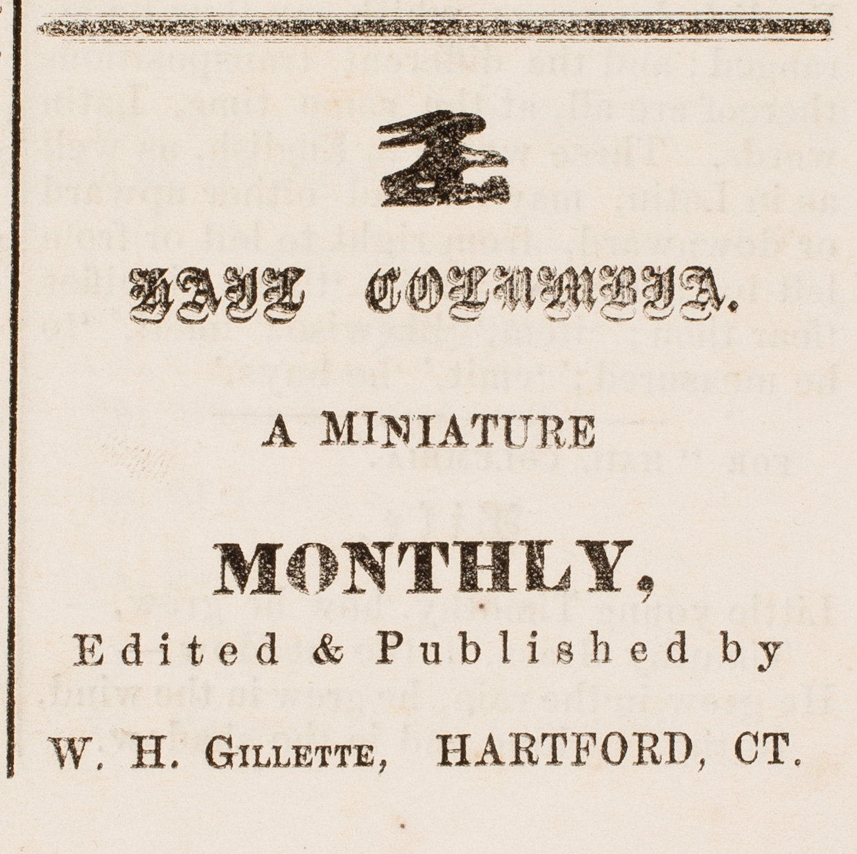
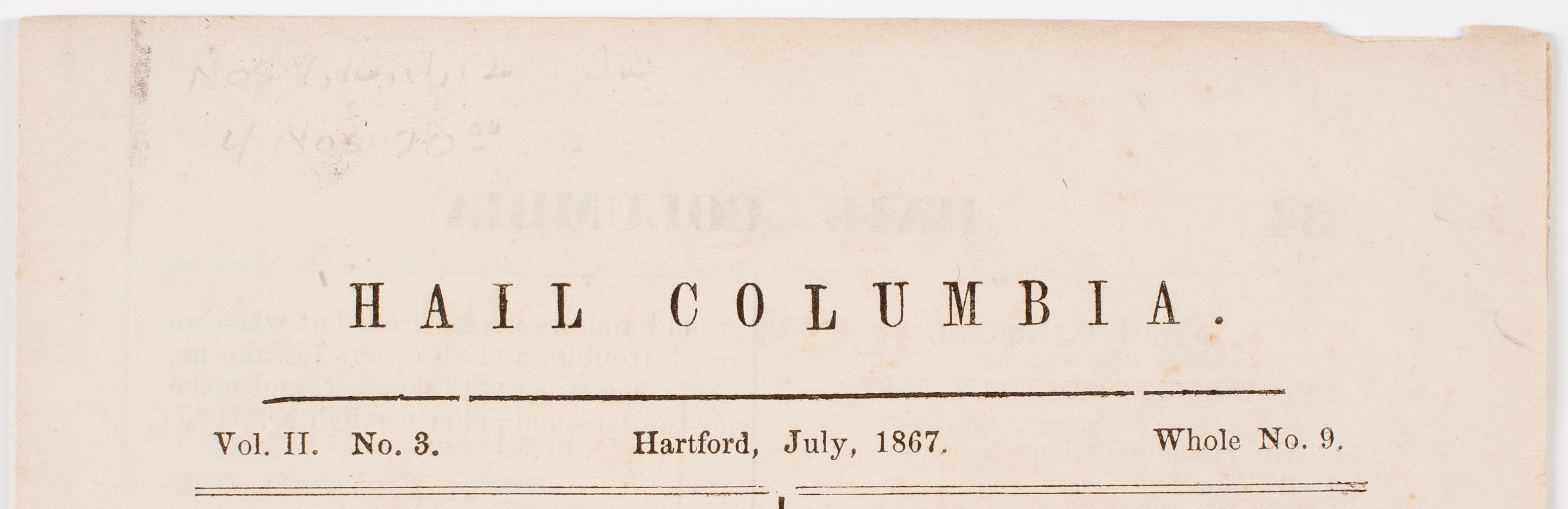
HailColumbia_0002A recently acquired amateur newspaper, Hail Columbia, published in Hartford by W.H. Gillette, sent this serials cataloguer on a hunt for the full name of the editor. The paper itself gave no clues, and it was fairly typical of such things—riddles, poetry, bits and pieces of “news,” notices of other amateur newspapers and the like. It must have been notable for something, as it was mentioned in the Hartford Courant, evinced by a thank you nod from the editor in the July 1867 issue.

Hail Columbia was started in 1866 but there is no indication of how long it ran. Working through Ancestry.com, I discovered the editor was William H. Gillette, son of Senator Francis Gillette. William was born July 24, 1853, and the family lived at Nook Farm in Hartford, near such notables as Henry Ward Beecher, Harriet Beecher Stowe, Mark Twain, and Charles Dudley Warner (editor of the Courant, which may explain the notice!). Gillette was about fourteen when he edited and published Hail Columbia.

HailColumbia_0001

From there he went on to become an actor, Mark Twain getting him his first role in Twain’s own play The Gilded Age in 1875. Gillette became a success both as a playwright and an actor, with his most famous role being Sherlock Holmes. He had a friendship and correspondence with Sir Arthur Conan Doyle, in 1898 arriving at Doyle’s residence in a long gray cape and deerstalker hat. With his height and longish, aristocratic face and beaky nose, he was the perfect Sherlock Holmes. Doyle had written a play about his famous detective, which Gillette extensively rewrote and asked Doyle if he could “marry Holmes.” Doyle replied the he could marry him or murder him or do anything he liked with him. The result was a four-act play, combining elements from several of Doyle’s stories, including A Scandal in Bohemia and The Final Problem. Touches of A Study in Scarlet, The Sign of Four, The Boscombe Valley Mystery, and The Greek Interpreter were also incorporated.

Gillette_as_SH_2
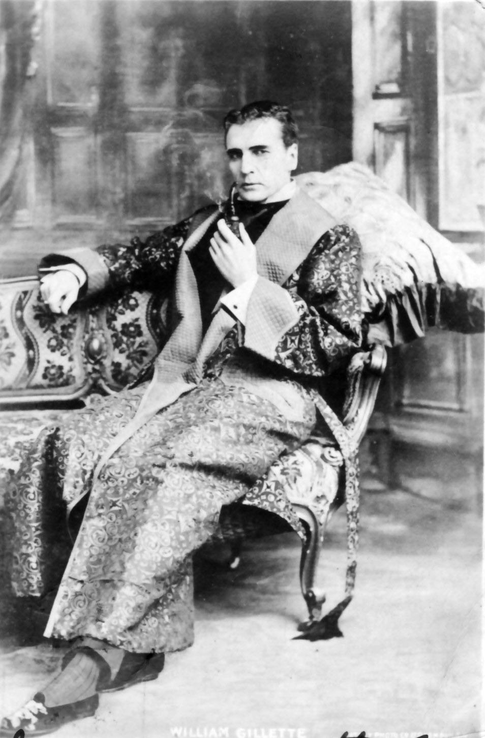
Gillette as Sherlock Holmes (from Wikimedia Commons)

Gillette’s portrayal of Holmes on the stage led to one of the more iconic representations of the detective, which never existed in the original stories. Although the cape and deerstalker hat appeared in the Strand Magazine serialization of the stories, the illustrations by Sidney Paget show Holmes with a straight stem pipe, not the curved calabash now associated with him. This was introduced by Gillette on stage, supposedly so that he could speak his lines more clearly with the curved stem. More likely it was because that type of pipe lent itself to a better view of the actor’s face! In any case, Gillette’s use of the calabash firmly entrenched that pipe in the Holmes canon, along with the violin, syringe, and magnifying glass.

Gillette was also an inventor and practical joker. His house in Haddam, now known as Gillette’s Castle, is an imposing fourteen-room mansion built of local, undressed fieldstone and has trap doors, secret passages, and intricate locks designed by the owner. It is surrounded by a miniature railway also designed and built by the actor. Gillette’s sitting room on the fourth floor was designed to replicate that of Sherlock Holmes, complete with the tobacco-stuffed Persian slipper hanging from the mantle. There is also a spring loaded bar that appeared and disappeared before guests. An inveterate animal lover, Gillette built a fountain in the conservatory for his two pet frogs, and had anywhere from fifteen to twenty cats in the house at one time. An advertisement placed in the Deep River Era by Gillette offered “Two perfectly black Tommy kittens to be given away, one all black, other black with white feet and underside. Both have double forepaws that is, seven toed. Not Persian, Angora or Siamese, But Real Cats they come of a family of great mousers. Anyone wanting one or both of these delightful felines must write stating qualifications. That is, we want to be sure that they do not go to stupid boobs who don’t know what a cat is. Would like to have a recommendation from last cats you have lived with, but probably that is asking too much. Address WG, Box 96, Hadlyme, Conn.”

Gillette died childless on April 29, 1937. His will stated

I would consider it more than unfortunate for me – should I find myself doomed, after death, to a continued consciousness of the behavior of mankind on this planet – to discover that the stone walls and towers and fireplaces of my home – founded at every point on the solid rock of Connecticut; – that my railway line with its bridges, trestles, tunnels through solid rock, and stone culverts and underpasses, all built in every particular for permanence (so far as there is such a thing); – that my locomotives and cars, constructed on the safest and most efficient mechanical principles; – that these, and many other things of a like nature, should reveal themselves to me as in the possession of some blithering saphead who had no conception of where he is or with what surrounded.


An Unusual Advertisement

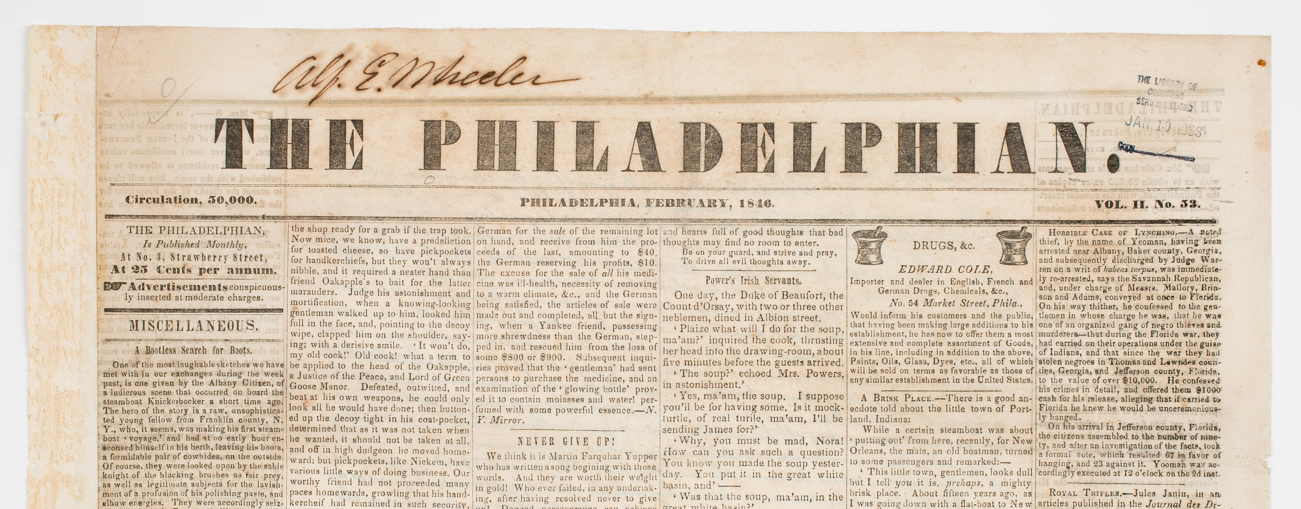
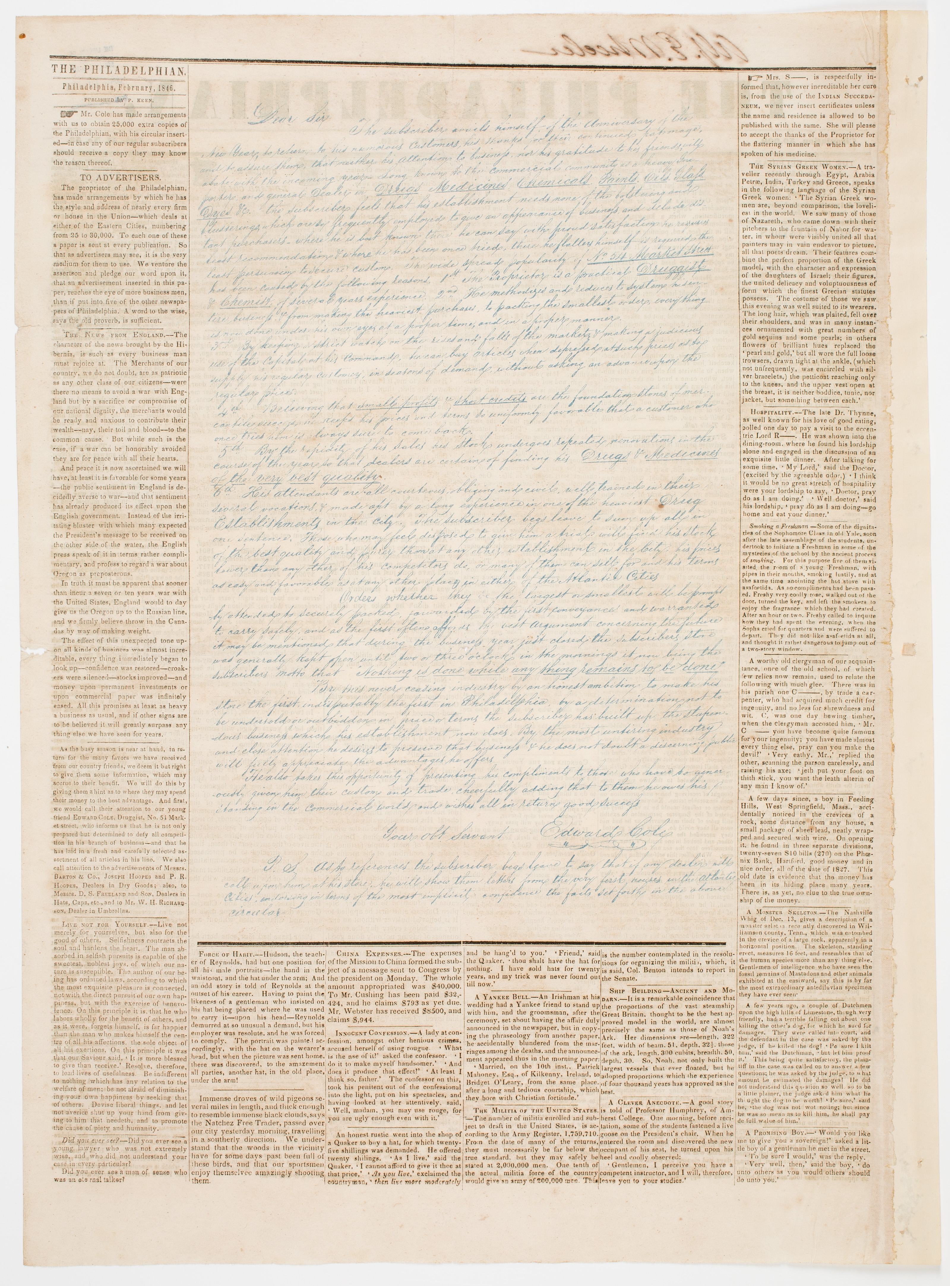
The Philadelphian  (Philadelphia, PA).  February 1846.

489331_0001This is a scarce monthly publication filled with stories, tidbits of information, and small jokes for the entertainment and amusement of the reader.

489331_0002What makes this particular issue interesting is an advertisement on page 2 that takes up almost two-thirds of the page.  It is for drugs, medicines, chemicals, paints, oils, glass, and dyes by Edward Coly.  Rather than being printed in black letterpress like the rest of the newspaper, it is made up to look like a handwritten letter from Coly and printed in blue ink.  The sheet of paper had to go through two different types of presses to achieve this effect. The advertisement was printed by lithography.  The printer had to leave space for the letter when setting type.   It would have been slow and not cheap, but the advertisement certainly is eye-catching and effective.

There are other examples of lithographed serials and serials with lithographed plates tipped in.  We even have a newspaper from San Francisco with the English text set in type on one side and Chinese text in lithograph on the other. But this is the only newspaper I know where there is a lithographed advertisement co-mingled with letterpress text on the same page.

The Acquisitions Table: Aladdin

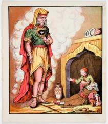
Aladdin.  Cincinnati: Peter G. Thomson, ca. 1877-1889.

AladdinAlthough McLoughlin Bros. dominated American picture book publishing in the last quarter of the nineteenth century, they were not without worthy competitors; among them was Peter Gibson Thomson (1851-1931).  This lusciously chromolithographed version of Aladdin sports a marvelous palette of colors and shades, and was probably the work of European lithographers who came to the United States after the Civil War.  In 1892, Peter G. Thomson established a factory for coated paper which became the largest of its kind in the world.

The Acquisitions Table: Map of Utah and Colorado

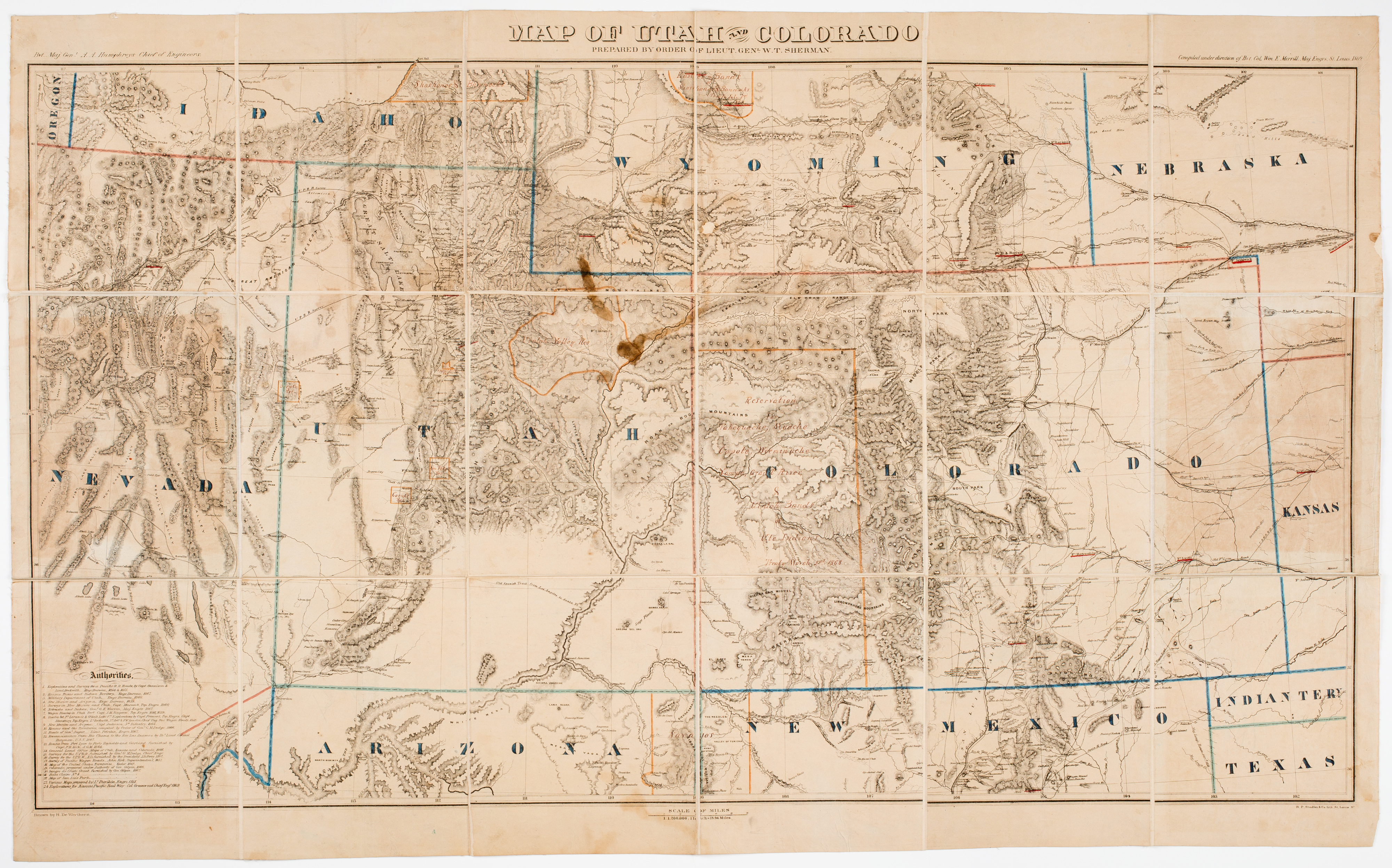
H. De Wertheren. Map of Utah and Colorado Prepared by order of Lt Gen. W.T. Sherman, St. Louis: R.P Studley & Co., 1869

Map of Utah and ColoradoThis map of Utah and Colorado and the bordering states and territories was made during the tenure of William Tecumseh Sherman as the head of the Military Division of the Missouri, which covered territory between the Mississippi River and the western edge of the Rocky Mountains. In this capacity, Sherman oversaw traffic on the overland trail systems, protected the railroads during construction, and oversaw the negotiation of treaties with Native people in the area. This copy of the map is annotated in manuscript with the regions of the country which had been set aside as reservations for many groups, including the Navajo, the Ute and the Shoshone peoples. The map was issued in the middle of the Indian Wars, just after the Winter Campaign of 1868-1869. Printed in St. Louis, the map is one of the earliest cartographic sheets printed by R.P. Studley & Co.. Starting in the late 1850s, the firm printed official reports, pamphlets, job work for the railroads and city businesses, and other ephemera, and are often credited with bringing the first lithographic press to the city. Gift of George Dalphin.

Now that’s a hat!

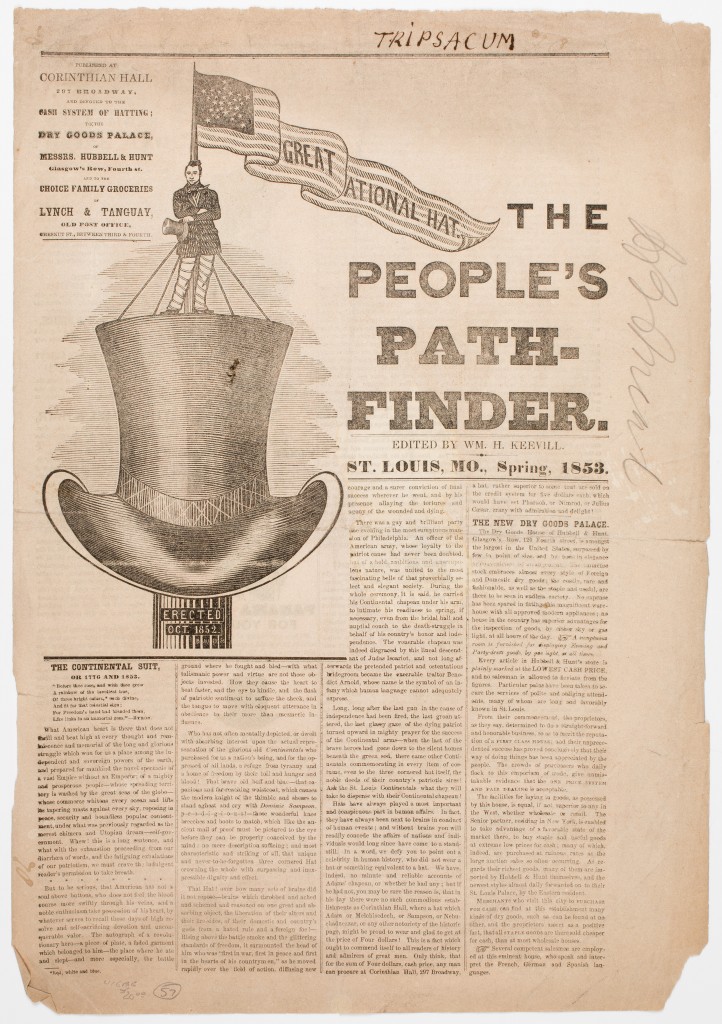
The People’s Pathfinder  (St. Louis, MO)  Spring 1853.  Edited by William H. Keevill.

459391_0001This is a rare advertising piece for the dry goods palace of Hubbell & Hunt at Corinthian Hall in St. Louis, Missouri.  As can be seen from the large woodcut on the front page, this publication is about hats.  The articles are about hats.  The advertisements are for different types of hats.  One article starts out, “Did you ever see a Bald Indian?” and concludes by promoting their ventilated hats.  At the end they note they employed Mr. G. A. Baner to cut the engravings because he was the finest in the area.  The “Great National Hat” on the front page with the man standing on it may not be an exaggeration.  On page 2, Mr. Keevill notes, “The Eighth Wonder is the Great National Hat on Corinthian Hall, twelve feet high, and built at a cost of some hundreds of dollars.”  Now that is a hat.
“Black Printers” on White Cards: Information Architecture in the Database of the Early American Book Trades

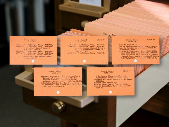
Since our founder Isaiah Thomas’s research for his ambitious The History of Printing in America (1810), AAS has held the largest collection of data on the early American book trades in North America and the Caribbean. The bulk of this information exists on 25 drawers of cards in our reading room and is known as the Printers’ File. Culled from biographies, reference books, and newspapers, the data detail the work of 8,000-10,000 printers, publishers, editors, binders, and others involved in the book trades up to 1820. We are now transforming all of this data, both from the cards and from our General Catalog, into the Database of the Early American Book Trades (DEABT). This online resource is an effort to augment the types of queries our data can answer, to link our data to related data sets, and to allow greater access to a resource that is currently only available in our reading room. The transformation has offered me a number of opportunities to reflect on how the information architecture governing this set of data makes meaning and is therefore ripe for the kinds of reflection Alan Lui calls for when he writes that digital humanists need to show that critical thinking about our resources “scales into thinking critically about the power, finance, and other governance protocols of the world.”

Slide14 (2)
Sample cards from the Printers’ File.

Book historians (and the more steeped in bibliography and cataloguing one is, the more I think this is true) are keenly aware of the importance of how information is structured. In her contribution to Debates in the Digital Humanities (2012), Joanna Drucker identifies such an awareness with the critical editing and online repositories built in the early 1990s, but we might trace such an awareness much further back if we are to look at the history of cataloging and bibliography in this country, and of course even further back, if we turn our gaze across the Atlantic. But, the point that I want to make here is less one about origins than it is about Drucker’s concern that what she terms “capta” and defines as “interpretation rather than data,” is lost in the creation of humanist “data.” Since her essay appeared a few years ago, much has been done to show that the information structures governing the data are a form of “capta” themselves. For example, Lisa Gitelman and Virginia Jackson argue in the introduction to ‘Raw Data’ is an Oxymoron (2013): “starting with data often leads to an unnoticed assumption that data are transparent, that information is self-evident, the fundamental stuff of truth itself. If we’re not careful, in other words, our zeal for more and more data can become a faith in their neutrality and autonomy, their objectivity” (16).

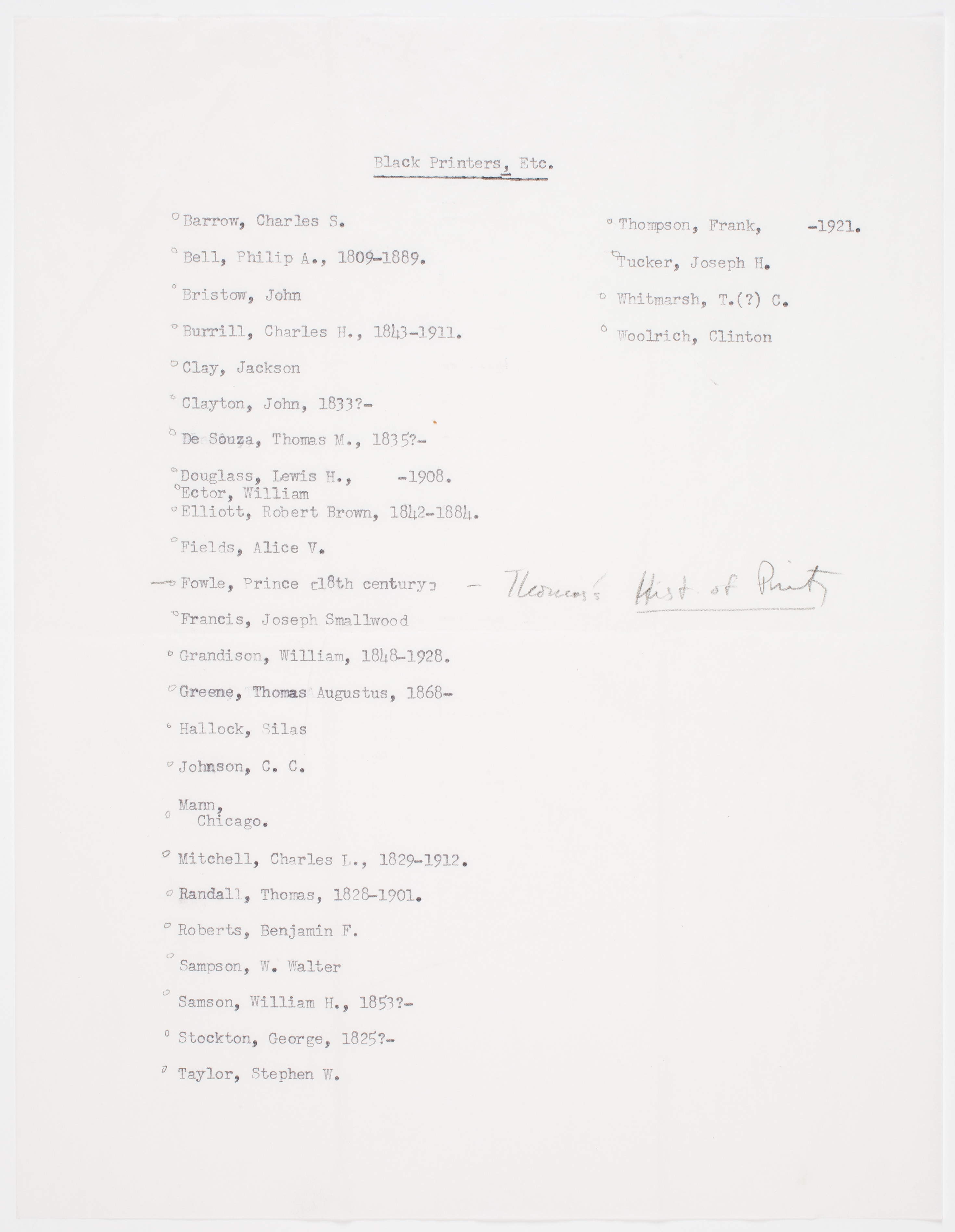
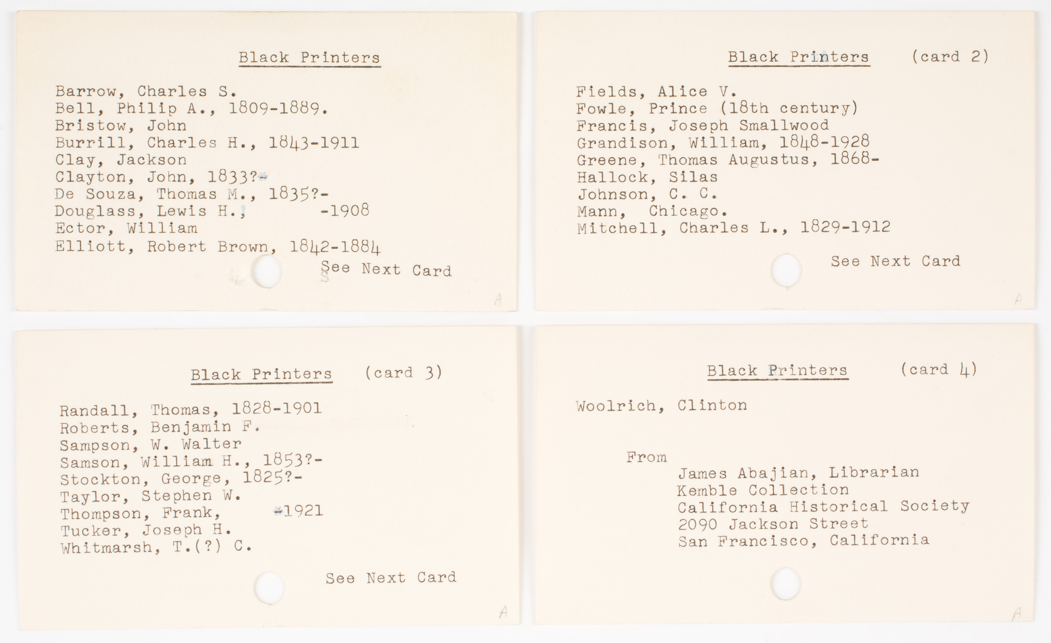
The transformation of the Printers’ File into the DEABT has rendered some of these hitherto “unnoticed assumptions” visible to me. The File is in effect a prosopography, tracing the business and at times personal lives, of thousands of people involved in and around the early American book trade and the cards themselves dictate this structure. Each of the salmon cards in the 25 drawers details the life of an individual. One person might have more than one card, but always—or almost always—there is a name at the top of the card to remind the user that it is the category of “person” that is organizing this inquiry. In this sea of salmon cards, there is however an exception: four white cards that, at their top, instead of a person’s name, have the title “Black Printers.” The cards then list a number of African American printers active in the trade in the eighteenth to early twentieth centuries. Why are these cards included? How did they come to disrupt the information structure that governs this data? And what do we make of such a disruption?

blackprinters_0002 (2)

The answer can be found in our institutional records, which trace the building of our collections and in so many ways reflect and inform the history of information science and librarianship in this country. In the AAS archives there is correspondence between California Historical Society librarian James Abajian and AAS associate librarian Fred Bauer, Jr. In June 1975, Abajian sent a general query to a number of university libraries and a few independent libraries about his latest project: “I am preparing for publication a monograph concerning U.S. 19th and early 20th century black printers, type founders, and ink and paper makers. If you have any references to blacks engaged in either this field or peripheral areas, I should very much appreciate receiving Xerox copies of them.” Bauer promptly responded with a list of reference books Abajian might consult, and he told him of the Printers’ File. Bauer lamented that the Printers’ File could not really be of help because of the way it was organized. He wrote, “Unfortunately, we do not have any entry to our Printer’s [sic] Catalog by sex or race (color). This great resource can only be tapped through the Surname of the printer.” In response, Abajian adjusted his query, forwarding “a selected list of such printers is attached for whatever can be done with it.” Bauer responded that he was pleased to have the list as he hoped “to turn up some information as we proceed with our cataloging,” and asked Abaijan for permission to include it in the File. Bauer again bemoaned the Printers’ File’s insufficiency, “Since we are still working in the period 1640-1830, we have only a slight chance to discover any of the people you have found, but we shall try. Please keep us advised of your results for we would welcome any additional information for our Printers’ file.” It is Abajian’s list that became the four 3×5 white index cards. Placed at the start of the “B”s, these cards understood in the context of this exchange speak to an absence in the history of the American trades: the names of these “black printers” are there because Abajian sought data that Bauer regrettably could not supply. In other words, their inclusion signifies exclusion.

abajian_0006 (2)
The letter from James Abajian with the list of black printers.

There is much more to be said about these cards as outliers, about the political and social conditions in which these men and women of the book trades worked and the reasons their work is obscure, and about the zeitgeist in which Abajian sought information about them.  For my limited purposes here, I want to say simply that, through rupture, these cards call attention to the forces at play as this huge amount of information was structured. In creating the online database, we will note the race, insofar as we know it, of all members of the trade, so that the uniqueness of these cards will be lost. We will be including that which Bauer laments the lack of in his letter to Abajian, and the “black printers” can be found by a simple querying of the database, as if these names had always been there. These names will not stand out because they are on white cards, but instead will exist in the same ontology as all the others in the database. The cards themselves, however, remind us that our organization of data, no matter how neutral we imagine it to be, is built out of and therefore reflects upon a particular moment, that it is performing a kind of “capta” through its very organization within a system, a system that can never itself be neutral because its creation, like the data it captures, is a humanist endeavor.

September issue of the Almanac is here!

The latest issue of the Society’s newsletter, the Almanac, is now available, complete with images of Boston on fire, the President of the United States, and some pretty exciting (to us, at least, given our penchant for old printing) packed rental trucks. If that’s not enough to entice you, there are also stories about upcoming public programs and a conference on image and text in American print culture; a generous gift from an AAS member and Councilor; the indefatigable efforts of our curator of newspapers to collect material on cross-country road trips; and of course, the honor we’re still over the moon about, the National Humanities Medal.

So please take a moment to check out what’s going on at the Society, and we hope you’ll join us for the upcoming programming!

Exploring the Archives with High School Students

Josiah Burden is a history teacher at Worcester’s South High Community School. Over the course of several years, he was able to take part in many workshops at AAS through a federally-funded Teaching American History grant awarded to AAS and the Worcester Public Schools. The experience led him to bring two of his own U.S. history classes on a field trip to AAS.

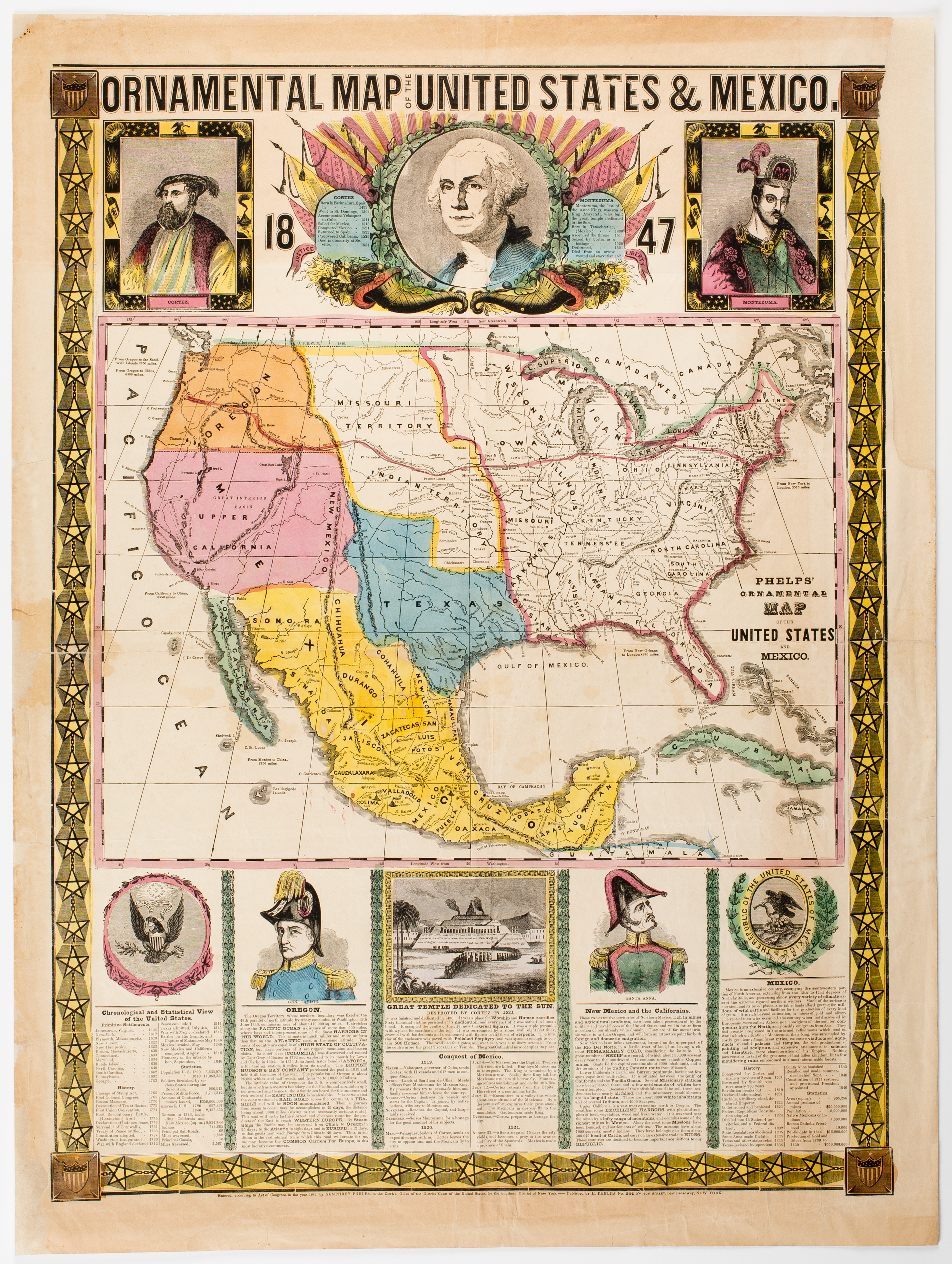
"Phelps' Ornamental Map of the United States and Mexico," by Phelps, Ensign & Thayer, 1847.
“Phelps’ Ornamental Map of the United States and Mexico,” by Phelps, Ensign & Thayer, 1847.

In April, I brought two U.S. History classes to AAS for a tour and workshop. My experience with the AAS as a teacher has been great. Through the workshops of the Teaching American History grant, and a handful of Saturday events, I have been working with the collection, and it seemed clear to me that my students had to come here.

I planned a field trip where my class would work with artifacts pertinent to the War with Mexico. A handful of visits to the reading room yielded several dozen fantastic items: political cartoons, campaign broadsides, lithographs, newspapers, and the like. There’s just so much to choose from. The real challenge was narrowing it down to a dozen or so pieces that told a somewhat balanced story.

AAS director of outreach showing students Old No. 1.
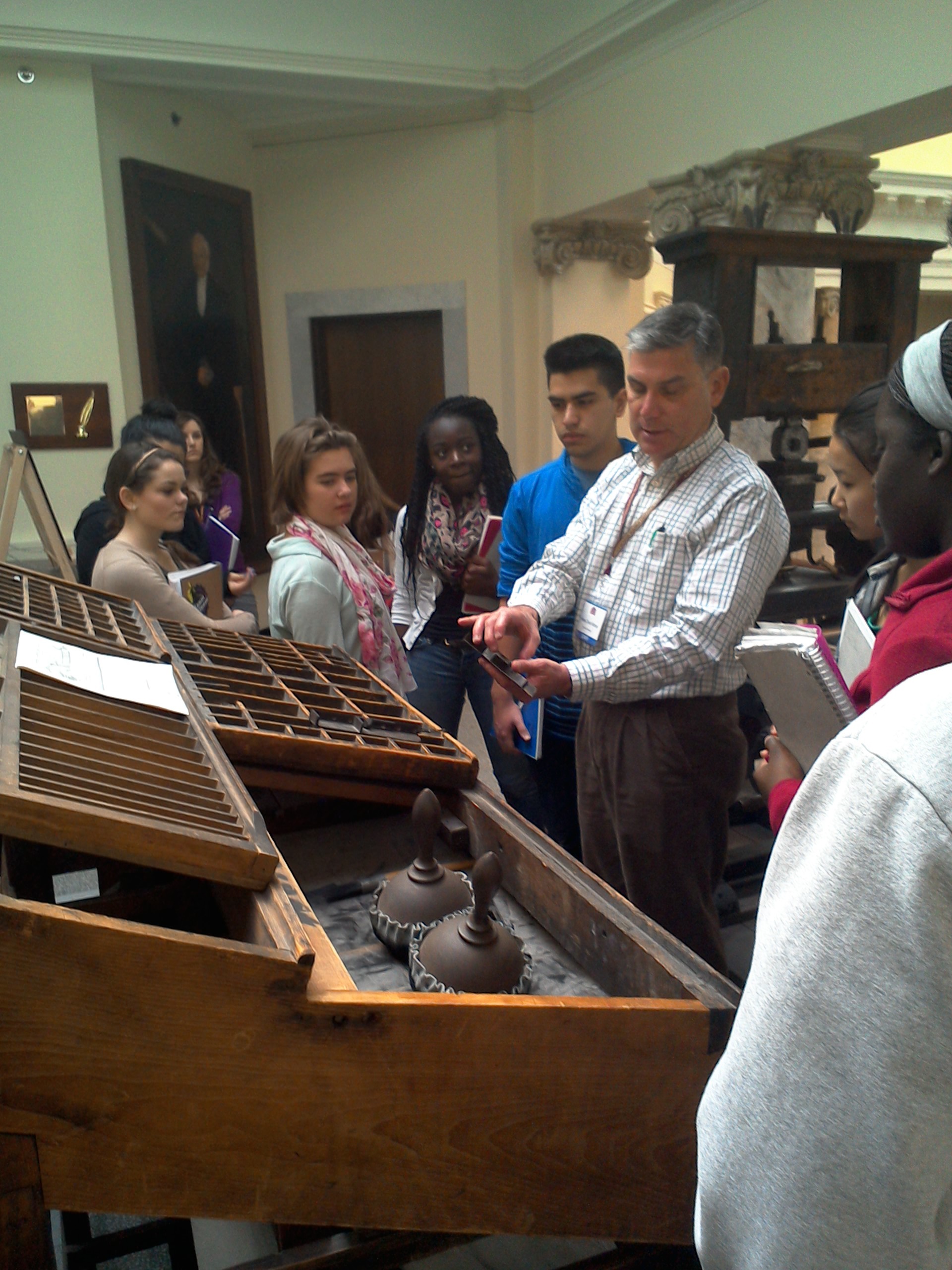
AAS director of outreach Jim Moran showing students Old No. 1.

With the help of the AAS outreach staff, we crafted an experience for students that would be both memorable and enlightening. I had tried to explain to the students beforehand the enormity of the library and the, well, coolness of the collection, but it’s really best understood in person. As impressive as the reading room is, it is the tip of the iceberg. As our tour wandered through the library, around the Isaiah Thomas press, and into the stacks, they began to get it.

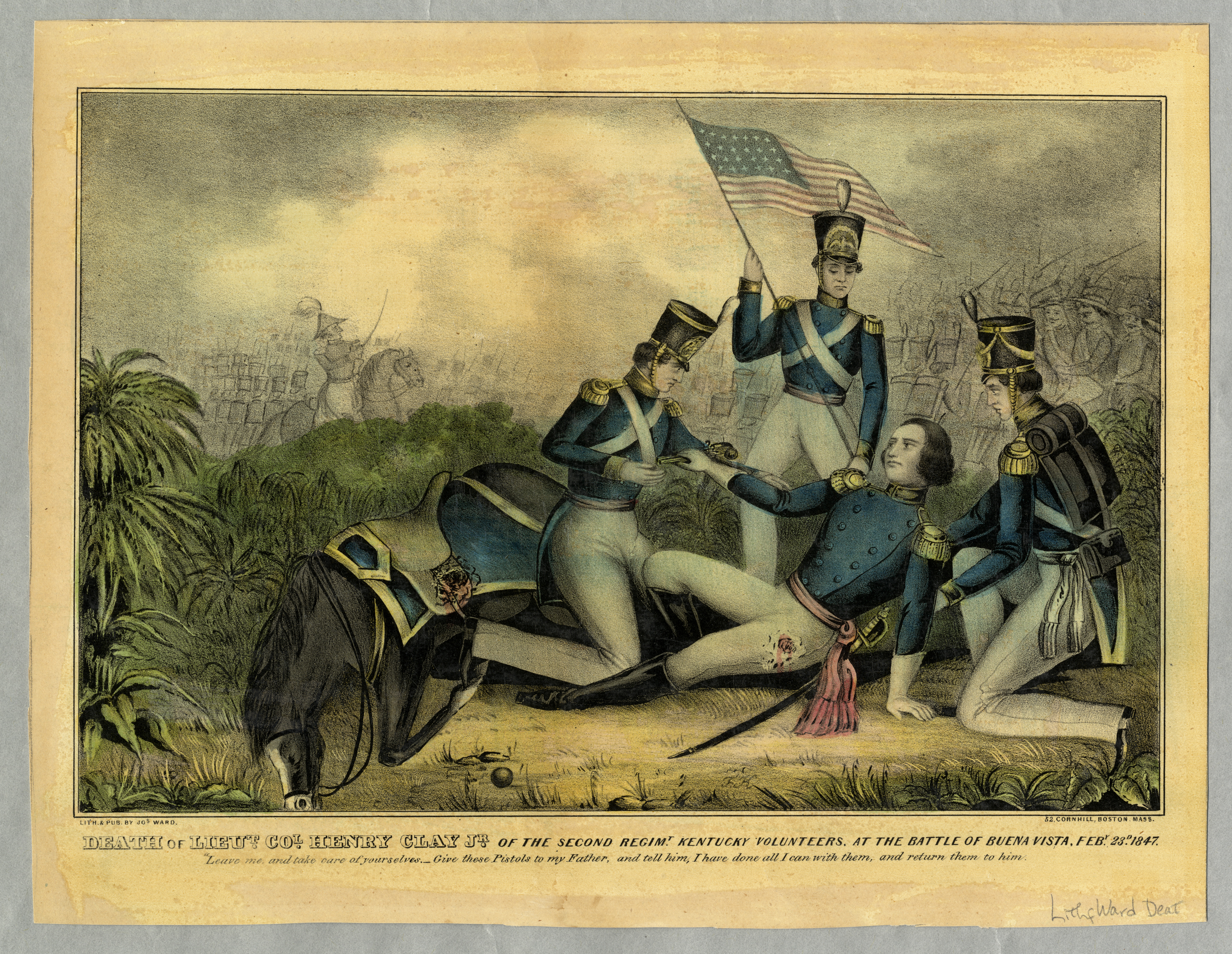
In the council room, my students worked together and individually to understand what each of the items meant, and how they could contribute to their understanding. It was great to see them interacting with the collection, gingerly turning the pages of a 150-year-old newspaper, disagreeing with each other over the meaning of a campaign poster produced in 1848. In what was probably the most interesting turn of events, one girl compared the depiction of the death of Henry Clay Jr. (see below) to the crucifixion of the Christ, using her art background to help explain the use of space and the position of the figures, the angle of the flag, to make a pretty compelling argument that the lithograph was not just a scene from the war but more of a commentary on the morality of the conflict that Clay’s father fought so intensely to prevent.

"Death of Lieut. Col. Henry Clay Jr. of the Second Regim. Kentucky Volunteers," by Jos. Ward, ca. 1847.
“Death of Lieut. Col. Henry Clay Jr. of the Second Regim. Kentucky Volunteers,” by Jos. Ward, ca. 1847.

The kids enjoyed the day the spent at the American Antiquarian Society. Several of them indicated that they never realized we had such an incredible wealth of important history right here in Worcester. All of them left with a better understanding of their place in the world. It was great to see them experiencing history through real objects; it’s an opportunity that students in our area are truly fortunate to have.

2014 Fall Public Program Lineup

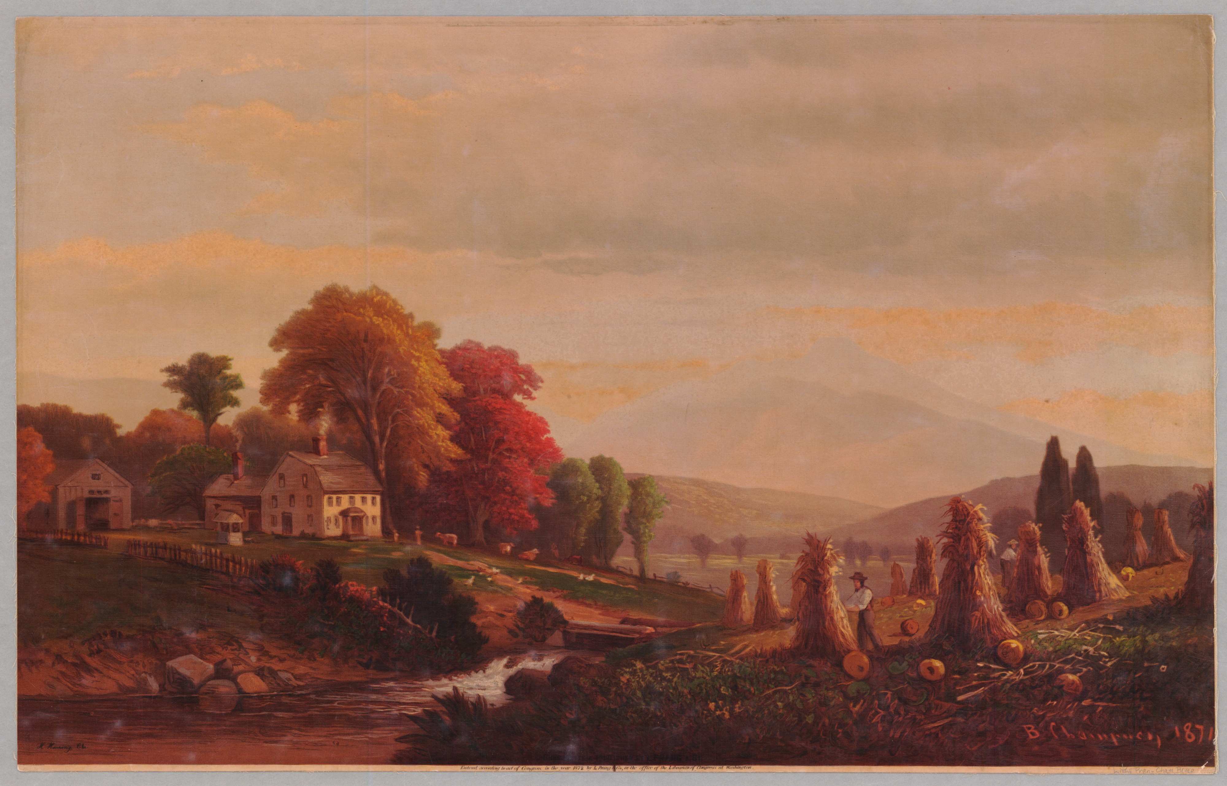
typical harvest
L. Prang & Co., 1872

The air is starting to change here in Worcester, getting a bit cooler and crisper, and that’s a sure sign that our public programs are about ready to start as well! Here’s a quick rundown of what will be coming to Antiquarian Hall this fall:

Friday, September 12, 2014, at 7:00 p.m.
Cartographic Innovation in the Early Republic
by Susan Schulten

In this talk, Susan Schulten will explore how the early nineteenth century represents a new era of visual thinking.  Through innovative maps and charts of the mail, internal improvements, climate, and vegetation, several individuals sought to uncover patterns in the human and natural world.  In a moment that evokes our own, these individuals used visual tools to navigate an increasingly complex, interdependent, and data-driven world.


Monday, October 6, 2014, at 7:00 p.m.
Disappearing Medium: Poetry and Print in the Antebellum United States
by Meredith McGill
JAMES RUSSELL WIGGINS LECTURE

In this lecture, Meredith McGill explores how we might understand the explosion of mass print as a formative event in the history of American poetry, and how we might look to antebellum poetry as a primary means for taking the measure of the cultural impact of print.


Thursday, October 23, 2014 at 7:00 p.m.
Eleventh Annual Robert C. Baron Lecture
by Kenneth Silverman

Kenneth Silverman will talk about his 1984 book The Life and Times of Cotton Mather, which won both the Pulitzer Prize for Biography and the Bancroft Prize for American History.  He will reflect on how he cam to write his biography of Mather, and how that experience compares to the experience of writing biographies of some very different American cultural figures.


Thursday, October 16, 2014, at 7:00 p.m.
Old Towns in a New Nation: New England Village Life in the Early Republic
by Mary Babson Fuhrer

Mary Babson Fuhrer will discuss the remarkable stories of conflict and transformation that reshaped local communities in the decades leading up to the Civil War.  The Boylston, Massachusetts diaries, letters, and account books she draws on form the basis of her recent book, Crisis of Community: Trials and Transformation of a New England Town, 1815-1848 (2014).


Thursday, November 6, 2014, at 7:00 p.m.
Sampling Urban Appetites
by Cindy Lobel

Cindy Lobel, author of Urban Appetites: Food and Culture in Nineteenth-Century New York (2014), will discuss the rise of New York City and the evolution of its food culture when the city grew from a small seaport to a booming metropolis.  Urban Appetites gives a complete picture of the evolution of New York, its politics, and its eating habits.

Visit AAS’s website for full program descriptions. We hope to see you there!

The Acquisitions Table: The Doll and Her Dresses

The Doll and Her Dresses. London: Frederick Warne & Co.; New York: Scribner, Welford & Co., ca. 1870.

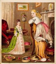
Doll and her dressesThis picture book is part of Warne’s Picture Puzzle Toy Books series, in which the young owner is supposed to cut out and paste cutouts of dress accessories and room ornaments to the existing color illustration, filling in the entire picture. In this case, the girl’s pink sash, the doll’s green overskirt, the bird cage on the mantle, and the baskets on the floor are cutouts. Each picture shows the blond-haired girl with her various dolls; the dolls are about three-quarter the size of their mistress and are clearly adult, thus providing the girl with a fantasy life in adult dressing.