When we were faced with the challenge of designing the catalog for the McLoughlin Brothers exhibition at the Grolier Club in New York in-house, the task seemed a bit overwhelming at first. The collection material featured was already so lively and engaging. But the answer quickly became clear when we began creating a plan for the recently published catalog—use the firm’s own work for inspiration.
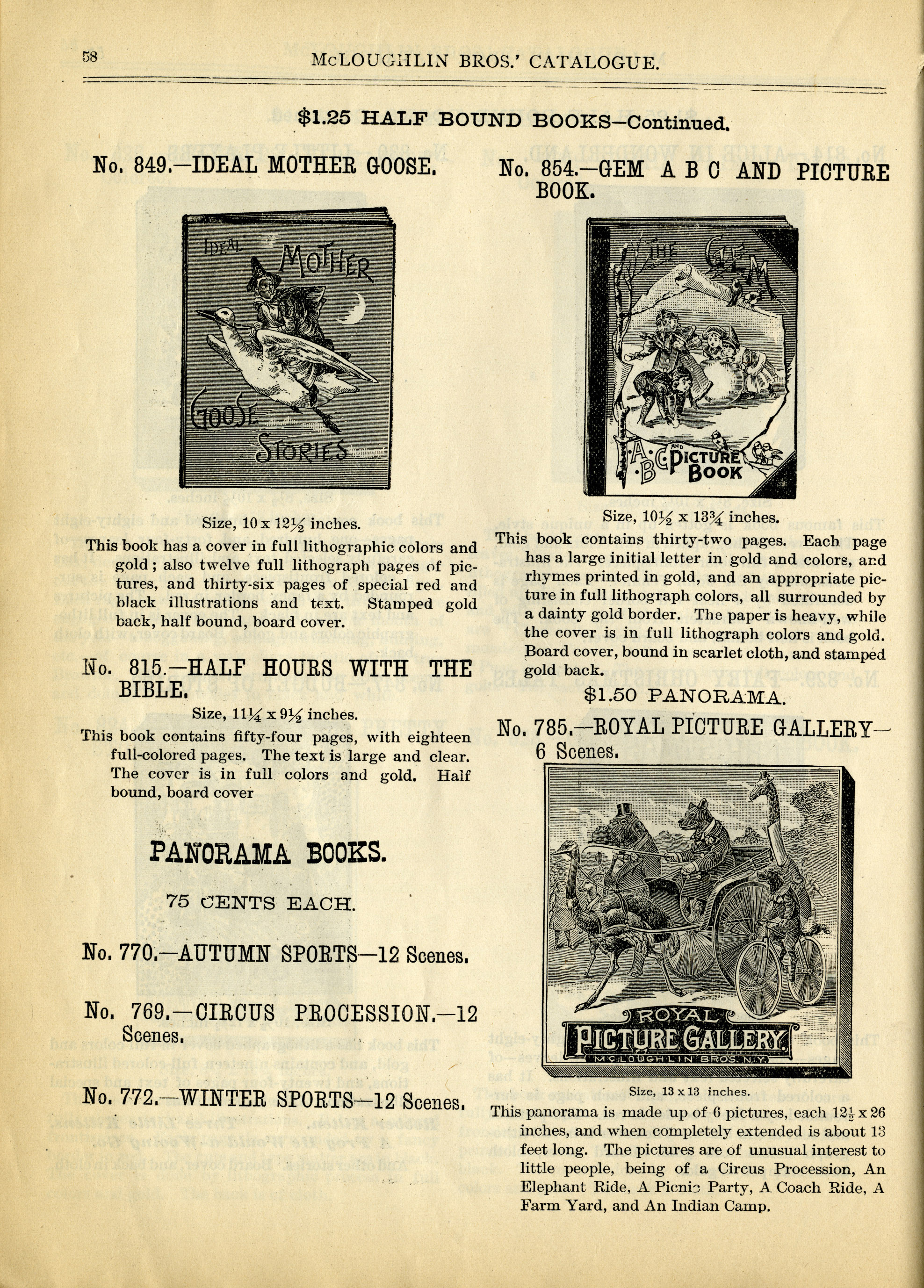
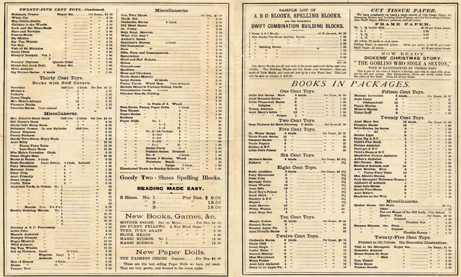
The Society holds the archival collection of the McLoughlin Brothers firm, which was assembled by former McLoughlin vice president Charles Ernest Miller in the twentieth century. The archive includes drawings, watercolors, proofs, print samples, correspondence, and original manuscripts, as well as order forms, catalogs, and price lists. We were drawn to the firm’s publisher’s catalogs (as seen in a sample page here), which proved to be the inspiration for our own.
Catalogs as Inspiration
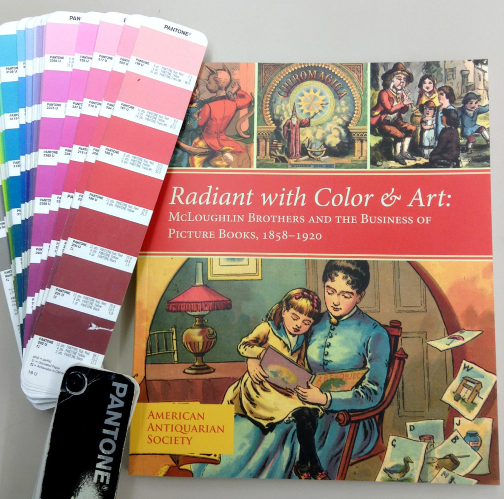
In our publication, Radiant with Color & Art: McLoughlin Brothers and the Business of Picture Books, 1858–1920, we wanted to create a layout with elements that hinted at these past publisher’s catalogs, so we incorporated parts of their design—size, double bars at the top of the page, a similar font style, and margins—into the whole of the modern one. We also liked the organized structure of the catalogs produced from the 1870s through the 1940s, as well as the saturated color palette of the artwork in the later copies, which made them inviting to flip through. We even reproduced pieces of the original catalogs where there was available space, such as on the endpapers (see above), which feature the firm’s publisher’s catalog from about 1871.
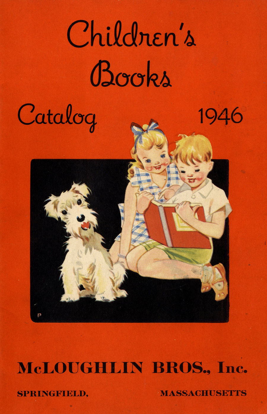
Once a basic layout had been decided, including the spacing, columns, and so on, we incorporated the photographs of the collection items taken by our staff photographer, Nikki Grdinich. At this point we also began focusing on the use of color in our catalog’s final design and narrowing down choices for cover artwork. The firm had a practice of “putting color on every page,”[1] so in homage, we put it on every spread; this gave us the opportunity to showcase some of our favorite items and to incorporate the vibrant colors of the firm’s later catalogs, such as this one from 1946.
However, matching “McLoughlin red,” a bright shade of scarlet found in many of the firm’s publications, proved problematic as it varied over the decades the firm was in business and in some cases by what the products were printed on (linen or paper). One thing that remained consistent was that it was vibrant. We used it on both the cover and introductory pages to sections of the catalog. The sampling of images included in our catalog seen below show some of the variations.
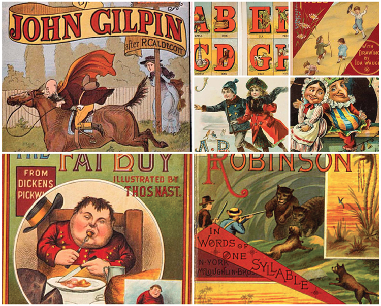
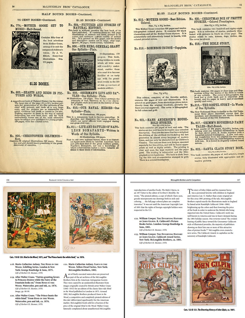 Another challenge in the design process was the great variety of types of items we needed to illustrate. They ranged from archival watercolors to block illustrations, shaped toy books to inexpensively made pamphlets, and board games to ABC and picture books. Looking through the archival collection of catalogs for inspiration on how to make these items work with each other, it seemed that McLoughlin wanted the viewer to easily make comparisons between texts. As we liked this strategy of comparison, we employed it in our design as well, such as in the section about “McLoughlin Brothers and Its Competitors” (seen here), which gives side-by-side comparisons of originals done by McLoughlin’s competitors and the pirated copies done by McLoughlin.
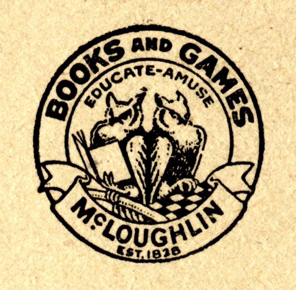
We also liked the font on the McLoughlin publisher’s device (two owls with the motto “Educate-Amuse”) and found that the font family Myriad would complement it. Throughout the catalog we also used small caps of Myriad for the san serif (as well as in the captions); we combined this with Minion as the serif typeface for the body text. These two fonts work together and seemed to fit the criterion of educating and amusing!
The final catalog is an upright, perfect-bound paperback of 144 pages; the trim-size is the same as a McLoughlin catalog produced in the 1910 to 1919 decade.
Printing the Catalog
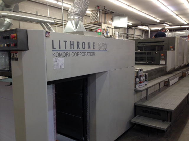
When it came to the actual printing of the catalog, we relied on the expertise of the sales representative and project manager at Puritan Capital, Richard Denzer. Puritan Capital, located in Hollis, New Hampshire, is well known to cultural institutions for printing fine art books and museum catalogs. Our catalog, done in 4/color process, was produced in their print shop on their 28 x 40-inch Komori Lithrone S40 Press. As we had requested to have 750 copies printed (a relatively short print-run), Denzer assured us this press would maintain the high print quality we desired of the finished product in a cost-effective way. “We chose the Komori Lithrone to print the catalog because it ends up being much more efficient price-wise to offset print the project, as opposed to producing it digitally on our HP Indigo press,” Denzer explained. “We also have a lot more control in regard to managing the color images with offset printing. Digital printing is great for a lot of things, but when it comes to art books, color reproduction can be less stable and less consistent.”
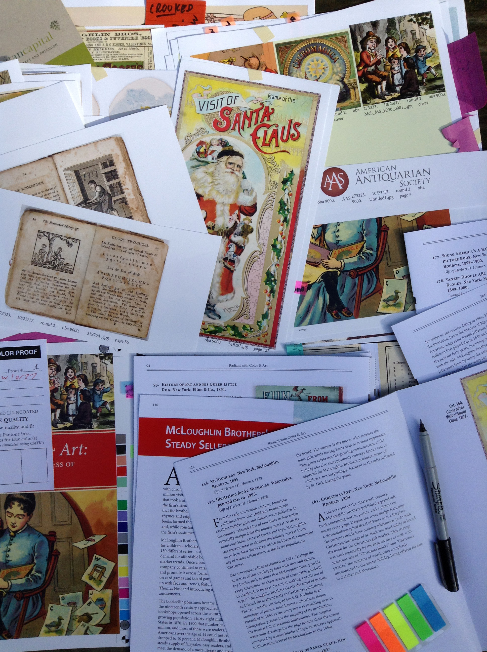
Denzer delivered two rounds of loose proofs (for color) from the prepress department at Puritan, as well as a composite proof (for layout). We reviewed them, comparing the illustrations with the original artwork and making notations on individual pages that needed corrections.
When we received the final copies of the exhibition catalog a few weeks ago, the first question upon opening the box was whether we achieved our version of “McLoughlin red.” We compared our Pantone formula guide—a fan-deck tool we used throughout the process for specific color and printing accuracy—against the color block on the cover. It was spot on.
Design can be a solitary activity. But for this catalog, there was nothing isolated about it—from working with curators Lauren Hewes and Laura Wasowicz to receiving feedback from editor Kayla Hopper to having conversations with other designers, such as AAS member Ingrid Jeppson Mach (elected 2008), who provided invaluable advice in the final stages of design. There was also input from the Society’s managers. Indeed, there were lots of voices. The entire team felt great pride when we finally opened those boxes from the printer (complete with the glee of the new book smell!). We hope you enjoy working your way through the catalog as much as we did laying it out and designing it.
Copies of the catalog can be purchased onsite at AAS and the Grolier Club or for shipping through Oak Knoll.
[1] Radiant with Color & Art, p. 61.
I have a large framed carbon print that my grandfather purchased at an auction around 1920. A Bright Midnight 3705, Carbon Print, Copyright 1907, by McLoughlin Bros.
Please let me know if you have any information about this print or where I can find out if it has any value.