
When AAS was tasked with creating the physical catalog for Radiant with Color & Art to coincide with the opening of the McLoughlin Brothers exhibition at the Grolier Club in 2017, the focus was (at least from the design perspective) on the eponymous color and art. We tried to frontload the design of that catalog to reflect and reproduce the quality of color achieved by Brothers’ printing successes. An earlier blog post reflected on our design process for the McLoughlin catalog.
We tried to apply that same formula last year when we were staring down the assignment of translating an exhibition into a catalog. Part-essay and part-illustrated checklist, the resulting exhibition catalog is softcover, 8.5 x 10” in its final trim size with 104 perfect-bound pages. It features ninety-two total images, seven of them bleeds. The design of the catalog was less about pigmentation and more about pragmatism.
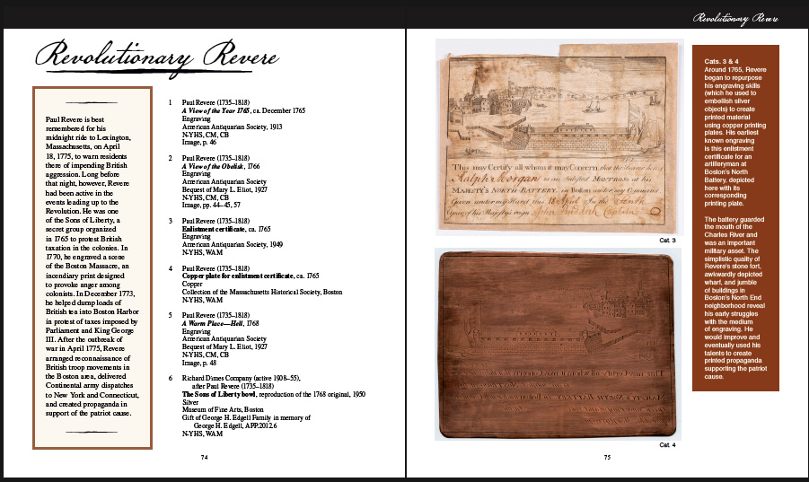 Beyond Midnight: Paul Revere is about capturing the nominal Revere as the “producer” whose raw materials’ list reads like a litany for eighteenth-century creative work: prints, tools, copper, lead, silver, mortar, wedding rings and church bells. Indeed, Revere’s work seemingly reached every area of early American culture during the revolutionary period, from extraordinary political events like the Stamp Act protests and the Boston Massacre to everyday items like Psalm books, tea sets, book plates and currency. The catalog is like the exhibition, infinitely more than just “Revere’s Ride.” The five essays by Jennifer Anderson, Lauren Hewes, Robert Martello, Nancy Siegel, and Nan Wolverton are generously illustrated with material used in the physical exhibition, and the checklist of the exhibition further showcases Revere in his many hats: as revolutionary, maker, networker, and legend.
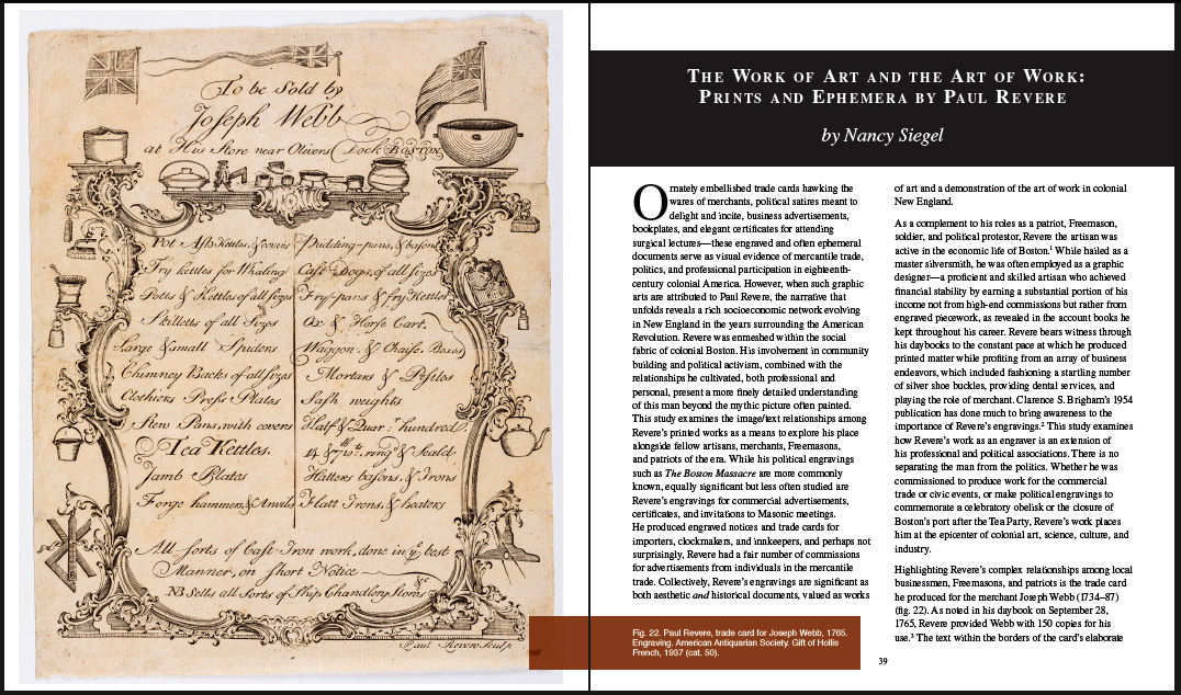
A survey of Revere’s print material shows he is a master in using tight spaces; he could maximize even the most limited of canvases. Looking at his body of engravings also shows him as an artist pushing both physical and political boundaries. And because Revere can borrow ideas like the best of them, we tipped our design-hat and, in turn, borrowed some of his ideas to use in the catalog, from the double columns to the close-fitted page. This feature was the one we co-opted for the print version of the catalog and is best seen in the page for Nancy Siegel’s essay “The Work of Art and the Art of Work” (below), which shows Revere at his finest in the illustrated Joseph Webb trade card (left page). In the copperplate engraving, Revere seems to be saying (and there is no source to confirm this, but to this designer’s eye it is obvious), “You want my signature Chippendale with text AND every ware illustrated in the shop as a border AND you expect it to still look good!? Pass my lodestone. And here, hold my bottle of dried tea leaves.”
 This catalog, like the McLoughlin one, was offset printed by Puritan Capital in Hollis, New Hampshire on their Komori Lithrone G40 press. In a conversation with our printing representative, Richard Denzer, we were told of the press’s ability towards quality of the print-image, as well as its commitment to saving energy and resources. This is something, upon reflection, we feel would have been important to the ever-practical-Revere. The paper we went with for Beyond Midnight is an 80# accent opaque white text, with a coated soft cover. With some of Revere’s more rugged engravings and plates, it mimics the originals held at AAS and elsewhere. Indeed, the name Revere is bound up with the idea of copper, so reproducing this was important to us. This paper choice also reflects beautifully the copper pieces and other physical objects, seen in the plate of the Boston Battery. The first time we held a hard copy of the book, this page took our breath away.
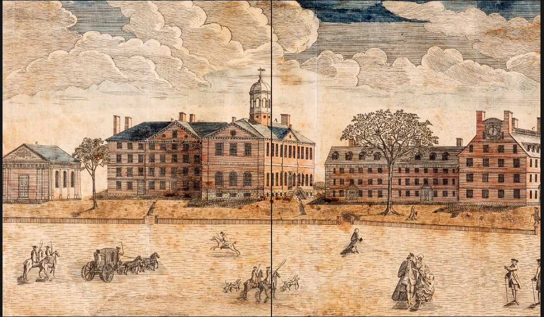
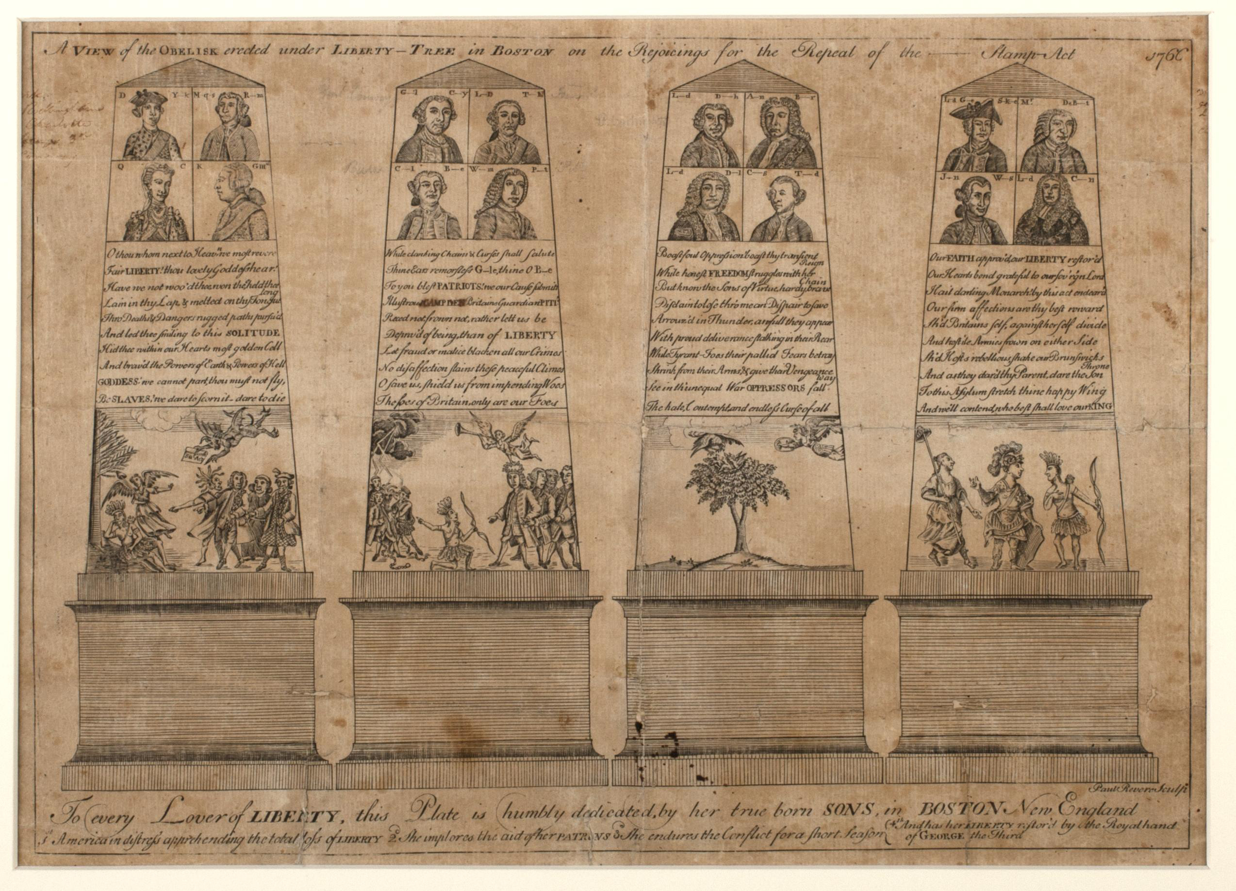 It was also important that the catalog include Revere’s signature prints. Full pages are devoted to prints like the Boston Massacre scene and his “Westerly View of the Colledges [Colleges] in Cambridge New England” (seen below), and the catalog offers a double-page spread for the 1766 engraving “A View of the Obelisk.” For fonts, we went with the ever-technical choices, set in STIX and Helvetica, as well as American Scribe for decorative purposes.
 A print-copy of the catalog is available at our distributor, Oak Knoll Books. And when the physical exhibitions re-open at the Worcester Art Museum and Concord Museum, their gift shops will be happy to get a copy in your hands.