 Did you receive your copy of the Almanac yet?
If not, a PDF version is currently available on the AAS website. But that’s not what this post is about. This is not a post about digital surrogacy. It’s a post about good, old-fashioned printing presses (okay, okay, a 1995 press). While we undoubtedly advocate for the most seamless access to all-things-AAS, we still get disproportionately excited about phrases like “trim-size,” “prepress proof” and “collate & saddle-stitch.”
We all channel printer/founder Isaiah Thomas; it’s an occupational hazard – what can we say.
The March 2013 issue of the Almanac – which hit mailboxes a few weeks ago – was crafted, curated, created, edited, designed and printed in Worcester County, Massachusetts (we believe Thomas would have been proud). Its birth began right here in house at AAS. After gathering information and copy from each department, the editing – and inevitable heart-breaking cutting – began. As evidenced by our initial draft that ran four pages longer than planned, it is extremely difficult for an institution that loves both words and images to make choices about what stays and what goes.
Nonetheless, several drafts and many eye-straining hours later, we had our final version and were ready to go to press. This is where the really interesting stuff begins.
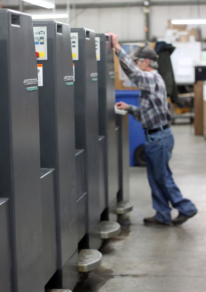
Printed, bound and mailed by American Printing and Envelope Company Inc., the Almanac was produced on a Heidelberg SM 52-6P Six Color Perfector Press (alas, the Almanac is only a four color job). This press runs 9,000 sheets per hour and is so fast that it actually required the Sports-Setting on the camera to be used to capture a sheet coming off into the press’s delivery.
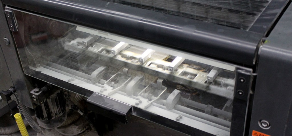
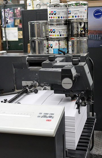 The Heidelberg is an offset press – a relative of the lithographic family. With the Almanac, Endurance Silk 80lb paper is loaded in the feeder and quickly moves its way through the press where each unit lays down one color of ink from the ink fountains (I spoke to one pressman who still called it an ink ball – another Thomas-proud moment). Working to distribute the ink evenly, some rollers oscillate and others are stationary. It is the set bead of ink from the fountain which determines a uniform and crisp impression on the paper.
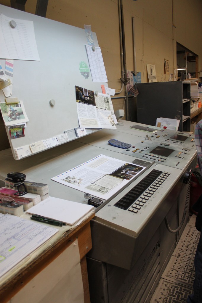
Pictured below are Almanac pages 10 and 7 on the CPC (Computer Print Control) station. This is where the pressman can manage and adjust color as needed to make the final copy look as close to the approved proof as possible.
The first issue of the Almanac in its newsletter format (in 1968) articulated the desire of the director to be in “closer communication” with the members and friends of the Society. Little – and arguably much – has changed since that first issue. The AAS Newsletter (retitled the Almanac in 1997) reports on publications, conferences, lectures, meetings, staff news, building repairs and renovations, members and fellows, cataloging and access tools and, of course, collections. We suppose our initial problem of simply having too much to include is a good one – it means there is a rich variety of activities, events, and news to share.
Although the Almanac’s informal style is somewhat ephemeral, that does not mean the quality or attention to its content, design, layout and printing is any less important or carefully considered. As a labor of love, it both inspires and requires strict attention to detail and painstaking design work.
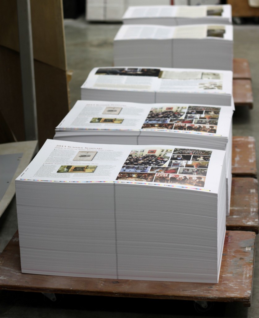 This attention extends to the lessons we learned through the course of the process. Case in point, while working on the Almanac, we challenged each other to use the word “indicia” in a sentence. It’s harder than you’d think; try it. We also learned things about designing, prepress and printing that were somewhat alarming. (For instance, the Almanac has bleeds, knockouts and traps.)
Indeed, newsletter work is a dangerous business.
Again we ask, have you received your copy of the Almanac yet? You’re welcome to download it from our website, but if you are now channeling Isaiah Thomas, send us an email or give us a call. We’d be happy to mail you a hard copy.
